The POWER Procedure
- Overview
-
Getting Started

-
Syntax
 PROC POWER Statement LOGISTIC Statement MULTREG Statement ONECORR Statement ONESAMPLEFREQ Statement ONESAMPLEMEANS Statement ONEWAYANOVA Statement PAIREDFREQ Statement PAIREDMEANS Statement PLOT Statement TWOSAMPLEFREQ Statement TWOSAMPLEMEANS Statement TWOSAMPLESURVIVAL Statement TWOSAMPLEWILCOXON Statement
 -
Details
 Overview of Power Concepts Summary of Analyses Specifying Value Lists in Analysis Statements Sample Size Adjustment Options Error and Information Output Displayed Output ODS Table Names Computational Resources Computational Methods and Formulas ODS Graphics ODS Styles Suitable for Use with PROC POWER
 -
Examples
 One-Way ANOVA The Sawtooth Power Function in Proportion Analyses Simple AB/BA Crossover Designs Noninferiority Test with Lognormal Data Multiple Regression and Correlation Comparing Two Survival Curves Confidence Interval Precision Customizing Plots Binary Logistic Regression with Independent Predictors Wilcoxon-Mann-Whitney Test
 - References
Modifying Symbol Locations
The default locations for plotting symbols are the points computed directly from the power and sample size algorithms. For example, Output 70.8.5 shows plotting symbols corresponding to computed points. The curves connecting these points are interpolated (as indicated by the INTERPOL= option in the PLOT statement).
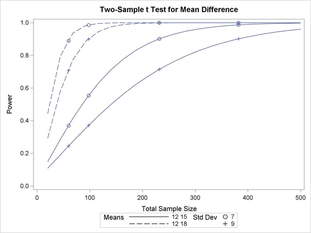
You can modify the locations of plotting symbols by using the MARKERS= option in the PLOT statement. The MARKERS=ANALYSIS option places plotting symbols at locations corresponding to the input specified in the analysis statement preceding the PLOT statement. You might prefer this as an alternative to using reference lines to highlight specific points. For example, you can reproduce Output 70.8.5, but with the plotting symbols located at the sample sizes shown in Output 70.8.1, by using the following statements:
proc power plotonly;
   twosamplemeans test=diff
      groupmeans   = 12 | 15 18
      stddev       = 7 9
      power        = .
      ntotal       = 232 382 60 98;
   plot x=n min=20 max=500
      markers=analysis;
run;
The analysis statement here is the TWOSAMPLEMEANS statement. The MARKERS=ANALYSIS option in the PLOT statement causes the plotting symbols to occur at sample sizes specified by the NTOTAL= option in the TWOSAMPLEMEANS statement: 232, 382, 60, and 98. The resulting plot is shown in Output 70.8.21.

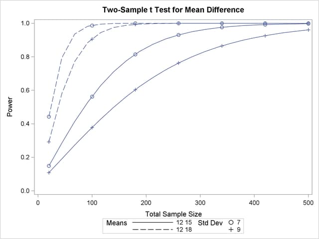
You can also use the MARKERS=NICE option to align symbols with the tick marks on one of the axes (the X axis when the X= option is used, or the Y axis when the Y= option is used):
   plot x=n min=20 max=500
      markers=nice;
The plot created by this PLOT statement is shown in Output 70.8.22.

Note that the plotting symbols are aligned with the tick marks on the X axis because the X= option is specified.