| Calculating Principal Components |
Plotting Against Original Variables
Now that you have reduced the dimensionality of the career performance variables to two dimensions, you can easily examine scatter plots of these principal components versus the SALARY variable. The two principal component scores are automatically stored in the data window.
| Choose Analyze:Scatter Plot ( Y X ). |
This displays the scatter plot variables dialog.
| Select SALARY in the list at the left, then click the Y button. |
SALARY appears in the Y variables list.
| Select PCR1 and PCR2, then click the X button. |
PCR1 and PCR2 appear in the X variables list.
| Select NAME in the list at the left, then click the Label button. |
NAME appears in the LABEL variables list.
A scatter plot variables dialog should now appear as in Figure 19.9.
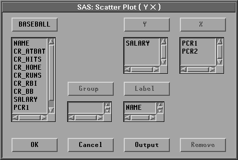
Figure 19.9: Variable Roles Assigned
| Click the OK button. |
A scatter plot window appears, as shown in Figure 19.10.
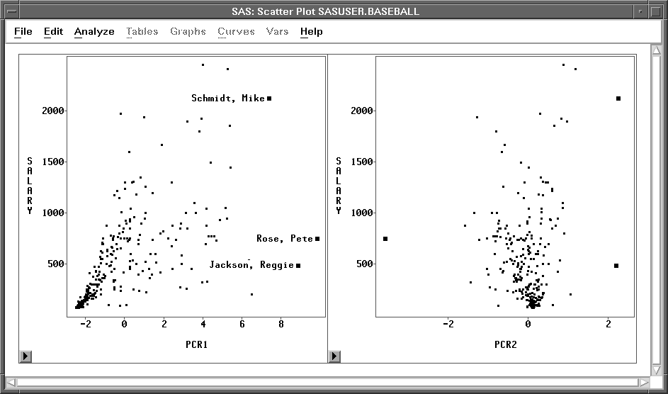
Figure 19.10: SALARY versus First Two Principal Components
Examine the scatter plot of SALARY versus PCR1, recalling that PCR1 is highly associated with overall career performance. The linear trend evident in the plot indicates a strong linear relationship between a player's salary and his overall performance. On the other hand, if you examine the scatter plot of SALARY versus PCR2 (which is the contrast between the combined performance of career home runs and runs batted in versus the other performance), you can see that there is no evident relationship.
You can also examine these scatter plots for potential outliers. Click on the observations with large values of PCR1 in the scatter plot of SALARY versus PCR1. These observations correspond to players who have had outstanding careers.
Copyright © 2007 by SAS Institute Inc., Cary, NC, USA. All rights reserved.