| Exploring Data in One Dimension |
Bar Charts
Interval variables contain values distributed over a continuous range. For example, in Figure 4.2 baseball players' salaries are stored in SALARY, an interval variable. To create a bar chart of players' salaries, follow these steps.
| Select SALARY in the data window. |
Scroll all the way to the right to find the SALARY variable. Point and click on the variable name.
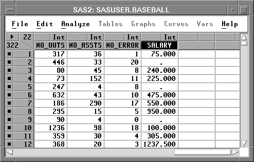
Figure 4.2: Selecting the SALARY Variable
| Choose Histogram/Bar Chart ( Y ) from the Analyze menu. |
![[menu]](images/one_oneeq1.gif)
Figure 4.3: Creating a Bar Chart
This creates a bar chart, as shown in Figure 4.4.
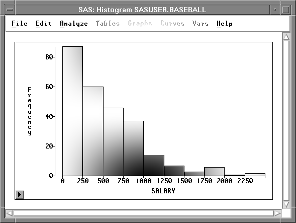
Figure 4.4: Bar Chart
| Point and click on any bar |
This labels the bar with its frequency and selects all the observations in the bar.
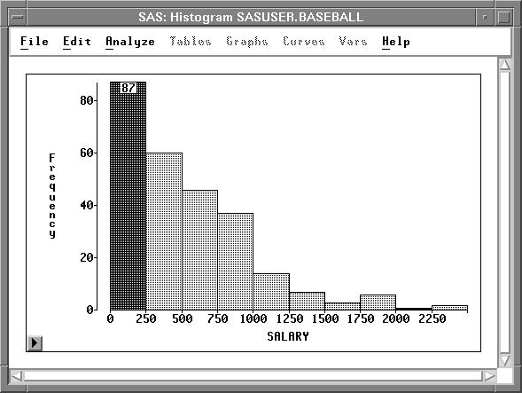
Figure 4.5: Clicking on a Bar
Notice that the observations are selected in the data window as well as in the bar chart window. Windows in SAS/INSIGHT software are just different views of the same data, so observations you select in one window are selected in all other windows.
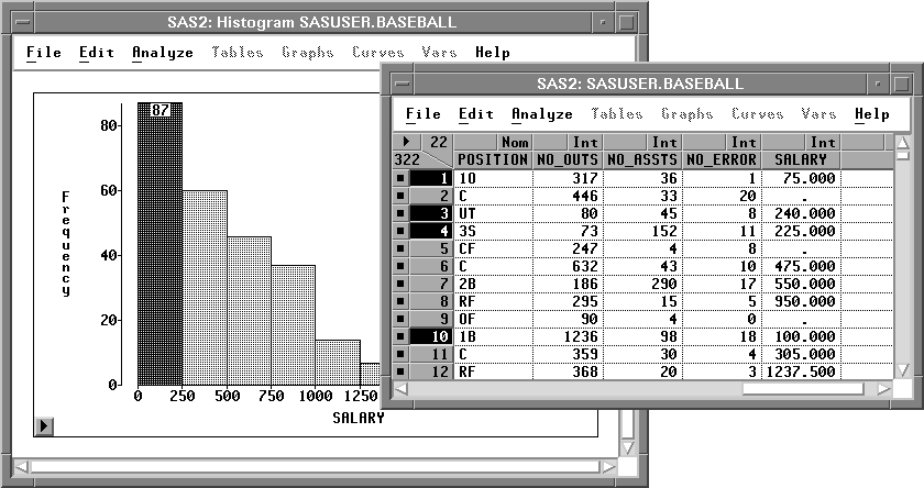
Figure 4.6: Selecting Observations in Multiple Windows
From this bar chart, you can see that the distribution of players' salaries is skewed to the right, with a few players earning high salaries. To find the number of players making the highest salaries, you can label all bars with their heights.
| Click on the menu button in the bottom left corner of the chart. |
This displays the bar chart pop-up menu in Figure 4.7. Click on Values.
![[menu]](images/one_oneeq2.gif)
Figure 4.7: Bar Chart Pop-up Menu.
This toggles the display of values for all bar heights. There are three players making salaries above $2,000,000.
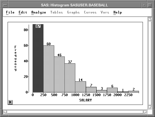
Figure 4.8: Bar Heights
It would be interesting to determine whether salaries differ in the American and National leagues. To compare the distribution of salaries from both leagues, follow these steps.
| Select LEAGUE in the data window. |
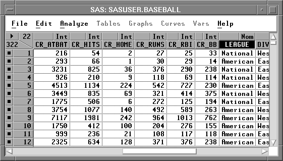
Figure 4.9: Selecting LEAGUE
Note that LEAGUE is a nominal variable. Nominal variables contain a discrete set of values. For example, LEAGUE contains only two values, American and National, for the American and National leagues.
| Choose Histogram/Bar Chart ( Y ) from the Analyze menu. |
From the bar chart in Figure 4.10 you can see that the BASEBALL data set has more observations from the American League.
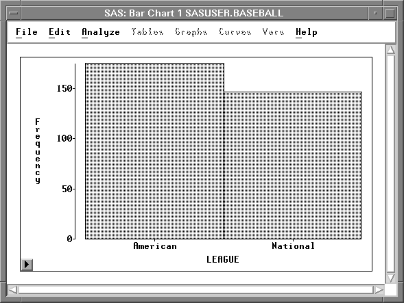
Figure 4.10: Bar Chart of LEAGUE
| Select Values from the bar chart pop-up menu in the new bar chart. |
This displays the frequencies for each of the leagues at the top of the bars on the bar chart.
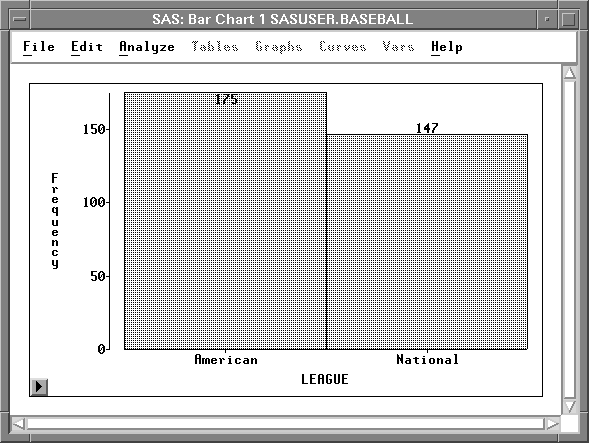
Figure 4.11: Bar Chart with Frequency Values
| Arrange the windows so you can see both bar charts. |
| Click on the bar that represents the American League. |
This selects all observations for players in the American League.
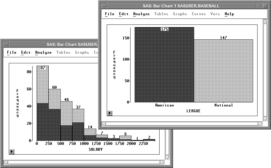
Figure 4.12: Selecting American League Observations
| Click on the bar that represents the National League. |
This selects all observations for players in the National League.
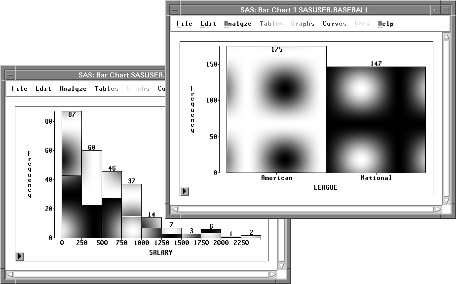
Figure 4.13: Selecting National League Observations
Both leagues have a broad distribution of SALARY with most players earning below $1,000,000 and a few earning much more.
You can examine the distributions in more detail by creating box plots.
Related Reading |
Bar Charts, Chapter 32. |
Copyright © 2007 by SAS Institute Inc., Cary, NC, USA. All rights reserved.