The RAREEVENTS Procedure(Experimental)

Getting Started: RAREEVENTS Procedure
This example illustrates the basic features of the RAREEVENTS procedure. The data are adapted from Benneyan (1998b). The following statements create a SAS data set named Infections by reading the dates of occurrences of an infectious disease and computing DaysBetween, the numbers of days between successive infections:
data Infections;
   input InfectionDate mmddyy10.;
   InfectionNumber = _n_;
   DaysBetween = InfectionDate - lag(InfectionDate);
   format InfectionDate  mmddyy10.;
datalines;
04/17/1995
04/17/1995
04/17/1995
04/19/1995
04/20/1995
05/03/1995
05/05/1995
05/05/1995
05/06/1995
05/07/1995
05/08/1995
05/09/1995
05/09/1995
05/10/1995
05/11/1995
05/27/1995
05/27/1995
05/28/1995
05/29/1995
05/31/1995
06/10/1995
06/11/1995
06/12/1995
06/14/1995
06/16/1995
06/16/1995
06/18/1995
06/21/1995
06/21/1995
;
Figure 16.3 shows a partial listing of the Infections data set.
Figure 16.3: Partial Listing of the Infections Data Set
The following statements produce a comparison plot and a rare events chart for the variable DaysBetween. Because its values are integers, a geometric distribution is used by default to make the comparison and to compute the probability
limits for the rare events chart. The value of parameter p for the geometric distribution is estimated from the data. InfectionNumber is an optional index variable whose values are used to label the rare event chart’s horizontal axis.
ods graphics on;
proc rareevents data=Infections;
   compare DaysBetween;
   chart DaysBetween * InfectionNumber;
   label DaysBetween = 'Days between Infections';
run;
The ODS GRAPHICS ON statement enables ODS Graphics, which is necessary for the procedure to produce graphical output. The COMPARE statement produces the needle plot that is shown in Figure 16.4.
Figure 16.4: Distribution of Days between Infections
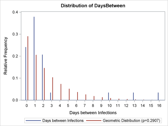
Interpreting a comparison plot of a small data sample can be difficult, but the data have the same general shape as the geometric distribution. The graph does not indicate that the geometric distribution is not appropriate for these data.
Figure 16.5 shows the rare events chart of the DaysBetween data that the CHART
statement produces.
Figure 16.5: Rare Events Chart for Urinary Tract Infections
The number of days between infections 15 and 16 exceeds the UPL, signaling unusual variation. Here the unusual variation is welcome, because less frequent infections are desirable.
The median and probability limits for the chart are computed as described in the section Constructing Rare Events Charts. The chart legend displays the probability,  , that a value from the geometric distribution is greater than the UPL. Note that the LPL in Figure 16.5 is equal to 0, which means that the probability of a
 DaysBetween value less than the LPL is 0. It is not unusual for the LPL to be equal to the minimum possible data value in a chart of
integer data. In this case, the procedure checks for sequences of consecutive values equal to the LPL as an indication of
unusual variation. The probability,  , of five consecutive 0 values from the geometric distribution is 0.0021, as indicated in the legend. The label outside the
upper right corner of the chart shows the overall
, of five consecutive 0 values from the geometric distribution is 0.0021, as indicated in the legend. The label outside the
upper right corner of the chart shows the overall 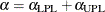 .
.