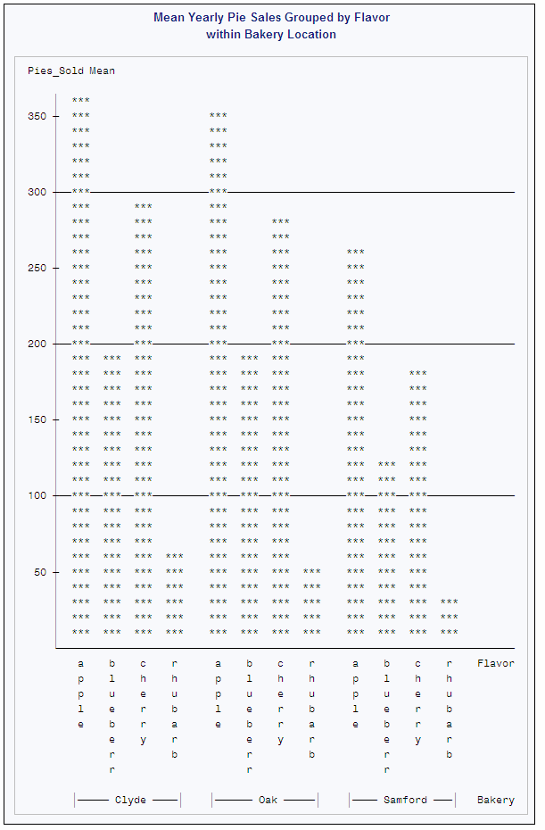
CHART Procedure

Example 4: Producing Side-by-Side Bar Charts

Features:
VBAR statement options:
GROUP=
REF=
SUMVAR=
TYPE=
Data set: PIESALES

Details

This example does the following:
  • charts the mean values of a variable for the categories of another variable
  • creates side-by-side bar charts for the categories of a third variable
  • draws reference lines across the charts

Program

proc chart data=piesales;
   vbar flavor / group=bakery
                 ref=100 200 300
                 sumvar=pies_sold
                 type=mean;
   title  'Mean Yearly Pie Sales Grouped by Flavor';
   title2 'within Bakery Location';
run;

Program Description

Create a side-by-side vertical bar chart. The VBAR statement produces a side-by-side vertical bar chart to compare the sales across values of Bakery, specified by GROUP=. Each Bakery group contains a bar for each Flavor value.
proc chart data=piesales;
   vbar flavor / group=bakery
Create reference lines. REF= draws reference lines to mark pie sales at 100, 200, and 300.
                 ref=100 200 300
Specify the bar length variable. SUMVAR= specifies Pies_Sold as the variable that is represented by the lengths of the bars.
                 sumvar=pies_sold
Specify the statistical variable. TYPE= averages the sales for 2005 and 2006 for each combination of bakery and flavor.
                 type=mean;
Specify the titles.
   title  'Mean Yearly Pie Sales Grouped by Flavor';
   title2 'within Bakery Location';
run;

Output: HTML

The following side-by-side bar charts compare the sales of apple pies, for example, across bakeries. The mean for the Clyde Drive bakery is 364, the mean for the Oak Street bakery is 345, and the mean for the Samford Avenue bakery is 261.
Mean Yearly Pie Sales Grouped by Flavor within Bakery Location