Defining a Lattice with Additional Features
Overview: Defining a Lattice
The following sections
explain how to generate Stock Plot, which requires
the following tasks:
Transforming the Input Data
A common use for a lattice
is to create a graph that shows different subsets of the same input
data. In some cases, those subsets are already defined in the input
data. However, you frequently have to transform the input data to
make it suitable for the graph that you are trying to create. This
might require any or all of the following:
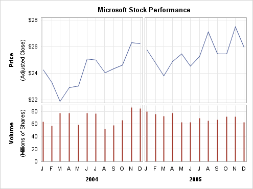
The graph that is shown in Stock Plot is based on
data from SASHELP.STOCKS, which contains several years of monthly
stock information for three companies. The data set contains columns
for STOCK, DATE , VOLUME, and ADJCLOSE (Adjusted Closing Price). However,
it does not have the volume and price information in the form that
is needed for the graph. The LATTICE layout does not support subsets
of the input data on a per-cell basis. So, in order to make the cell
content different, unique variables must be created for each cell
to provide the appropriate date, volume, and price information. The
following DATA step performs the necessary input data transformations:
data stock;
  set sashelp.stocks;
  where stock eq "Microsoft" and year(date) in (2004 2005);
  format Date2004 Date2005 date.
         Price2004 Price2005 dollar6.;
  label Date2004="2004" Date2005="2005";
  if year(date) = 2004 then do;
     Date2004=date;
     Vol2004=volume*10**-6;
     Price2004=adjclose;
  end;
  else if year(date)=2005 then do;
     Date2005=date;
     Vol2005=volume*10**-6;
     Price2005=adjclose;
  end;
  keep Date2004 Date2005 Vol2004
       Vol2005 Price2004 Price2005;
run;
The data is filtered
for Microsoft and for the years 2004 and 2005. Next, new variables
are created for each year and the Volume and Stock Price within each
year. Because the volumes are large, they are scaled to millions.
This scaling is noted in the graph. This coding results in a "sparse"
data set, but it is the correct organization for the lattice because
observations with missing X or Y values are not plotted.
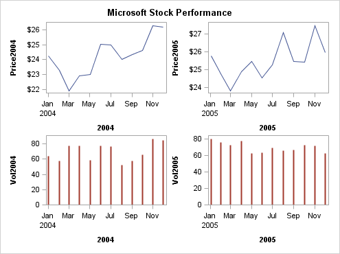
Obs   Date2004   Date2005   Price2004   Price2005   Vol2004   Vol2005

  1         .    01DEC05          .         $26       .       62.8924
  2         .    01NOV05          .         $27       .       71.4692
  3         .    03OCT05          .         $25       .       72.1325
  4         .    01SEP05          .         $25       .       66.9765
  5         .    01AUG05          .         $27       .       65.5300
  6         .    01JUL05          .         $25       .       69.0466
  7         .    01JUN05          .         $25       .       62.9567
  8         .    02MAY05          .         $25       .       62.6998
  9         .    01APR05          .         $25       .       77.0902
 10         .    01MAR05          .         $24       .       72.8997
 11         .    01FEB05          .         $25       .       75.9923
 12         .    03JAN05          .         $26       .       79.6428
 13   01DEC04          .        $26           .     84.4881     .
 14   01NOV04          .        $26           .     86.4461     .
 15   01OCT04          .        $25           .     65.7429     .
 16   01SEP04          .        $24           .     57.7253     .
 17   02AUG04          .        $24           .     52.1046     .
 18   01JUL04          .        $25           .     76.6667     .
 19   01JUN04          .        $25           .     77.0683     .
 20   03MAY04          .        $23           .     58.9425     .
 21   01APR04          .        $23           .     77.3867     .
 22   01MAR04          .        $22           .     77.1119     .
 23   02FEB04          .        $23           .     57.3859     .
 24   02JAN04          .        $24           .     63.6359     .
The key point to be
aware of is that every plot in every cell must use variables that
contain just the information appropriate for that cell. You cannot
use WHERE clauses within the template definition to form subsets of
the data.
proc template;
define statgraph lattice1;
 begingraph;
   entrytitle "Microsoft Stock Performance";
   layout lattice / columns=2 rows=2;
     /* define row 1 */
     seriesplot y=price2004 x=date2004 / lineattrs=GraphData1;
     seriesplot y=price2005 x=date2005 / lineattrs=GraphData1;

     /* define row 2 */
     needleplot  y=vol2004 x=date2004 /
       lineattrs=GraphData2(thickness=2px pattern=solid);
     needleplot  y=vol2005 x=date2005 /
       lineattrs= GraphData2(thickness=2px pattern=solid);

   endlayout;
 endgraph;
end;
run;

proc sgrender data=stock template=lattice1;
run;
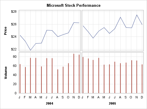
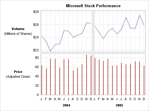
Using External Axes
Initial Lattice for the Graph would benefit from externalizing
the X and Y axes because the external axes reduces the redundant X
axis information and unify the data ranges in the Y axes. We would
also like to add grid lines to all axes. To conserve space along
the X axes, the automatic formatting of each TIME axis is turned off
in the following template code. The TICKVALUEFORMAT=MONNAME1. setting
indicates how to format the time axis tick values.
proc template;
define statgraph lattice2;
 begingraph / designwidth=495px designheight=370px;
   entrytitle "Microsoft Stock Performance";
   layout lattice / columns=2 rows=2
                    rowdatarange=union columndatarange=union
                    rowgutter=3px columngutter=3px ;
     /* define row 1 */
     seriesplot x=date2004  y=price2004 / lineattrs=GraphData1;
     seriesplot x=date2005  y=price2005 / lineattrs=GraphData1;

     /* define row 2 */
     needleplot  x=date2004  y=vol2004 /
         lineattrs=GraphData2(thickness=2px pattern=solid);

     needleplot   x=date2005 y=vol2005 /
         lineattrs= GraphData2(thickness=2px pattern=solid);

     rowaxes;
       rowaxis / griddisplay=on display=(label tickvalues)
                 label="Price"  labelattrs=(weight=bold);
       rowaxis / griddisplay=on display=(label tickvalues)
                 label="Volume" labelattrs=(weight=bold);
     endrowaxes;

     columnaxes;
       columnaxis / griddisplay=on display=(label tickvalues)
                    labelattrs=(weight=bold)
                    timeopts=(tickvalueformat=monname1.);
       columnaxis / griddisplay=on display=(label tickvalues)
                    labelattrs=(weight=bold)
                    timeopts=(tickvalueformat=monname1.);
     endcolumnaxes;
   endlayout;
 endgraph;
end;
run;

proc sgrender data=stock template=lattice2;
run;
Using Cell Axes
In most cases externalizing
axes improves graph appearance and streamlines coding. However, if
there are some axis options that do not apply uniformly to all axes
in a column or row, you need to use the standard axis options on a
cell basis instead of external axes.
For example, if you
wanted X-axis grid lines to appear on the top row of plots but not
on the second row of plots, you could not use external axes. Instead,
you would enclose the cell contents in an overlay-type layout block
and add XAXISOPTS= options on the layout statements. as shown in the
following layout blocks:
/* overlay blocks define X-axis options for row 1 */
layout overlay / xaxisopts=(display=none  griddisplay=on);
  seriesplot x=date2004  y=price2004 / lineattrs=GraphData1;
endlayout;

layout overlay /  xaxisopts=(display=none griddisplay=on);
  seriesplot x=date2005  y=price2005 / lineattrs=GraphData1;
endlayout;

/* overlay blocks define X-axis options for row 2 */
layout overlay / xaxisopts=(display=(label tickvalues)
                            timeopts=(tickvalueformat=monname1.));
  needleplot  x=date2004  y=vol2004 /
    lineattrs=GraphData2(thickness=2px pattern=solid);
endlayout;

layout overlay / xaxisopts=(display=(label tickvalues)
                 timeopts=(tickvalueformat=monname1.));
  needleplot   x=date2005 y=vol2005 /
    lineattrs= GraphData2(thickness=2px pattern=solid);
endlayout;
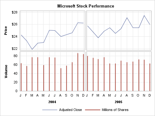
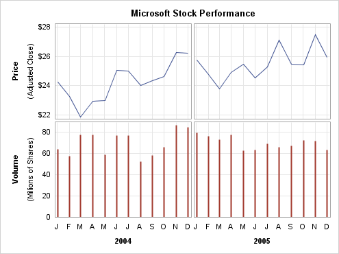
Adding Sidebars
The graph in Lattice with External Axes is progressing
well, but the ENTRYTITLE is centered on the entire graph. It would
look better if it were centered on the grid area. This can be accomplished
by removing the ENTRYTITLE statement and replacing it with a SIDEBAR
block. Four sidebar areas are available: two that span all columns
(one on the TOP and one on the BOTTOM), and two that span all rows
(one on the RIGHT and one on the LEFT).
sidebar / align=top;
  entry "Microsoft Stock Performance" /
    textattrs=GraphTitleText pad=(bottom=5px);
endsidebar;
Finally, we need a way
of explaining that the prices in the first row represent an adjusted
close value. We also need to explain that the axis scaling for the
second row is in millions of shares. Two strategies are available
for providing this information.
The first strategy is
to create an external legend. For this strategy, we must define legend
text on two of the plot statements, and add a DISCRETELEGEND statement
to the BOTTOM sidebar.
seriesplot x=date2004  y=price2004 /
  lineattrs=GraphData2(thickness=2px pattern=solid)
  name="series" legendlabel="Adjusted Close";

needleplot  x=date2004  y=vol2004 /
  lineattrs=GraphData2(thickness=2px pattern=solid)
  name="needle" legendlabel="Millions of Shares";

sidebar / align=bottom;
  discretelegend "series" "needle" / border=off pad=(top=10px);
endsidebar;
The other strategy is
to add to the row information. At first glance, it would seem that
you could do this very simply by extending the axis label text:
rowaxes;
  rowaxis / griddisplay=on display=(tickvalues)
            label="Volume (Millions of Shares)" ;
  rowaxis / griddisplay=on display=(tickvalues)
            label="Price (Adjusted Close)" ;
endrowaxes;
The problem here is
that the extra axis label text might not fit; depending on the text
size and the graph size, the text might be truncated. The axis option
SHORTLABEL="string" is available
to handle truncation, but we want more text, not alternate text, and
there is no way to wrap the axis label to two lines. The solution
is use row headers instead of specifying axis labels.
Using Column or Row Headers
For the graph that is shown in Lattice with External Axes, we want to
explain that the axis scaling in the first row is in millions of shares,
and that the prices in the second row represent an adjusted close
value. The strategy that we used in Adding Sidebars was to create
an external legend that displays that information. Another strategy
that we can use is to remove the label information from the row axes
and introduce a ROWHEADERS block, as shown in the following code:
rowaxes;
  rowaxis / griddisplay=on display=(tickvalues);
  rowaxis / griddisplay=on display=(tickvalues);
endrowaxes;

rowheaders;
  layout gridded / columns=1;
    entry "Volume" / textattrs=GraphLabelText;
    entry "(Millions of Shares)" / textattrs=GraphValueText;
  endlayout;
  layout gridded / columns=1;
    entry "Price" / textattrs=GraphLabelText;
    entry "(Adjusted Close)" / textattrs=GraphValueText;
  endlayout;
endrowheaders;
By nesting the ENTRY
statements in the GRIDDED layouts, we can have multiple lines of text
split exactly where we want and in any text style that we desire.
Without the GRIDDED layouts, only one ENTRY statement could be used
per row.
To allow more space for the plots, we can rotate the
row header text to make it appear to be a row axis label. Notice that
we must specify COLUMNS=2 for the GRIDDED layouts.
rowaxes;
  rowaxis / griddisplay=on display=(tickvalues);
  rowaxis / griddisplay=on display=(tickvalues);
endrowaxes;

rowheaders;
  layout gridded / columns=2 ;
    entry "Price" / textattrs=GraphLabelText rotate=90 ;
    entry "(Adjusted Close)" / textattrs=GraphValueText rotate=90 ;
  endlayout;
  layout gridded / columns=2 ;
    entry "Volume" / textattrs=GraphLabelText rotate=90 ;
    entry "(Millions of Shares)" / textattrs=GraphValueText rotate=90 ;
  endlayout;
endrowheaders;
Adjusting the Sizes of Rows and Columns
By default, the rows
and columns of the lattice are of the same depth and width. You can
use the ROWWEIGHTS= and COLUMNWEIGHTS= options on the LAYOUT LATTICE
statement to designate different row depths or column widths or both.
Consider the following settings:
LAYOUT LATTICE /  ROW=2 COLUMNS=2
  ROWWEIGHTS=(.6 .4) COLUMNWEIGHTS=(.45 .65) ;
LAYOUT LATTICE with Different Row and Column Sizes uses these settings. The ROWWEIGHTS=
setting specifies that the first row gets 60% of available row space,
and the second row gets 40%. The COLUMNWEIGHTS= setting specifies
that the first column gets 45% of available column space, and the
second column gets 65%. Potentially, the settings on these options
affect the space that is allocated to cell headers and to row and
column headers.
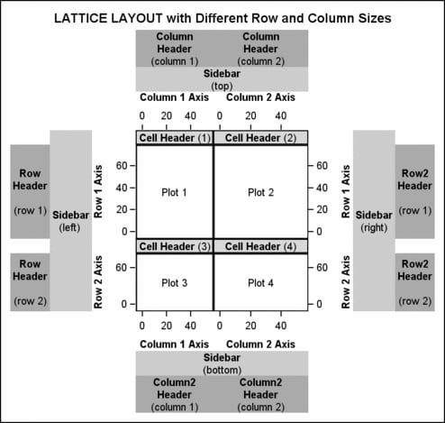
In a traditional stock
plot, the area devoted to price information is larger than the area
devoted to the volume information. Here is the adjustment made to
the row depths:
layout lattice / columns=2 rows=2 rowweights=(.6 .4)
                 rowdatarange=union columndatarange=union
                 rowgutter=3px columngutter=3px;
This next example shows
another way that the ROWWEIGHTS= and COLUMNWEIGHTS= options can be
used. Graph with ROWEIGHTS=(.9 .1) shows a two row by one column lattice.
The first row is an overlay of a histogram, a density plot, a fringe
plot (the short vertical lines below the histogram) representing each
observation, and a legend. The second row contains a box plot. The
X axes have a uniform scale to ensure that the box plot aligns correctly
with the histogram. Because the space that is required to show the
second row (box plot) is so much less than the space that is required
for the first row, the option ROWEIGHTS=(.9 .1) has been used to reapportion
the row space.
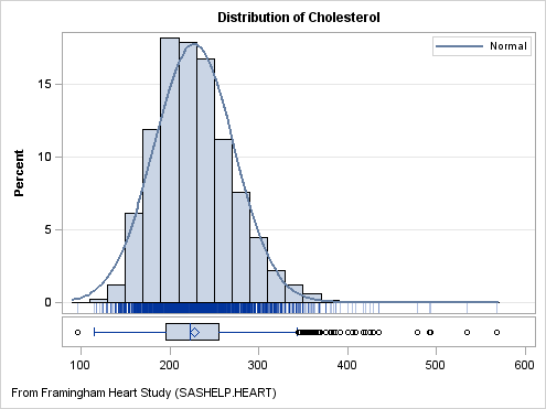
proc template;
  define statgraph distribution;
    begingraph;
      entrytitle "Distribution of Cholesterol";
      entryfootnote halign=left
                   "From Framingham Heart Study (SASHELP.HEART)";
      layout lattice / rowweights=(.9 .1)
                       columndatarange=union rowgutter=2px;
        columnaxes;
          columnaxis / display=(ticks tickvalues);
        endcolumnaxes;
        layout overlay / yaxisopts=(offsetmin=.04 griddisplay=auto_on);
          discretelegend "Normal" / location=inside
            autoalign=(topright topleft) opaque=true;
          histogram Cholesterol / scale=percent binaxis=false;
          densityplot Cholesterol / normal( ) name="Normal";
          fringeplot Cholesterol / datatransparency=.7;
        endlayout;
        boxplot y=Cholesterol / orient=horizontal  boxwidth=.9;
      endlayout;
    endgraph;
  end;
run;

proc sgrender data=sashelp.heart template=distribution;
run;
For a generic version
of this template, which can be used to show the distribution for any
continuous variable without redefining the template, see Using Dynamics and Macro Variables to Make Flexible Templates.