Assigning Data to a Plot
About Assigning Data to a Plot
About Plot Roles
A role is a generic
term for the purpose that a variable serves in a plot. All plots have
predefined roles. For example, a scatter plot includes roles named
for X , Y, Group, Data Label, Error Upper and Error Lower. A bar chart
includes roles named Category, Response, Group, and URL. In the scatter
plot example, you might assign a data variable WEIGHT to the plot
role X.
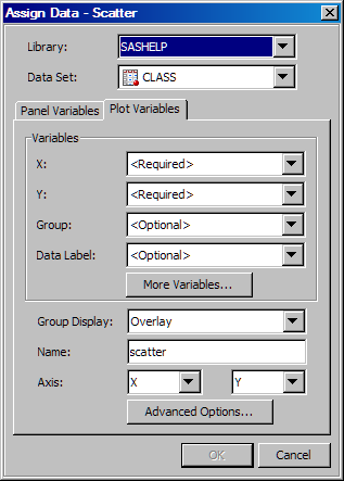
Assign Data to a New Plot
For each new plot that
you add to a graph, you assign data in the Assign Data dialog box. The fields on this dialog box vary by plot. The Assign Data dialog box displays the plot type in its
title bar.
Note: If you are changing
the data for an existing plot, see Change the Data Assignment for a Plot in a Graph.
-
In the Assign Data dialog box, specify the SAS library and data set that you want to use for the plot. Select the appropriate items from the Library and Data Set list boxes.
-
In the Variables section, assign a data variable to each plot role that is listed. (Some roles might be optional.) To assign a variable, select the variable from the list box next to the role's label. For more information about the roles, see Summary of Plot Roles and Data Attributes.
-
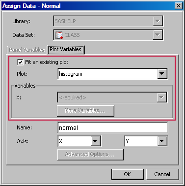
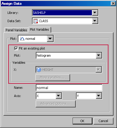
If the Fit an existing plot check box is available, select the check box to match the variables of the plot to those of another plot. This check box is available only for specific plot overlays, such as a Loess plot over a scatter plot or a normal plot over a histogram.If you select the check box, make sure that the plot that you want to fit appears in the Plot list box.
-
If you want to create a classification panel, click the Panel Variables tab and select one or more classification variables. For instructions, see Creating a Classification Panel.
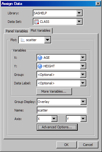
Change the Data Assignment for a Plot in a Graph
After a graph has been
created, you can change the data assignment for one or more plots
in the graph. You also change the data assignment for one or more
plots when you open a graph from the Graph Gallery. (Placeholder data
is assigned to plots for the graphs in the gallery.)
You assign data in the Assign Data dialog box. The fields on this dialog box
vary by plot. The following display shows the Assign Data dialog box for a scatter plot.
-
If you want to change the SAS library and data set, select the appropriate items from the Library and Data Set list boxes.
-
In the Variables section, assign a data variable to each plot role that is listed. (Some roles might be optional.) To assign a variable, select the variable from the list box next to the role's label. For more information about the roles, see Summary of Plot Roles and Data Attributes.
-
If the Fit an existing plot check box is available, select the check box to match the variables of the plot to those of another plot. This check box is available only for specific plot overlays, such as a Loess plot over a scatter plot or a normal plot over a histogram.If you select the check box, make sure that the plot that you want to fit appears in the Plot list box.
-
If you want to create a classification panel, click the Panel Variables tab and select one or more classification variables. For instructions, see Creating a Classification Panel.
Summary of Plot Roles and Data Attributes
In the Assign Data dialog box, you assign data variables to
various plot roles, such as X, Y, and so on. The roles that are available
depend on which type of plot you are editing.
Several types of plots
enable you to specify a variable for grouping the data. Scatter plots,
series plots, step plots, bar charts, box plots, needle plots, and
vector plots support this role in the designer.
For some plot types,
when you group the data, you can also specify how the grouped plot
elements appear in the graph. Scatter plots, series plots, step plots,
needle plots, box plots, and bar charts support this feature.
For some plot types,
you can specify an amount to offset all plot elements from the discrete
tick marks. Specify a value from -0.5 (left offset) to +0.5 (right
offset). Scatter plots, series plots, step plots, needle plots, box
plots, and bar charts support this feature.
You can display the
data label for each observation in a scatter plot, and a curve label
for a series or a step plot.
Some plots can display
the upper and lower error (or confidence or prediction) limits for
the data. You compute these error values in advance as variables in
the data set. Then, you assign the variables to the appropriate role
for the plot.
This option is available
for plots such as series or step plots. The connect order specifies
how to connect the data points to form the step or line. Select X Axis to connect data points as they occur minimum-to-maximum
along the X axis. Select X Values to connect
data points in the order read from the X variable. X Axis is the default.
For bar charts, you
provide a category variable and an optional response variable. If
you do not specify a response variable, then the designer displays
the frequency for the category variable.
-
The Group role creates a separate bar segment for each unique group value in each category. You can also use the Group Display option to specify whether bars are stacked or clustered. For more information, see Group Display.
-
Bar Width enables you to specify the width of the bars as a ratio of the maximum possible width. The maximum width is equal to the distance between the center of each bar and the centers of the adjacent bars. Specify a value from 0.0 (narrowest) to 1.0 (widest).
-
Discrete Offset enables you to specify an amount to offset all bars from the category midpoints. To access this option, click Advanced Options in the Assign Data dialog box. For more information, see Discrete Offset.
For box plots, you
specify variables for the X and Y roles.
-
The Group role creates a separate box segment for each unique group value in each category. You can also use the Group Display option to specify whether boxes are overlaid or clustered. For more information, see Group Display.
-
Box Width enables you to specify the width of the boxes as a ratio of the maximum possible width. Specify a value from 0.0 (narrowest) to 1.0 (widest).
-
Discrete Offset enables you to specify an amount to offset all boxes from the tick marks. To access this option, click Advanced Options in the Assign Data dialog box. For more information, see Discrete Offset.
For band plots, in
addition to the X variable, you can specify the upper and lower limits
for the band.
For a contour plot,
you must specify grid data for the contour X and Y roles, with a Z
value for each (X,Y) crossing.
| Line | displays contour levels as unlabeled lines. |
| Fill | displays the area between the contour levels as filled. Each contour interval is filled with one color. |
| Gradient | displays a smooth gradient of color to represent contour levels. |
| LineFill | combines the Line and Fill types. Each contour interval is filled with one color. Displays contour levels as unlabeled lines. |
| LineGradient | combines the Line and Gradient types. Displays contour levels as unlabeled lines. |
| LabeledLine | adds labels to the Line type. Displays contour levels as labeled lines. |
| LabeledLineFill | adds labels to the LineFill type. Each contour interval is filled with one color. Displays contour levels as lines with labels showing contour level values. |
| LabeledLineGradient | adds labels to the LineGradient type. Displays contour levels as lines with labels showing contour level values. |
You can select the Fit an existing plot check box to match the variables
of an overlaid loess, regression, or PBSpline (penalized B-spline)
plot to those of a scatter plot.
You can specify the
position and other information for horizontal, vertical, and sloped
reference lines as well as for drop lines. For more information,
see Adding Reference Lines to Graphs.
Block plots create
one or more strips of rectangular blocks containing text values. The
width of each block corresponds to specified numeric intervals along
the X-axis. The height of the blocks represents the value of the chart
statistic for each category of data.
You select an X variable
and a block variable. If the X variable is numeric, values are expected
to be in sorted, ascending order.