GKPI Procedure

Overview: GKPI Procedure
About KPI Charts and the GKPI Procedure
The GKPI procedure creates
graphical key performance indicator (KPI) charts. KPIs are metrics
that help a business monitor its performance and measure its progress
toward specific goals. The procedure produces five KPI chart types:
The GKPI procedure produces
a KPI chart based on a series of qualitative range boundaries and
an actual KPI value that you specify. If you specify a target value,
the KPI chart also displays the target value. The procedure uses a
set of default colors for the KPI chart, but you can specify your
own colors.
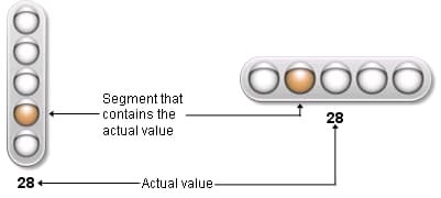
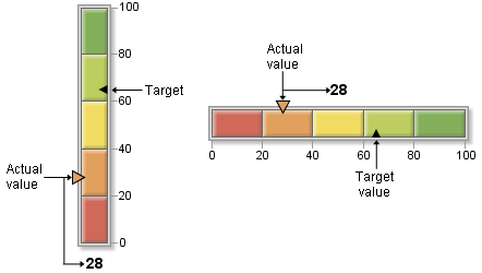
Slider KPI Charts
Slider KPI charts display
a bar divided into qualitative ranges according to the boundary values
that you specify. The actual value of the KPI is indicated with a
triangle pointer the left (for a vertical slider) or on the top (for
a horizontal slider). This actual value indicator is the same color
as the range that contains the actual KPI value. The target value,
if it is specified, is displayed as a smaller triangle on the right
side (or bottom) of the slider.
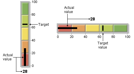
Bullet Graph KPI Charts
Bullet graphs display
a bar divided into qualitative ranges according to the boundary values
that you specify. The actual value of the KPI is indicated with a
black line, or bullet, down the center of the graph. The target value,
if it is specified, is displayed as a vertical line (in a horizontal
bullet graph) or a horizontal line (in a vertical bullet graph) across
the graph.
Dial KPI Charts
Dial KPI charts display
a dial divided into qualitative ranges according to the boundary values.
The actual value of the KPI is indicated with a large, white triangle
pointer. The target value, if it is specified, is displayed as a small,
black triangle. The center of the dial is the same color as the range
that contains the actual KPI value.
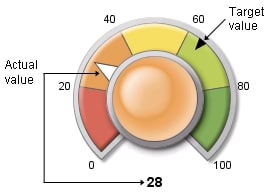
Speedometer KPI Charts
Speedometer KPI charts
display a speedometer with the tick marks evenly spaced around the
dial and colored ranges that correspond to the range boundaries that
you specify. Speedometers can be displayed as a full speedometer,
as a half speedometer, or as a quarter speedometer. The actual value
of the KPI is indicated by a long pointer. The target value, if it
is specified, is displayed as a small, black triangle.
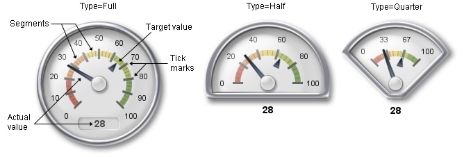
In each display type,
tick marks are evenly spaced but do not correspond to colored range
boundaries. The numbered band in the full speedometer is always divided
into ten sections (using 11 tick marks). The numbered band in the
half speedometer is divided into five sections (six tick marks), and
the quarter speedometer is divided into three sections (four tick
marks).