The SAS BI Dashboard Designer Interface
Your First Look at the SAS BI Dashboard Designer Interface
Tip
In order to view the entire
interface, especially when working with indicators and dashboards,
it is recommended that you set your display resolution to 1280 x 1024.
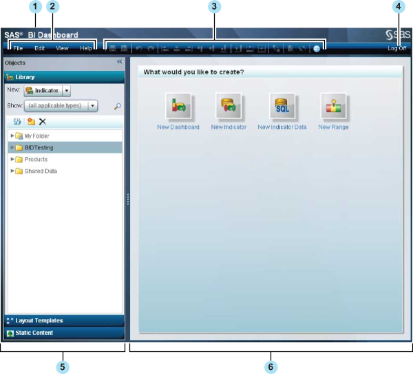
| 1 | Banner. |
| 2 | Menu. For more information, see The Menu. |
| 3 | Toolbar. For more information, see The Toolbar. |
| 4 | Log Off. |
| 5 | Objects pane. For more information, see The Objects Pane. |
| 6 | Workspace. For more information, see The Workspace. |
The Menu
The dashboard designer
menu provides the following tasks and features for use while designing
a dashboard:
Edit
-
Align. Aligns the layout of the objects in a dashboard in one of the following ways: left margin, right margin, bottom margin, top margin, or horizontal or vertical center. Also adjusts the order of overlapping objects in the following ways: bring to front and send to back. For more information about the alignment tools, see Align and Size Objects.
-
Size. Sizes the objects in a dashboard or indicator in one of the following ways: to the same height, the same width, or to both the same height and width. For more information about the sizing tools, see Align and Size Objects.
The Toolbar
The dashboard designer
toolbar provides easy-to-click icons for tasks that are frequently
used with dashboard objects.
|
Aligns
the layout of the selected objects in a dashboard with the object
that was selected first. If only one object is selected, it is moved
to the left edge (position 0) of the dashboard. For more information
about the alignment tools, see Align and Size Objects.
|
|
|
When an object on a dashboard is
partially or completely underneath another object, brings the selected
obscured object to the front. For more information
about the alignment tools, see Align and Size Objects.
|
|
|
Sizes
the objects to the same height. The height used is that of the currently
selected object. For
more information about the sizing tools, see Align and Size Objects.
|
|
|
Opens
the Set Up Interactions window. For more information,
seeAdding Interactions between Indicators.
|
|
|
Open
the current dashboard in the Preview Dashboard window.
Click Close to return to the dashboard designer. For more information,
see Test a Dashboard by Using Preview Dashboard.
|
|
|
Opens the current dashboard in the
SAS BI Dashboard viewer. For more information, see Dashboard Viewer.
|


The Objects Pane
Library Section


Layout Templates Section
The Layout Templates
section provides template objects that control the flow of indicators
in a dashboard. For
more information, see Using a Template to Lay Out Dashboard Content.
Static Content Section
The Static Content section
provides objects for static content in a dashboard: labels and images. For more information,
see Linking to Other Information by Adding Static Content.
The Workspace
When you build a dashboard,
you interact with the objects that you use to build a dashboard in
the workspace.
If you need more room
to display a dashboard in the workspace, you can click View Maximize Workspace to collapse the Objects and Properties panes. Or,
you can click << and >> in
the upper right corner of each panel. You can expand the panes to
their original positions by clicking >> and << on
the collapsed panes.
Maximize Workspace to collapse the Objects and Properties panes. Or,
you can click << and >> in
the upper right corner of each panel. You can expand the panes to
their original positions by clicking >> and << on
the collapsed panes.
Maximize Workspace to collapse the Objects and Properties panes. Or,
you can click << and >> in
the upper right corner of each panel. You can expand the panes to
their original positions by clicking >> and << on
the collapsed panes.
The Properties Pane
Indicator Properties Pane
If you are viewing an
indicator tab, the Properties pane provides the General Settings,
Display Settings, and Personalized User Settings sections.
-
For information about the General Settings section, see Setting Indicator Properties.
-
For information about the Display Settings section and the display settings for each type of indicator, see Indicator Dictionary.
-
For information about the Personalized User Settings section, see Customizing Alerts.
Dashboard Properties Pane
If you are viewing a
dashboard tab, the Properties pane is context sensitive. When you
first open a dashboard, the properties shown are for the dashboard
object only. The Dashboard section provides properties that are specific
to the dashboard. If you select an object within the dashboard, additional
properties specific to that object are displayed in the Objects section
of the Properties pane.
-
For information about dashboard properties, see Setting Dashboard Properties
-
For information about dashboard object properties, see Setting the Properties of Indicators and Other Objects in a Dashboard.
-
For examples of using static labels and static images, see Linking to Other Information by Adding Static Content.