Pie Chart
Definition
Usage Information
|
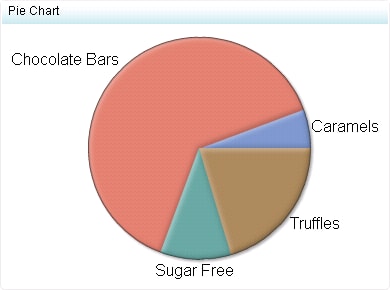
Although pie charts
are commonly used in reports and presentations, they can be difficult
to interpret because the human eye can have difficulty estimating
area and comparing angles, both of which are necessary to draw conclusions
from a pie chart. Due to these difficulties, avoid pie charts with
many slices or slices with values that are close to each other.
|
|
|
This indicator type can be used to define a link or as the
destination of a link.For
more information about defining an indicator with a hyperlink, see Adding Links to Indicators or Other Content.
|
|
|
Filtering multiple items is supported.For
more information, see Supporting Multiple Selections in a Filtered Data Interaction.
|