Range Map

Definition

A range map is a chart that compares data points in terms of position and range. The ranges in a range map are defined by colors and border each other such that every part of the map represents a certain range.
Example of a Range Map Indicator
example Range Map indicator
For a sample of the indicator data that was used to create this indicator, see “Sample Data Structure” for this indicator.

Usage Information

Data best suited for
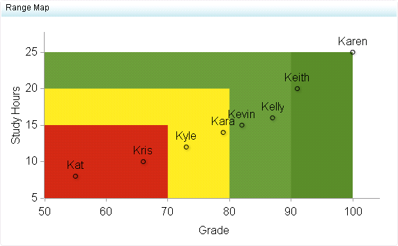
Range maps can be used when comparing data points in terms of position and range. Use range maps when there are many data points in different ranges. For example, range maps can be used when representing the body weight of males across different ranges: underweight, healthy, overweight, and obese. Each data point should fall into one of these ranges on the map.
Target audience
This indicator type is appropriate for all user audiences. Most people find this indicator type familiar and easy to interpret. The addition of zones related to a range help the user quickly compare data points based on meaningful performance intervals.
Data aggregation support
This indicator type does not aggregate the indicator data.
Range support
A range is required.
Alert support
Alerts are supported. For information, see Customizing Alerts.
Link support
This indicator type can be used to define a link or as the destination of a link.For more information about defining an indicator with a hyperlink, see Adding Links to Indicators or Other Content.
Interaction support
  • Data filter support: This indicator type can be used as either a source or target indicator.
  • Interactive highlighting support: This indicator type can be used as either a source or target indicator.
For more information, see Adding Interactions between Indicators.
Filter multiple items support
Filtering multiple items is supported.For more information, see Supporting Multiple Selections in a Filtered Data Interaction.

General Settings

The General Settings section provides controls that support the following tasks:
This indicator requires that you specify two ranges: the X-axis range and the Y-axis range. In the preceding figure, the X-axis range uses a range defined for grades, and the Y-axis range uses a range defined for study hours.
Note: Both ranges must have the same number of intervals defined. Otherwise, the following message is displayed:
The X range and the Y range must have the same number of intervals.

Display Settings

The following display settings are used in the preceding figure. For more information, see “Sample Data Structure” for this indicator.
Display Setting
Selection Used for Figure
Point label
Student
X-axis value
Grade
Y-axis value
Study Hours
Show labels
This setting is selected.
X-axis title
<blank> (defaults to Grade)
Y-axis title
<blank> (defaults to Study Hours)
Scale X axis
This setting is selected.
Scale Y axis
This setting is selected.
You can customize the following display settings for this indicator:
  • (Required) From the Point label list, select the value that you want to use to label the data points.
  • (Required) From the X-axis value list, select the column in your data that you want to use for the X-axis value in the indicator. When you view your indicator data, the columns in the data set are described by the values in the Column Name column. The selections available in the X-axis value list are all of the values in the Column Name column.
  • (Required) From the Y-axis value list, select the column in your data that you want to use for the Y-axis value in the indicator. When you view your indicator data, the columns in the data set are described by the values in the Column Name column. The selections available in the Y-axis value list are all of the values in the Column Name column.
  • Select Show labels if you want the indicator to include the labels for each map portion or pie slice.
  • In the X-axis title field, type the title to use for the X axis in the indicator. If you do not specify a title, the value that you selected from the X-axis value list is used by default. If you do not want a title, type a space in the field. If you select Scale X axis, a measurement label is added to the title.
  • In the Y-axis title field, type the title to use for the Y axis in the indicator. If you do not specify a title, the value that you selected from the Y-axis value list is used by default. If you do not want a title, type a space in the field. If you select Scale Y axis, a measurement label is added to the title.
  • Select Scale X axis if you want to scale that axis. When you make this selection, a measurement label is added to the X-axis title if the data is numeric. For example, if the X-axis title is set to Revenue and you select Scale X axis, the X-axis title is displayed as Revenue (millions).
  • Select Scale Y axis if you want to scale that axis. When you make this selection, a measurement label is added to the Y-axis title if the data is numeric. For example, if the Y-axis title is set to Revenue and you select Scale Y axis, the Y-axis title is displayed as Revenue (millions).
  • Select Hide axes when zoomed out if you want to hide the axes when a user zooms out the view of an indicator. When the user zooms in, the axes reappear. Select this setting to avoid visual clutter when the view is zoomed out.
  • Select Hide axis tick labels if you want to hide the axis tick labels when a user zooms out the view of an indicator. When the user zooms in, the axis tick labels reappear. Select this setting to avoid visual clutter when the view is zoomed out.
  • From the Row group by list, select the value that you want to use to group rows of data. If you do not want to group the rows, select (none).
  • From the Column group by list, select the value that you want to use to group columns of data. If you do not want to group the columns, select (none).
  • From the X-axis format list, select the format that you want to apply to the data on that axis. If you do not want to specify a format, select (none). When set to (none), the indicator uses the format that is used in the data source.
  • From the Y-axis format list, select the format that you want to apply to the data on that axis. If you do not want to specify a format, select (none). When set to (none), the indicator uses the format that is used in the data source.

Sample Data Structure

To create a range map, you must provide a variable (point label) and two measures (X-axis value and Y-axis value).
The following data sample is associated with the figure previously shown. Underneath each column heading is its associated display setting.
Student
(Point label)
Grade
(X-axis value)
Study Hours
(Y-axis value)
Kara
79.00
14.00
Karen
100.00
25.00
Kat
55.00
8.00
Keith
91.00
20.00