Waterfall Chart

Definition

A waterfall chart is a visualization of the sequence of positive and negative values that arrive at a final value. This chart is also called a progressive bar chart.
Example of a Waterfall Chart Indicator
example waterfall chart indicator
For a sample of the indicator data that was used to create this indicator, see “Sample Data Structure” for this indicator.

Usage Information

Data best suited for
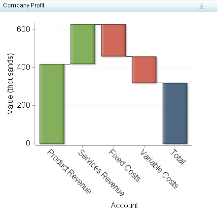
Waterfall charts are most often used when representing account or revenue data. They display how an initial value is increased or decreased by intermediate values. Use waterfall charts when you want to display details about how a value was increased or decreased, as well as the beginning and ending values.
Waterfall charts work well for the following scenarios:
  • illustrating cash flow over time, including beginning and ending balances
  • financial data
Not suited for
Do not use waterfall charts for the following scenarios:
  • when the end results are the only items that are of importance
  • when displaying point-in-time data
Target audience
Most users will be unfamiliar with this indicator type. It is not recommended that you use this indicator type unless you are sure your audience knows how to interpret it, or you provide instructions on how to interpret it.
Data aggregation support
This indicator type averages the applicable indicator data.
Range support
A range is required.
Alert support
Alerts are supported. For information, see Customizing Alerts.
Link support
This indicator type can be used to define a link or as the destination of a link.For more information about defining an indicator with a hyperlink, see Adding Links to Indicators or Other Content.
Interaction support
  • Data filter support: This indicator type can be used as either a source or target indicator.
  • Interactive highlighting support: This indicator type can be used as either a source or target indicator.
For more information, see Adding Interactions between Indicators.
Filter multiple items support
Filtering multiple items is supported.For more information, see Supporting Multiple Selections in a Filtered Data Interaction.

Display Settings

The following display settings are used in the preceding figure. For more information, see “Sample Data Structure” for this indicator.
Display Setting
Selection Used for Figure
Range value
Color
X-axis value
Account
Difference
Value
X-axis title
<blank> (defaults to Account)
Y-axis title
<blank> (defaults to Value)
Note: The Scale Y axis setting adds the label (thousands) to the title.
Scale X axis
This setting is selected.
Scale Y axis
This setting is selected.
You can customize the following display settings for this indicator:
  • (Required) From the Range value list, select the value to which you want to apply the defined range intervals.
  • (Required) From the X-axis value list, select the column in your data that you want to use for the X-axis value in the indicator. When you view your indicator data, the columns in the data set are described by the values in the Column Name column. The selections available in the X-axis value list are all of the values in the Column Name column.
  • (Required) From the Difference list, select the value to use for each bar. This value is an offset of the ending value for the previous bar in a waterfall chart indicator.
  • In the X-axis title field, type the title to use for the X axis in the indicator. If you do not specify a title, the value that you selected from the X-axis value list is used by default. If you do not want a title, type a space in the field. If you select Scale X axis, a measurement label is added to the title.
  • In the Y-axis title field, type the title to use for the Y axis in the indicator. If you do not specify a title, the value that you selected from the Y-axis value list is used by default. If you do not want a title, type a space in the field. If you select Scale Y axis, a measurement label is added to the title.
  • Select Scale X axis if you want to scale that axis. When you make this selection, a measurement label is added to the X-axis title if the data is numeric. For example, if the X-axis title is set to Revenue and you select Scale X axis, the X-axis title is displayed as Revenue (millions).
  • Select Scale Y axis if you want to scale that axis. When you make this selection, a measurement label is added to the Y-axis title if the data is numeric. For example, if the Y-axis title is set to Revenue and you select Scale Y axis, the Y-axis title is displayed as Revenue (millions).
  • Select Hide axes when zoomed out if you want to hide the axes when a user zooms out the view of an indicator. When the user zooms in, the axes reappear. Select this setting to avoid visual clutter when the view is zoomed out.
  • Select Hide axis tick labels if you want to hide the axis tick labels when a user zooms out the view of an indicator. When the user zooms in, the axis tick labels reappear. Select this setting to avoid visual clutter when the view is zoomed out.
  • From the Row group by list, select the value that you want to use to group rows of data. If you do not want to group the rows, select (none).
  • From the Column group by list, select the value that you want to use to group columns of data. If you do not want to group the columns, select (none).
  • From the Difference axis format list, select the format to apply to the data on the Difference axis.
  • From the X-axis format list, select the format that you want to apply to the data on that axis. If you do not want to specify a format, select (none). When set to (none), the indicator uses the format that is used in the data source.
  • From the Y-axis format list, select the format that you want to apply to the data on that axis. If you do not want to specify a format, select (none). When set to (none), the indicator uses the format that is used in the data source.

Sample Data Structure

To create a waterfall chart, you must provide a minimum of three data columns: range value, X-axis value, and difference.
Note: The Order column is included for managing the order of the X-axis values. Order column is the selection in the Sort by field for this example indicator. For more information, see Specify the Sort Order.
The following data sample is associated with the figure previously shown. Underneath each column heading is its associated display setting.
Account
(X-axis value)
Value
(Difference)
Color
(Range value)
Order
Product Revenue
420,000
1
1
Services Revenue
210,000
1
2
Fixed Costs
–170,000
–1
3
Variable Costs
–140,000
–1
4
Total
–320,000
0
5
Note: The indicator source data includes a Total column as an observation. However, that observation is not used in the waterfall chart. The total is excluded in order to force the data to start from the X axis. The waterfall chart cannot provide the total automatically, so you must use this workaround.