Clustered Bar Chart

Definition

A clustered bar chart consists of a grid and some vertical or horizontal columns (bars) that are arranged in groups, or clusters. Each bar represents quantitative data. The bars of each data series are always in the same position in each cluster throughout the chart. Different colors, shares, or patterns typically distinguish each data series.
Example of a Clustered Bar Chart Indicator
example clustered bar chart indicator
For a sample of the indicator data that was used to create this indicator, see “Sample Data Structure” for this indicator.

Usage Information

Data best suited for
Use a clustered bar chart when you want to compare the value of a specific subdimension across multiple dimensions. A bar chart enables you to compare values across a related dimension (time or some other variable). Clustering adds the ability to break down a higher-level trend into more detail across a subdimension (time or some other variable) to provide more relevant information. The subdimensions represent discrete portions of the total, and the value of one subdimension is not related to the value of another subdimension.
Target audience
This indicator type is appropriate for all user audiences. Most people find this indicator type familiar and easy to interpret.
Data aggregation support
This indicator type sums the applicable indicator data.
Range support
Ranges are not supported.
Alert support
Alerts are not supported.
Link support
This indicator type can be used to define a link or as the destination of a link.For more information about defining an indicator with a hyperlink, see Adding Links to Indicators or Other Content.
Interaction support
  • Data filter support: This indicator type can be used as either a source or target indicator.
  • Interactive highlighting support: This indicator type can be used as either a source or target indicator.
For more information, see Adding Interactions between Indicators.
Filter multiple items support
Filtering multiple items is supported.For more information, see Supporting Multiple Selections in a Filtered Data Interaction.

General Settings

Display Settings

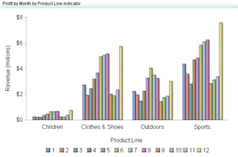
The following display settings are used in the preceding figure. For more information, see “Sample Data Structure” for this indicator.
Display Setting
Selection Used for Figure
X-axis value
Product Line
Cluster group
Month
Y-axis value
Sales
X-axis title
<blank> (defaults to Product Line)
Y-axis title
Set to Revenue
Note: The Scale Y axis setting adds the label (millions) to the title.
Scale Y axis
This setting is selected.
You can customize the following display settings for this indicator:
  • (Required) From the X-axis value list, select the column in your data that you want to use for the X-axis value in the indicator. When you view your indicator data, the columns in the data set are described by the values in the Column Name column. The selections available in the X-axis value list are all of the values in the Column Name column.
  • (Required) From the Cluster group list, select the value that you want to use to define the cluster in the indicator.
  • (Required) From the Y-axis value list, select the column in your data that you want to use for the Y-axis value in the indicator. When you view your indicator data, the columns in the data set are described by the values in the Column Name column. The selections available in the Y-axis value list are all of the values in the Column Name column.
  • In the X-axis title field, type the title to use for the X axis in the indicator. If you do not specify a title, the value that you selected from the X-axis value list is used by default. If you do not want a title, type a space in the field. If you select Scale X axis, a measurement label is added to the title.
  • In the Y-axis title field, type the title to use for the Y axis in the indicator. If you do not specify a title, the value that you selected from the Y-axis value list is used by default. If you do not want a title, type a space in the field. If you select Scale Y axis, a measurement label is added to the title.
  • Select Scale X axis if you want to scale that axis. When you make this selection, a measurement label is added to the X-axis title if the data is numeric. For example, if the X-axis title is set to Revenue and you select Scale X axis, the X-axis title is displayed as Revenue (millions).
  • Select Scale Y axis if you want to scale that axis. When you make this selection, a measurement label is added to the Y-axis title if the data is numeric. For example, if the Y-axis title is set to Revenue and you select Scale Y axis, the Y-axis title is displayed as Revenue (millions).
  • From the X-axis format list, select the format that you want to apply to the data on that axis. If you do not want to specify a format, select (none). When set to (none), the indicator uses the format that is used in the data source.
  • From the Y-axis format list, select the format that you want to apply to the data on that axis. If you do not want to specify a format, select (none). When set to (none), the indicator uses the format that is used in the data source.
  • From the X-axis labels list, select the style to apply to the data labels that are used on the X axis. Depending on your labels, one style might be easier to read than others.

Sample Data Structure

To create a clustered bar chart, you must provide two variables (one for the bar and one for the cluster) and one measure.
The following data sample is associated with the figure previously shown. Underneath each column heading is its associated display setting.
Product Line
(X-axis value)
Month
(Cluster group)
Sales
(Y-axis value)
Children
1
$256,803
Clothes & Shoes
1
$2,762,409
Outdoors
1
$2,253,080
Sports
1
$4,393,168
Children
2
$237,388
Clothes & Shoes
2
$1,953,145
Outdoors
2
$1,977,344
Sports
2
$3,607,938