| Full Factorial Designs |
Exploring the Response Data
You can use the graphical tools listed in Table 3.2 in the Explore Data window to understand your data before fitting a model.
Table 3.2: Plots in the Explore Data Window and Their UsesMain-Effects Plot
To view a main-effects plot, click Explore.
|
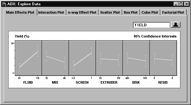
From this plot, it is clear that both FLUID and SCREEN individually have an impact on YIELD. The other factors seem to have less of an impact, and it is not clear whether their main effects will be flagged as significant in a formal test.
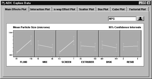
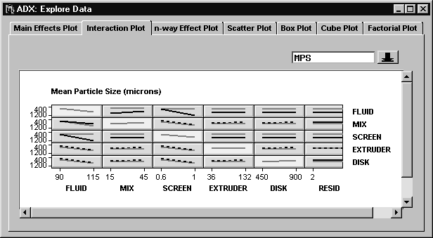
You can view the main-effects plot for MPS by clicking the down arrow beside YIELD and selecting MPS.
|
Before moving on to the interaction plot, select View ![]() Include in report to save the main-effects plot for later reporting. You might want to increase the window size to make room for the whole plot.
Include in report to save the main-effects plot for later reporting. You might want to increase the window size to make room for the whole plot.
Interaction Plot
Since a full factorial design provides information for all possible two-factor interactions, you should examine interaction plots.
Click the Interaction Plot tab.
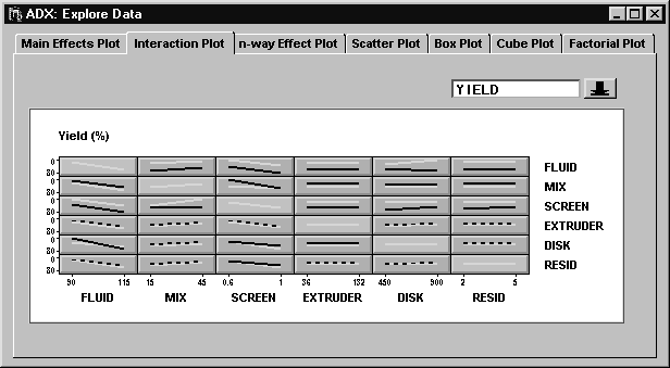
The off-diagonal cells in the matrix are interaction plots, which show how the effect of one factor on the response changes based on the level of another factor. The diagonal cells are main-effects plots.
|
Table 3.3 explains how to interpret an interaction plot.
Table 3.3: Interpreting an Interaction Plot| Pattern | Interpretation |
| Parallel lines | No interaction effect |
| Intersecting lines | Interaction effect |
| Single striped line | Effects of factor pair coincide |
| Nonparallel nonintersecting lines | Possible interaction effect |
The matrix of interaction plots shows several potentially significant interaction effects on YIELD, including FLUID*DISK, MIX*SCREEN, MIX*RESID, SCREEN*DISK, SCREEN*RESID, and EXTRUDER*DISK.
Individual plots in the matrix might be too small to see when there are a large number of factors. To increase the size of a cell, do one of the following:
- Right-click and select Zoom . The arrow changes to a magnifying glass. Click on the cell that you want to examine. This cell now takes up the whole screen. Right-click and clear Zoom to restore the matrix.
- Click and drag the lower-right corner of any cell to simultaneously resize all the cells. If you resize the window containing the interaction plot, the cells are resized automatically so that the plot continues to fill the window.
|
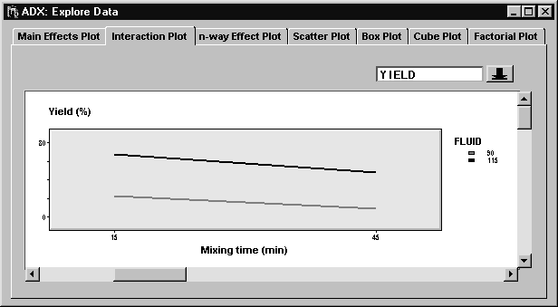
When the lines are not parallel but do not cross in the range of observed values, then it helps to look at confidence intervals . Right-click and select Confidence intervals to display 95% confidence intervals as error bars at the endpoints of the lines.
Click the down arrow and select MPS to view the interaction plot for the MPS response.
|
After exploring the interaction plot in detail, you should identify the following interaction effects as potentially significant as shown in Table 3.4.
Table 3.4: Potentially Significant Interactions| Response | Two-Factor Interactions |
| YIELD | FLUID*DISK, MIX*SCREEN, MIX*RESID, SCREEN*DISK, SCREEN*RESID, and FLUID*RESID |
| MPS | RESID*FLUID, RESID*MIX, RESID*SCREEN, RESID*DISK, FLUID*MIX |
Of course, you should use a formal test, such as an analysis of variance, before drawing any firm conclusions. This is done in the section "Fitting a Model".
The right mouse button offers other options. For example, you can label the plot lines directly by toggling off Effects legend . You can change fonts, colors, and line styles by selecting Properties.
Select View ![]() Include in report to save the interaction plot in a report, which will be generated at the end of your session.
Include in report to save the interaction plot in a report, which will be generated at the end of your session.
n-way Effect Plot
You can use the ![]() -way effect plot to examine possible three- and four-way interactions. Since higher-order interactions are more subtle than two-way interactions, these plots are more complex.
-way effect plot to examine possible three- and four-way interactions. Since higher-order interactions are more subtle than two-way interactions, these plots are more complex.
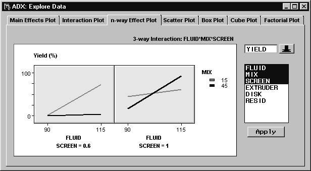
Click the n-way Effect Plot tab. ADX starts by presenting the two-way interaction plot for FLUID and MIX (this might change if you have used this window with this design before). In this case, 20 different three-way interaction plots can be generated, since there are 20 ways to select three factors from six factors.
To explore the three-way interactions, do the following:
- Select SCREEN from the Select Effects list to highlight it. Click Apply to generate a three-way interaction plot for FLUID, MIX, and SCREEN.
- The difference between the slopes of the two lines in each plot changes considerably between the two plots. This suggests the presence of a FLUID*MIX*SCREEN effect. A formal test of this effect is recommended; see the section "Fitting a Model". In fact, a formal test will confirm the significance of this effect.
- Select View
 Include in report to save this graphic for later reporting. Keep the name in the resulting dialog box, and click OK.
- Select SCREEN to clear it, and then select RESID to highlight that effect. Click Apply to generate a three-way interaction plot for FLUID, MIX, and RESID.
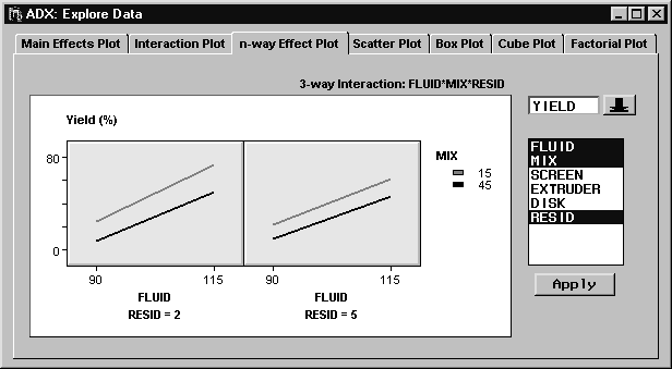
- The two resulting plots look similar. This suggests that there is no three-way interaction between FLUID, MIX, and RESID.
- Follow a similar process to examine some of the other possible 18 three-way interactions.
Note: In a three-way interaction plot, you look for a difference in the relationship between the slopes of the two lines between plots.
Alternatively, you can create an ![]() -way effect plot from the Interaction Plot tab by moving the mouse pointer over the cell with the first two effects, right-clicking, and selecting 3FI plot->
. You can repeat this sequence from the resulting three-way interaction plot to generate a four-way interaction plot, or you can select four effects in the
-way effect plot from the Interaction Plot tab by moving the mouse pointer over the cell with the first two effects, right-clicking, and selecting 3FI plot->
. You can repeat this sequence from the resulting three-way interaction plot to generate a four-way interaction plot, or you can select four effects in the ![]() -way plot.
-way plot.
Scatter Plot
You can use scatter plots to look for run-order effects, also called serial, time-dependent, or learning effects. The scatter plot in ADX is interactive and is flexible enough to display any variable on the X or Y axis or as BY variables.Scatter plots are discussed in detail in the section "Scatter Plot".
Box Plot
You can use box plots to display the response distribution at different combinations of factor levels. Box plots can reveal differences in the response mean at different levels, suggesting main effects. Box plots can also reveal whether the response variation is homogeneous across factor levels, an assumption made in analysis of variance.
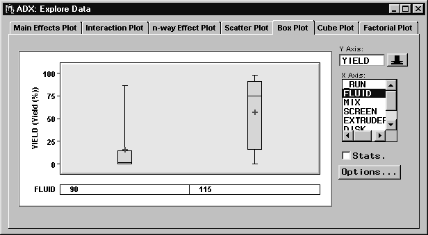
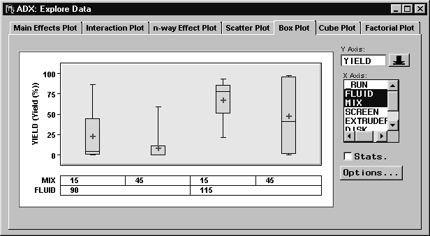
In the Explore Data window, click the Box Plot tab. A box plot with default settings will appear. A symbol, by default a plus sign (+), is drawn at the mean response for each factor level. The bottom and top of the box represent the first and third quartiles of the response, and a line is drawn at the median response. The whiskers represent the low and high values of the response.
|
The Y axis variable is YIELD, and the X axis variable is FLUID. To look at information about the response within a level of FLUID, double-click the box. The arrow changes to a magnifying glass, indicating the presence of detailed information.
Select Stats. to display some of these statistics under each box in the box plot. By default, ADX displays the number of responses, the mean, and the standard deviation. You can choose which statistics to display by clicking Options in the Box Plot window.
You can display more than one stratification variable at a time by selecting multiple variable names in the X Axis box. You do not have to hold down the CTRL key and click to select multiple stratification variables. Clicking on a variable already highlighted will deselect it.
|
Once you have selected the stratification variables, you can rearrange them by vertically dragging their names at the left of their level label boxes. Note that the arrow changes to a hand when you can drag variables.
Further options are available from the Box Plot window, which you can open by clicking the Options button. Options for changing fonts and colors are available when you right-click and select Properties.
Cube Plot
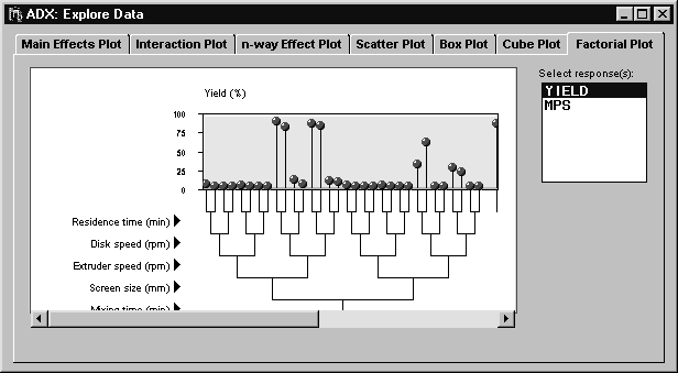
The cube plot shows the average response at the high and low levels of three factors at a time, arranged on a cube. Further information can be found in the section "Cube Plot".Factorial Plot
The factorial plot displays the mean response for the combination of factor levels displayed. The display changes if you change the order of the factors of the tree. Refer to Beckman (1996) for an in-depth discussion of factorial plots.
Click the Factorial Plot tab to display the factorial plot.
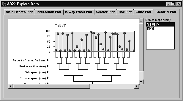
|
Interacting with the factorial plot helps you visualize which factors cause the largest change in response going from low to high. (You might want to maximize your window to view more of the plot.)
Place the mouse pointer over FLUID; it will change to a vertical double arrow. Click and drag to move FLUID so that it is the lowest branch, and observe the change in the factorial plot. Since moving FLUID to the bottom seems to separate most of the high responses from the low responses, it appears that FLUID is a significant main effect.
|
You can hide the factor level labels by clicking on the arrow to the right of the factor name. This helps you view more of the plot.
Copyright © 2008 by SAS Institute Inc., Cary, NC, USA. All rights reserved.