| Statistical Graphics Using ODS |
| The SGPLOT Procedure |
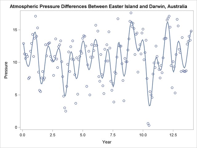
PROC SGPLOT provides a simple way to make a variety of scatter plots. This example is taken from Example 50.4 of Chapter 50, The LOESS Procedure. The following statements create a SAS data set that contains information about differences in ocean pressure over time:
data ENSO;
   input Pressure @@;
   Year = _n_ / 12;
   datalines;
12.9  11.3  10.6  11.2  10.9   7.5   7.7  11.7

   ... more lines ...

;
The following statements create a scatter plot of points along with a penalized B-spline fit to the data and produce Figure 21.36:
proc sgplot data=enso noautolegend;
   title 'Atmospheric Pressure Differences Between '
         'Easter Island and Darwin, Australia';
   pbspline y=pressure x=year;
run;
Figure 21.36
Penalized B-Spline Fit with PROC SGPLOT
See Chapter 91, The TRANSREG Procedure, for more information about penalized B-splines. Also see the section Grouped Scatter Plot with PROC SGPLOT and Figure 21.12 for an example of a scatter plot with groups of observations.
Copyright © SAS Institute, Inc. All Rights Reserved.