The RAREEVENTS Procedure(Experimental)

Rare Events Charts and c Charts
The traditional control chart that is most comparable to a rare events chart is the c chart, which is used to monitor counts of unwanted process outcomes. (See the section CCHART Statement: SHEWHART Procedure for a detailed description of c charts and how to produce them by using the SHEWHART procedure.) However, as explained by Kaminsky et al. (1992), Benneyan (2001a), and others, c charts and other traditional control charts do not always perform well when used to monitor rare events.
Figure 16.1 shows a c chart of needle sticks per week in a hospital. Weeks are identified on the horizontal axis, and the weekly counts of needle sticks are plotted. The control limits are used to detect unusual variation in the number of needle sticks.
Figure 16.1: c Chart for Needle Sticks per Week
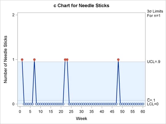
In this case needle sticks are truly rare. Almost all the weekly counts are 0, no week has more than 1, and the mean count is very low. Because the upper control limit (UCL) is less than 1, each individual needle stick signals unusual variation. This c chart might be too sensitive to provide useful information.
To address this problem, you could increase the counts (and therefore the UCL) by increasing the length of the time periods
over which you accumulate the counts. In this case, grouping the needle stick counts into 15 four-week periods produces a
c chart with  and a maximum count of 2, and no unusual variation is signaled. A drawback of this approach is that data are available for
analysis only every four weeks, so a change in the process might not be detected quickly. Another possibility would be to
modify the way that the control limits are computed by basing them on a discrete distribution other than the Poisson distribution.
A better alternative is to use a rare events chart.
and a maximum count of 2, and no unusual variation is signaled. A drawback of this approach is that data are available for
analysis only every four weeks, so a change in the process might not be detected quickly. Another possibility would be to
modify the way that the control limits are computed by basing them on a discrete distribution other than the Poisson distribution.
A better alternative is to use a rare events chart.
Figure 16.2 shows a rare events chart that is used to plot the same needle stick data, which are transformed into weeks between sticks. Individual needle sticks are identified in order of occurrence on the horizontal axis. For each event, the time in weeks since the previous event is plotted.
Figure 16.2: Rare Events Chart for Weeks between Needle Sticks
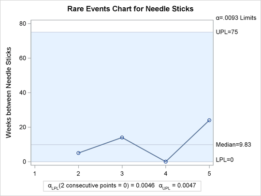
The rare events chart does not signal any unusual variation. There would be a signal if two consecutive data values were zero, indicating needle sticks in three consecutive weeks. For more information, see the section Probability Limits Based on a Geometric Distribution.
When you use a rare events chart, you do not need to wait until the end of a reporting period or collect a large sample of data before plotting a point on the chart. Instead, you can add a point to the chart immediately when an event occurs. Therefore you can construct a useful chart in a more timely manner, which improves your chances of detecting process changes. Because the values that are plotted in a rare events chart are times between events, the simple occurrence of a single event will not signal unusual variation. In summary, a rare events chart is better suited than traditional control charts to detecting changes in the frequency of low-probability events.