The UNIVARIATE Procedure
- Overview
-
Getting Started

-
Syntax
-
DetailsMissing ValuesRoundingDescriptive StatisticsCalculating the ModeCalculating PercentilesTests for LocationConfidence Limits for Parameters of the Normal DistributionRobust EstimatorsCreating Line Printer PlotsCreating High-Resolution GraphicsUsing the CLASS Statement to Create Comparative PlotsPositioning InsetsFormulas for Fitted Continuous DistributionsGoodness-of-Fit TestsKernel Density EstimatesConstruction of Quantile-Quantile and Probability PlotsInterpretation of Quantile-Quantile and Probability PlotsDistributions for Probability and Q-Q PlotsEstimating Shape Parameters Using Q-Q PlotsEstimating Location and Scale Parameters Using Q-Q PlotsEstimating Percentiles Using Q-Q PlotsInput Data SetsOUT= Output Data Set in the OUTPUT StatementOUTHISTOGRAM= Output Data SetOUTKERNEL= Output Data SetOUTTABLE= Output Data SetTables for Summary StatisticsODS Table NamesODS Tables for Fitted DistributionsODS GraphicsComputational Resources
-
ExamplesComputing Descriptive Statistics for Multiple VariablesCalculating ModesIdentifying Extreme Observations and Extreme ValuesCreating a Frequency TableCreating Plots for Line Printer OutputAnalyzing a Data Set With a FREQ VariableSaving Summary Statistics in an OUT= Output Data SetSaving Percentiles in an Output Data SetComputing Confidence Limits for the Mean, Standard Deviation, and VarianceComputing Confidence Limits for Quantiles and PercentilesComputing Robust EstimatesTesting for LocationPerforming a Sign Test Using Paired DataCreating a HistogramCreating a One-Way Comparative HistogramCreating a Two-Way Comparative HistogramAdding Insets with Descriptive StatisticsBinning a HistogramAdding a Normal Curve to a HistogramAdding Fitted Normal Curves to a Comparative HistogramFitting a Beta CurveFitting Lognormal, Weibull, and Gamma CurvesComputing Kernel Density EstimatesFitting a Three-Parameter Lognormal CurveAnnotating a Folded Normal CurveCreating Lognormal Probability PlotsCreating a Histogram to Display Lognormal FitCreating a Normal Quantile PlotAdding a Distribution Reference LineInterpreting a Normal Quantile PlotEstimating Three Parameters from Lognormal Quantile PlotsEstimating Percentiles from Lognormal Quantile PlotsEstimating Parameters from Lognormal Quantile PlotsComparing Weibull Quantile PlotsCreating a Cumulative Distribution PlotCreating a P-P Plot
- References
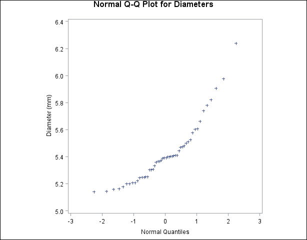
Example 4.30 Interpreting a Normal Quantile Plot
This example illustrates how to interpret a normal quantile plot when the data are from a non-normal distribution. The following
statements create the data set Measures, which contains the measurements of the diameters of 50 steel rods in the variable Diameter:
data Measures;
   input Diameter @@;
   label Diameter = 'Diameter (mm)';
   datalines;
5.501  5.251  5.404  5.366  5.445  5.576  5.607
5.200  5.977  5.177  5.332  5.399  5.661  5.512
5.252  5.404  5.739  5.525  5.160  5.410  5.823
5.376  5.202  5.470  5.410  5.394  5.146  5.244
5.309  5.480  5.388  5.399  5.360  5.368  5.394
5.248  5.409  5.304  6.239  5.781  5.247  5.907
5.208  5.143  5.304  5.603  5.164  5.209  5.475
5.223
;
The following statements request the normal Q-Q plot in Output 4.30.1:
symbol v=plus;
title 'Normal Q-Q Plot for Diameters';
ods graphics off;
proc univariate data=Measures noprint;
   qqplot Diameter / normal
                     square
                     vaxis=axis1;
   axis1 label=(a=90 r=0);
run;
The nonlinearity of the points in Output 4.30.1 indicates a departure from normality. Because the point pattern is curved with slope increasing from left to right, a theoretical
distribution that is skewed to the right, such as a lognormal distribution, should provide a better fit than the normal distribution.
The mild curvature suggests that you should examine the data with a series of lognormal Q-Q plots for small values of the
shape parameter ![]() , as illustrated in Example 4.31. For details on interpreting a Q-Q plot, see the section Interpretation of Quantile-Quantile and Probability Plots.
, as illustrated in Example 4.31. For details on interpreting a Q-Q plot, see the section Interpretation of Quantile-Quantile and Probability Plots.
Output 4.30.1: Normal Quantile-Quantile Plot of Nonnormal Data
A sample program for this example, uniex18.sas, is available in the SAS Sample Library for Base SAS software.