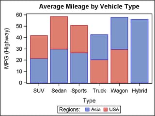
Example Program and Statement Details
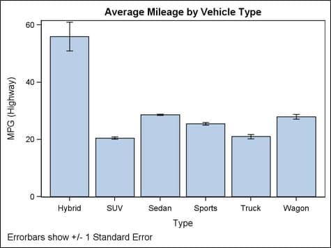
Example Program
proc template;
  define statgraph barchartparm;
    begingraph;
      entrytitle "Average Mileage by Vehicle Type";
      entryfootnote halign=left
        "Error bars show +/- 1 Standard Error";
      layout overlay;
        barchartparm x=type y=mean /
          errorlower=eval(mean-stderr)
          errorupper=eval(mean+stderr) ;
      endlayout;
    endgraph;
  end;
run;

/* create summarized data for barchartparm */
proc summary data=sashelp.cars nway;
  class type;
  var mpg_highway;
  output out=mileage mean=mean stderr=stderr ;
run;

proc sgrender data=mileage template=barchartparm;
run;
Statement Summary
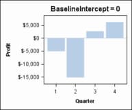
Options
specifies the response
axis intercept for the baseline.
Interaction: If
GROUPDISPLAY=STACKED is specified, this option is ignored and the
baseline is not displayed.
Tip: The
baseline does not add a tick or a tick value to the axis. To label
the baseline, you can use a REFERENCELINE statement to overlay a line
with the same X or Y value and use the REFERENCELINE statement’s
CURVELABEL= option.
specifies the width
of the group clusters as a fraction of the midpoint spacing on a discrete
axis or a fraction of the minimum interval between adjacent data values
on an interval axis.
Interaction: For
this option to take effect, the GROUP= option must also be specified, and the GROUPDISPLAY= option must be set to CLUSTER.
specifies the appearance
of the bar connect lines. See General Syntax for Attribute Options for the syntax
on using a style-element and Line Options for available line-options.
specifies the label
to appear at the end of each bar.
Interaction:
If the GROUP= option is used and there are multiple input observations
per bar for the GROUP= column, the value for the DATALABEL= column
should be the same for each observation that is on the same bar.
specifies the color
and font attributes of the labels that are specified in the DATALABEL=
option. See General Syntax for Attribute Options for the syntax
on using a style-element and Text Options for available text-options.
enhances the visual
appearance of the filled bars.
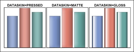
Requirement: For
this option to have any effect, the fill must be enabled by the ODS
style or the DISPLAY= option.
Interaction: When
a data skin is applied, all bar outlines are set by the skin, and
the OUTLINEATTRS= option is ignored.
specifies the degree
of the transparency of the bar fill, bar outline, error bars, and
connect line, if displayed.
Tip: The FILLATTRS= option can be used to set transparency
for just the bar fills. You can combine this option with FILLATTRS=
to set one transparency for the bar outlines, error bars, and connect
lines but a different transparency for the bar fills. Example:
datatransparency=0.2 fillattrs=(transparency=0.6)
specifies an amount
to offset all bars from the category midpoints.
Range: -0.5
to +0.5, where .5 represents half the distance between category
ticks. Normally, a positive offset is to the right when ORIENT=VERTICAL,
and up when ORIENT=HORIZONTAL. (If the layout's axis options set REVERSE=TRUE,
then the offset direction is also reversed.)
Details: This
feature is useful for graphing multiple response variables side by
side on a common axis. By default within an overlay-type layout, if
multiple BARCHART statements are used with different response variables,
the bars for matching category values are centered on the midpoints
and the bars are superimposed. To make it easier to distinguish among
superimposed bars, you can assign a different BARWIDTH= setting to
each BARCHARTPARM statement in the overlay:
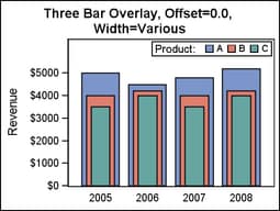
layout overlay / cycleattrs=true
    xaxisopts=(display=(tickvalues))
    yaxisopts=(label="Revenue" offsetmax=0.2);

  barchartparm x=year y=A_revenue / name="A"
    legendlabel="A" barwidth=0.8 ;
  barchartparm x=year y=B_revenue / name="B"
    legendlabel="B" barwidth=0.6 ;
  barchartparm x=year y=C_revenue / name="C"
    legendlabel="C" barwidth=0.4 ;

  discretelegend "A" "B" "C" / title="Product:"
    location=inside halign=right valign=top;
endlayout;
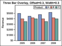
To place the different
response values side by side, you can assign a different offset to
each BARCHARTPARM statement. If desired, the BARWIDTH= option can
be used in conjunction with DISCRETEOFFSET= to create narrower bars
that require less width within the plot area:
layout overlay / cycleattrs=true
    xaxisopts=(display=(tickvalues))
    yaxisopts=(label="Revenue" offsetmax=0.2);

  barchartparm x=year y=A_revenue / name="A"
    legendlabel="A"
    discreteoffset=-0.3 barwidth=0.3 ;
  barchartparm x=year y=B_revenue / name="B"
    legendlabel="B"
    discreteoffset=0    barwidth=0.3 ;
  barchartparm x=year y=C_revenue / name="C"
    legendlabel="C"
    discreteoffset=+0.3 barwidth=0.3 ;

  discretelegend "A" "B" "C" / title="Product:"
    location=inside halign=right valign=top;
endlayout;
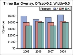
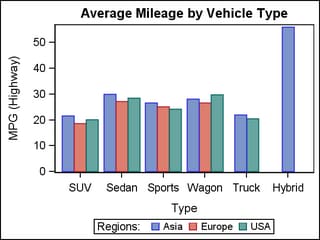
Different combinations
of DISCRETEOFFSET and BARWIDTH can be used to get the effect that
you want. Gaps can be created between bars by providing a narrower
bar width. Or, bars can be overlapped if the bar widths are increased
in proportion to the discrete offset.
layout overlay / cycleattrs=true
    xaxisopts=(display=(tickvalues))
    yaxisopts=(label="Revenue" offsetmax=0.2);

  barchartparm x=year y=A_revenue / name="A"
    legendlabel="A" datatransparency=0.2
    discreteoffset=-0.2 barwidth=0.5 ;
  barchartparm x=year y=B_revenue / name="B"
    legendlabel="B" datatransparency=0.2
    discreteoffset=0   barwidth=0.5 ;
  barchartparm x=year y=C_revenue / name="C"
    legendlabel="C" datatransparency=0.2
    discreteoffset=+0.2 barwidth=0.5 ;

  discretelegend "A" "B" "C" / title="Product:"
    location=inside halign=right valign=top;
endlayout;
specifies which bar
features to display.
a list of options,
enclosed in parentheses, that must include one of the following:
| OUTLINE | Displays outlined bars. |
| FILL | Displays bars with a solid fill. |
| CONNECT | Displays line segments connecting adjacent midpoints at the end of each bar. |
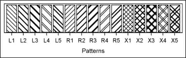
| FILLPATTERN | Displays bars with a patterned fill. This setting is used primarily for grouped bar charts that must be rendered in monochrome for use in a journal article. The fill patterns make it easier to distinguish among groups when color is not available. |
Error bars are automatically
displayed whenever the ERRORUPPER= or ERRORLOWER= options are specified.
Use the OUTLINEATTRS=, FILLATTRS=, and FILLPATTERNATTRS= options to control the appearance
of the bars. Use CONNECTATTRS= to control the appearance of the
connect lines.
specifies the attributes
of the error bars associated with the bars. See General Syntax for Attribute Options for the syntax
on using a style-element and Line Options for available line-options.
specifies the values
of the lower endpoints on the Y error bars.
The error bar values
must be absolute data values, not data values relative to the value
of the bar.
The appearance of
the error bars is controlled by the ERRORBARATTRS= option.
specifies the values
of the upper endpoints on the Y error bars.
The error bar values
must be absolute data values, not data values relative to the value
of the bar.
The appearance of
the error bars is controlled by the ERRORBARATTRS= option.
specifies the appearance
of the filled bar area. See General Syntax for Attribute Options for the syntax
on using a style-element and Fill Options for available fill-options.
Tip: The DATATRANSPARENCY= option sets the transparency for
bar fills, bar outlines, error bars, and connect lines. You can combine
this option with DATATRANSPARENCY= to set one transparency for the
bar outlines, error bars, and connect lines but a different transparency
for the bar fills. Example:
datatransparency=0.2 fillattrs=(transparency=0.6)
specifies the appearance
of the pattern-filled bar area.
To specify a style-element,
only one of the elements GraphData1–GraphDataN can be used,
subject to the Restriction listed in a moment.
specifies a color to
use for the bar-fill-pattern lines. With grouped data, this setting
has the effect of holding the pattern line color constant across all
group values.
Restriction: The
only SAS-delivered styles that support fill patterns are JOURNAL2,
JOURNAL3, and MONOCHROMEPRINTER. If any other SAS-delivered style
is in effect and this option uses a style-element in
its specification, this option is ignored.
Interaction: For
this option to take effect, the DISPLAY= option must include FILLPATTERN among the display options.
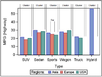
creates a separate
bar segment or bar for each unique group value of the specified column.
specifies
a discrete attribute variable that is defined in a DISCRETEATTRVAR statement.
-
If bar fills are enabled by the ODS style or the DISPLAY= option, each distinct group value is represented in the graph by a different fill color or fill pattern. The fill colors are defined by the GraphData1:Color–GraphDataN:Color style references. The fill patterns are defined by the GraphData1:FillPattern–GraphDataN:FillPattern style references.
-
If bar outlines are enabled by the ODS style or the DISPLAY= option, each distinct group value is represented in the graph by a different outline. The outline colors are defined by the GraphData1:ContrastColor–GraphDataN:ContrastColor style references.
Interaction: The
bar display depends on the setting for the GROUPDISPLAY= option. For example, for a vertical
bar chart with GROUPDISPLAY=STACK, the bar segments are stacked to
form the bar. The height of each segment represents the corresponding
group value’s proportional contribution to the response value.
Interaction: By
default, the group values are mapped in the order of the data. The GROUPORDER= option can be used to control the
sorting order of the group values. The INDEX= option can be used to alter the default sequence of colors,
fill patterns, and line patterns.
Interaction: The
INCLUDEMISSINGGROUP option controls whether missing group values are
considered a distinct group value.
Tip:
The representations that are used to identify the groups can be overridden
individually. For example, each distinct group value is represented
by a different line pattern for the bar outlines, but the PATTERN=
setting in the OUTLINEATTRS= option could be used to assign the
same line pattern to all bar outlines and connect lines.
specifies whether missing
values of the group variable are included in the plot.
Tip: Unless
a discrete attribute map is in effect or the INDEX= option is used,
the attributes of the missing group value are determined by the GraphMissing
style element except when the MISSING= system option is used to specify
a non-default missing character or when a user-defined format is applied
to the missing group value. In those cases, the attributes of the
missing group value are determined by a GraphData1–GraphDataN
style element.
specifies indices for
mapping line attributes (color and pattern) to one of the GraphData1–GranphDataN
style elements.
Restriction: If
the value of the numeric-column is
missing or is less than 1, the observation is not used in the analysis.
If the value is not an integer, only the integer portion is used.
Interaction: All
of the indexes for a specific group value must be the same. Otherwise,
the results are unpredictable.
Interaction: The
index values are 1-based indices. For the style definitions in GraphData1–GraphDataN,
if the index value is greater than N, then a modulo operation remaps
that index value to a number less than N to determine which style
to use.
Discussion: Indexing
can be used to collapse the number of groups that are represented
in a graph. For more information, see Remapping Groups for Grouped Data.
specifies the orientation
of the Y axis and the bars.
Tip:
When this option is set to VERTICAL, the category variable appears
on the X (or X2) axis and the response variable appears on the Y (or
Y2) axis. To set the axis properties for this chart, you should use
the appropriate axis options of the layout container.
specifies the appearance
of the bar outlines. See General Syntax for Attribute Options for the syntax
on using a style-element and Line Options for available line-options.
Interaction: For
this option to have any effect, outlines must be enabled by the ODS
style or the DISPLAY= option.
specifies that the
data columns for this chart be used for determining default axis features.
Details: This
option is needed only when two or more plots within an overlay-type
layout contribute to a common axis. For more information, see When Plots Share Data and a Common Axis.
specifies user-defined
roles that can be used to display information in the tooltips.
Requirement: The
role names that you choose must be unique and different from the pre-defined
roles X, Y, ERRORLOWER, ERRORUPPER, GROUP, and INDEX.
This option provides
a way to add to the data columns that appear in tooltips specified
by the TIP= option.
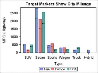
specifies the target
value for each bar. The visual representation is a triangle with a
line at the target value.
layout overlay;
  barchartparmm x=type y=mpg_highway / barwidth=.8
    target=mpg_city group=origin groupdisplay=cluster
    name='bar';
  discretelegend 'bar';
endlayout;
specifies the information
to display when the cursor is positioned over a bar. If this option
is used, it replaces all the information displayed by default. Roles
for columns that do not contribute to the bar chart can be specified
along with roles that do.
Default: The
columns assigned to these roles are automatically included in the
tooltip information: X, Y, ERRORLOWER, ERRORUPPER, and GROUP.
an ordered, blank-separated
list of unique BARCHARTPARM and user-defined roles. BARCHARTPARM roles
include X, Y, ERRORUPPER, ERRORLOWER, INDEX, and GROUP.
Requirement: To
generate tooltips, you must include an ODS GRAPHICS ON statement that
has the IMAGEMAP option specified, and write the graphs to the ODS
HTML destination.
Interaction: The
labels and formats for the TIP variables can be controlled with the TIPLABEL= and TIPFORMAT= options.
specifies an HTML page
to display when the bar is selected.
Requirement: To
generate selectable bars, you must include an ODS GRAPHICS ON statement
that has the IMAGEMAP option specified, and write the graphs to the
ODS HTML destination.
For non-grouped data,
the values of the column are expected to be same for each unique X
value. If they are not, only the first URL value for a given X value
is used. The URL value can be blank for some X values, meaning that
no action is taken when the bars for those X values are selected.
The URL value can be the same for different X values, meaning that
the same action is taken when the bars for those X values are selected.
specifies whether data
are mapped to the primary X (bottom) axis or to the secondary X2 (top)
axis.
Interaction: The
overall plot specification and the layout type determine the axis
display. For more information, see How Axis Features Are Determined.
specifies whether data
are mapped to the primary Y (left) axis or to the secondary Y2 (right)
axis.
Interaction: The
overall plot specification and the layout type determine the axis
display. For more information, see How Axis Features Are Determined.