Example: Create a Heterogeneous Panel

About This Example

In this example, you create a paneled graph with two cells. Each cell contains different types of plots. You also do the following:
  • add and customize the contents of a cell legend
  • change the style element of the kernel plot
  • resize the two cells
  • customize the title and footnote
  • change the graph's style
Here is the graph that you create in this example:
Heterogeneous Panel
Heterogeneous Panel
There are several ways to create and customize this graph. The following steps show one way to create the graph.

Step One: Create the First Cell and Assign Data

To create the first cell and assign data:
  1. Open the Graph Gallery if it is not already open. For instructions, see Open and Use the Graph Gallery.
  2. On the Basic tab, double-click the Histogram icon. The Assign Data dialog box appears.
  3. In the Assign Data dialog box, complete these steps:
    • Select SASHELP from the Library list box.
    • Select CARS from the Data Set list box.
    • Select HORSEPOWER from the X list box.
  4. Click OK.

Step Two: Add Normal and Kernel Plots to the Graph

To add normal and kernel plots to the graph:
  1. From the Plot Layers panel of the Elements pane, click and drag the Normal icon to the graph. The Assign Data dialog box appears.
  2. In the Assign Data dialog box, keep the default selections. These are as follows:
    • The Fit an existing plot check box is selected.
    • histogram is selected from the Plot list box.
    Keep all other defaults and click OK. A normal plot is added to your graph.
  3. From the Plot Layers panel, click and drag the Kernel icon to the graph. The Assign Data dialog box appears.
  4. In the Assign Data dialog box, keep the default selections. These are as follows:
    • The Fit an existing plot check box is selected.
    • histogram is selected from the Plot list box.
    Keep all other defaults and click OK. A kernel plot is added to your graph.

Step Three: Change the Style Element of the Kernel Plot

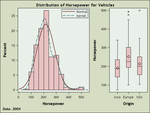
In the example, both the normal and the kernel density plots have the same visual properties, and you cannot distinguish between the two. In this step, you change the style element of the kernel plot so that you can distinguish the kernel plot from the normal plot.
  1. Right-click anywhere within the plot area and select Plot Properties. The Cell Properties dialog box appears and displays the Plots tab.
  2. From the Plot list box, select kernel if it is not already selected.
  3. From the Style Element list box, select GraphFit2.
  4. Click OK.
The kernel plot now has a different appearance from the normal plot. This change makes it easier to distinguish the two plots from each other.

Step Four: Add and Customize a Discrete Cell Legend

In this step, you first add a legend to the graph cell. Then you remove the histogram from the legend. Finally, you capitalize the normal and kernel labels in the legend.
To add and customize a legend:
  1. Click and drag the Discrete Legend icon from the Insets panel to the upper right corner of the cell. By default, all plots in the cell are displayed in the legend.
  2. Right-click the legend, and then select Legend Contents. The Legend Contents dialog box appears.
  3. Clear the check box next to the histogram plot.
  4. Double-click the label for the normal plot and change the first letter to a capital N.
  5. Double-click the label for the kernel plot and change the first letter to a capital K.
  6. Click OK.

Step Five: Create the Second Cell and Add a Plot

  1. Right-click anywhere within the plot area and select Add a Column. A new column cell is added to the right of the histogram.
  2. From the Plot Layers panel, click and drag the Box icon to the new cell. The Assign Data dialog box appears.
  3. In the Assign Data dialog box, complete these steps:
    • Select SASHELP from the Library list box.
    • Select CARS from the Data Set list box.
    • Select ORIGIN from the X list box.
    • Select HORSEPOWER from the Y list box.
  4. Click OK.

Step Six: Widen the Cell in the First Column

Both cells in the graph currently have the same width. You can widen the cell that contains the histogram so that the histogram has more space.
To change the width of the two columns:
  1. Position the cursor between the two cells of the graph. A dashed line appears between the cells and the cursor changes to a two-headed arrow two-headed arrow.
  2. Click and drag the dashed line toward the right. The cell with the histogram becomes wider and the cell with the box plot becomes narrower.

Step Seven: Customize the Title and Footnote

To customize the title and the footnote:
  1. Double-click the placeholder title. The placeholder text is highlighted:
    title text box
  2. In the text box, enter Distribution of Horsepower for Vehicles.
  3. In the bottom left corner of the graph, double-click the placeholder footnote. The placeholder text is highlighted.
  4. In the text box, enter Data: 2004.

Step Eight: Change the Graph's Style

To change the graph's style:
  1. Right-click the graph and select Graph Properties. The Graph Properties dialog box appears.
  2. From the Style list box, select Curve.
  3. Click OK.