On the Basic tab, double-click the Vertical Bar icon.
The Assign Data dialog box appears.
In the Assign
Data dialog box, complete these steps:
Select SASHELP from the Library list box.
Select PRDSALE from the Data Set list box.
Select COUNTRY from the Category list box.
Select PREDICT from the Response list box.
Click the Panel Variables tab.
Select PRODTYPE from the Column list box.
Click OK.
From the Plot Layers panel, click and drag the Bar icon to the graph. The Assign Data dialog
box appears.
In the Assign
Data dialog box, complete these steps:
Select COUNTRY from the Category list box.
Select ACTUAL from the Response list box.
Click OK.
Step Two: Change Plot Properties
Change the color and
transparency of the second bar chart so that it can more easily be
distinguished from the first bar chart.
To change the plot
properties:
Right-click anywhere
within the plot area and select Plot Properties. The Cell Properties dialog box appears
and displays the Plots tab.
From the Plot list box, select bar2 if
it is not already selected.
In the Fill section, select a different color from the Color list box. For this example, select the peach color ().
Click and drag the Transparency slider to the right to increase the transparency
to 50%.
Click the Bar tab.
Select 0.65 from the Bar Width list box.
Click OK.
Tip
The bar width can also be
changed when you assign data to the plot. To access this option, click Advanced Options in the Assign Data dialog box.
Step Three: Add a Global Legend
To add a global legend
to a graph:
Click in the toolbar. The Global Legend dialog box appears. The dialog box contains a list of all the plots
and lines in the graph.
Select the check box
next to the Select Plot column heading. Both
plots are automatically selected.
Click OK. The legend appears at the bottom of the graph.
Step Four: Customize the Title and Footnote
Most graphs that are
opened from the Graph Gallery contain a placeholder title and footnote.
For this example, you replace the title text and remove the footnote.
To customize the title
and the footnote:
Double-click the placeholder
title. The placeholder text is highlighted:
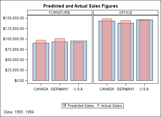
In the text box, enter Predicted and Actual Sales Figures.
In the bottom left corner
of the graph, double-click the placeholder footnote. The placeholder
text is highlighted.
In the text box, enter Data: 1993, 1994.
Step Five: Remove the Axis Labels
The axis labels occupy
graph space and are not necessary to understand the graph. You can
remove them from the graph.
Triple-click the Y axis
label (“Predicted Sales”) and press DELETE. The axis
label is removed.
Triple-click the X axis
label (“Country”) and press DELETE. The axis label is
removed.
The labels are not permanently
deleted. If you want to restore a label for an axis, right-click the
axis and select Axis Properties. Then select
the Label check box.