Changing the Properties of a Statistical Graph
Change the Properties of a Statistical Graph
The properties
of a statistical graph determine features that affect the overall
appearance of the graph. These properties include (but are not limited
to) the following items:
Note: Any changes
that you make to a graph's properties remain in effect only while
the current project is open. If you close and then reopen the project,
the properties revert to their default values.
-
The Properties dialog box contains several tabs that organize the properties you can change. In general, there are two types of properties:
-
The Graph, Axis, Legend, and Titles tabs contain properties that all or most statistical graphs have in common. For a description of these properties, see General Properties.
-
The dialog box also contains a tab that has graph-specific properties. The name and contents of this tab vary depending on the type of graph you are modifying. For a description of these properties, see Graph-Specific Properties.
-
General Properties
Graph Tab
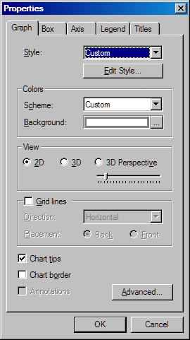
Select a predefined
graph style name from the list box. The style that you select overrides
the style that has been selected for the project. For details about the
project style, see Apply a Style to a Project.
You can also select Edit Style and then customize the currently selected
style. For instructions, see Customize the Style Applied to a Graph.
Select a color scheme
from the Scheme list box to change the colors
of the graph.
You can also select  to open the Background dialog box, where you can
choose the background color, gradient, and texture. For information
about this dialog box, see Changing Background Color, Gradient, and Texture.
to open the Background dialog box, where you can
choose the background color, gradient, and texture. For information
about this dialog box, see Changing Background Color, Gradient, and Texture.
to open the Background dialog box, where you can
choose the background color, gradient, and texture. For information
about this dialog box, see Changing Background Color, Gradient, and Texture. Select whether you
want to view the graph in two-dimensional, three-dimensional, or three-dimensional
perspective format. If you select 3D Perspective, then you can use the Perspective slider
to increase or decrease the depth of the graph. This format is not
available for pie charts.
Select Grid lines to display grid lines for the graph. If you
display grid lines, then you can make the following changes:
Select or clear the Chart tips check box to display or hide chart tips.
Chart tips contain data details and appear when you move the cursor
over particular areas on a graph. For example, moving the cursor over
the bars in a bar chart displays the data values associated with the
bars.
Select Chart border if you want a border around the graph.
This option is not available for pie charts.
Click the Advanced button to open the Advanced Settings dialog
box, which contains the following items:
Use the radio buttons
to select either graph-style rotation around the X and Y axes or map-style,
three-dimensional arcball rotation around all three axes (X, Y, and
Z). To use arcball rotation, imagine a virtual sphere surrounding
the object, select a point on the sphere, and rotate that point to
a new location. If you select a position outside the sphere, then
the object is rotated around the Z axis only. Arcball rotation is
most useful (and the default setting) for maps.
Use the check boxes
to determine the behavior when you copy and paste a graph into PowerPoint.
The check boxes enable you to display interactive graphs and to remove
the graph background.
Select or clear the Scrollbars check box to control whether scroll bars
appear for a graph. Though scroll bars are enabled, the threshold
for displaying scroll bars varies with the type of graph. You can
control the threshold for displaying scroll bars by changing the values
in the Horizontal and Vertical list boxes. (If you select the zoom tool and zoom in on any of the
graphs, the scroll bars appear.)
Axis Tab
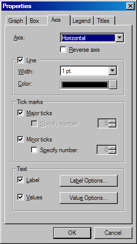
The Axis tab in the Properties dialog box enables you to
control the display and formatting of axes. These properties are not
available for pie charts. The Axis tab contains
the following items:
Select or clear the Line check box to control whether the specified axis
line is displayed or hidden.
Use the Width list box to set the line width from one point
to six points. The default width depends on the graph type.
To change the color
of the line, click to open the Color dialog box, which contains colors
to choose from and the option to define your own color. See Using the Color Dialog Box.
to open the Color dialog box, which contains colors
to choose from and the option to define your own color. See Using the Color Dialog Box. Control axis labels
and values using the following items:
Select or clear the Labels check box to control whether axis labels are
displayed. For graphs that use a group variable, you can also display
or hide the Group values.
Change the label text
or font by selecting the Label Options button.
In the Label Options dialog box, you can specify the text of axis
labels by selecting Custom label and then
entering the desired label text into the text box.
Use the Values check box to control whether axis values are
displayed. For graphs that use a group variable, you can also display
or hide the Group values.
Legend Tab
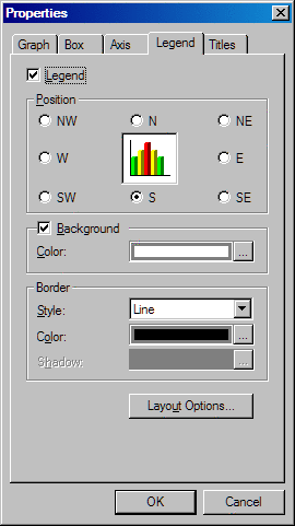
You can
change the legend position, background, border, or text in the Legend tab of the Properties dialog box. The Legend tab contains the following items:
Set the legend's position
relative to the graph by selecting one of the position choices. For
example, choose NW to position the legend
in the top left corner of the graph or S to
position the legend in bottom center of the graph.
The legend's background
is the area within its border. Select or clear the Background check box to control the legend background's display. Click to open a Legend dialog box that enables you to change
the background's color, gradient, and texture. For details, see Changing Background Color, Gradient, and Texture.
to open a Legend dialog box that enables you to change
the background's color, gradient, and texture. For details, see Changing Background Color, Gradient, and Texture. Select a border style
from the Style list box. Choose None to remove the border. After you choose a style,
you can select the border color. If the style that you choose uses
a shadow, then you can also choose a color for the shadow. Click to open the Color dialog box. The Color dialog box
contains colors to choose from and the option to define your own color
for the border and shadow. For details, see Using the Color Dialog Box.
to open the Color dialog box. The Color dialog box
contains colors to choose from and the option to define your own color
for the border and shadow. For details, see Using the Color Dialog Box. When you select the Layout Options button, the Layout Options dialog box
opens. This dialog box contains the following items:
To set the label's
position relative to the graph, select one of the position choices
from the Position list box. Select Automatic to specify that the position be automatically
assigned.
The data in the legend
can be placed in rows or columns. From the Layout list box, select rows or columns, or select Automatic to specify that the layout be automatically assigned. If you specified
rows or columns as the layout of the legend, then you can use the Numbers list box to specify the number of rows or columns
in the legend.
Titles Tab
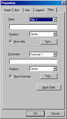
The Titles tab in the Properties dialog box enables you
to control the display of titles and footnotes. The Titles tab contains the following items:
You can specify the
text, position, and font for up to four titles. Select which title
you want to edit from the list box, and enter the text for that title
in the text box.
Select the location
for the title from the Position list box. You can locate the title
in the center, left, or right portion of the display.
You can specify the
text, position, and font for up to two footnotes. Select which footnote
you want to edit from the list box, and enter the text for that footnote
in the text box.
Select the location
for the footnote from the Position list box.
You can locate the footnote in the center, left, or right portion
of the display.
Click the Font button to open the Font dialog box. The Font dialog
box enables you to specify the font type and font characteristics
such as size and color for your footnote.
Customize the Style Applied to a Graph
You can
customize the style that is used for a graph by entering changes in
the Edit Style dialog box. To open this dialog box:
Select a different
style from the list box, if appropriate. The style that you select
overrides the style that has been selected for the project. (For details about the
project style, see Apply a Style to a Project.)
Select a scheme from
the Scheme list box to change the graph color
scheme.
Click to open a dialog box where you can change the background
color, gradient, and texture. For information about using this dialog
box, see Changing Background Color, Gradient, and Texture.
to open a dialog box where you can change the background
color, gradient, and texture. For information about using this dialog
box, see Changing Background Color, Gradient, and Texture. Use the selection buttons to open separate dialog boxes to change the legend,
floor, and wall fill color, gradient, and texture. For help using
these dialog boxes, see Changing Background Color, Gradient, and Texture. For the chart's walls and data element
fill, you can use the Transparency slider
to increase (move to the right) or decrease (move to the left) the
level of transparency.
to open separate dialog boxes to change the legend,
floor, and wall fill color, gradient, and texture. For help using
these dialog boxes, see Changing Background Color, Gradient, and Texture. For the chart's walls and data element
fill, you can use the Transparency slider
to increase (move to the right) or decrease (move to the left) the
level of transparency.
Click a data element
fill color from the color palette and then select Edit to open the Data Element dialog box. This dialog box enables you
to change the color, gradient, and texture for the data element fill
values. Clicking the Edit All button enables
you to select and apply either or both of the following:
-
texture file and a fit (for the selected texture file) to the entire chart. Select the Texture check box to specify a texture image file and file fitting. Use the File list box to select a predefined image. To select an image from your file system, click the file selection button, and then choose the image from the Open window.
Use the Fit list box to specify a fitting
setting for your texture file.
-
color ramp. You can select a predefined color ramp or define your own color ramp by selecting starting and ending colors. The predefined color ramps available in the Scheme list box are lighter to darker colors that are used to indicate lower and high data values respectively. For example, if White to Orange is the selected scheme, then the lowest data values are white. The middle data values are light to darker orange. The highest data values are the darkest shade of orange. Select the Color ramp check box to specify a color ramp. Use the Scheme list box to select a predefined color ramp scheme. Click on the Start and End selection buttons to open the Color dialog box, where you can select
start and end colors for the color ramp. For help using the Color
dialog box, see Using the Color Dialog Box.
Click the Color selection buttons for Outlines, Grid, and Axis and borders to
open the Color dialog boxes for each. The Color dialog boxes enable
you to select the color for the specified line type. Click the Width list box to select line widths for the different
types of lines. For both the Grid and Axis and borders, you can also select a defined line
style from the Style list box.
for Outlines, Grid, and Axis and borders to
open the Color dialog boxes for each. The Color dialog boxes enable
you to select the color for the specified line type. Click the Width list box to select line widths for the different
types of lines. For both the Grid and Axis and borders, you can also select a defined line
style from the Style list box.
Click the Color selection buttons for Title, Labels, and Values to open a Color dialog
box for each. The Color dialog boxes enable you to select the color
for specified text type. Click on the Font buttons to specify a font for titles, labels, and text data values.
Use the Shadow and Border check boxes to select or clear text shadows and borders.
for Title, Labels, and Values to open a Color dialog
box for each. The Color dialog boxes enable you to select the color
for specified text type. Click on the Font buttons to specify a font for titles, labels, and text data values.
Use the Shadow and Border check boxes to select or clear text shadows and borders.
Use the Style list
boxes to select a defined style for the Shadows, Text borders, and Selection. Click the Color selection buttons to open the Color dialog boxes for each effect. The
Color dialog boxes enable you to select the color for the specified
effect. For shadows, use the arrows to the right of Offset to assign a shadow offset value. For text borders, you can select
a border width from the Width list box.
to open the Color dialog boxes for each effect. The
Color dialog boxes enable you to select the color for the specified
effect. For shadows, use the arrows to the right of Offset to assign a shadow offset value. For text borders, you can select
a border width from the Width list box.
Using the Color Dialog Box
Several
tabs in the Properties dialog box provide a button that opens the
Color dialog box. The Color dialog box contains colors to choose from
and the option to define your own color.
Clicking
the Define Custom Colors button extends the
Color window and adds a color palette, a vertical slider thumb, a
preview box, and several text boxes. To define a color, you can use
the methods listed below singly or in combination:
-
Position the target on a color you would like to define. Use the vertical slider thumb to increase (move up) or decrease (move down) the red, green, blue, and lumination values. As the slider thumb is moved, the values in the Red, Green, Blue, and Lum text boxes increase or decrease to reflect the slider thumb's position. When the slider thumb is moved or values are entered into any of the text boxes, the color that you are defining is displayed in the Color Solid preview box. Once the color has been displayed in the preview box, click the Add to Custom Colors button. The color is then available for selection on the left side of the Color dialog box in the Custom colors section.
-
Use the Hue, Saturation, Lum, Red, Green, and Blue text boxes to define your color. As you enter values into these text boxes, the target and slider thumb move to positions reflecting the color being defined. When the color you want to define is displayed in the Color Solid preview box, click the Add to Custom Colors button. The color is then available for selection on the left side of the Color dialog box in the Custom colors section.
Changing Background Color, Gradient, and Texture
Several
tabs in the Properties dialog box provide a button that opens a dialog
box containing three tabs: Solid Color, Gradient, and Texture. Open
this dialog box to change the background appearance for a graph. You
can change the following items:
Select a solid color
from the Color palette. Click the More button to open the Color dialog box. The Color
dialog box contains additional colors to select from and the option
to define your own color. For details, see Using the Color Dialog Box.
A gradient blends from
one color to another on your graph. The Preview box shows you how the blend looks.
Use the Type list box to set the type of gradient. The gradient
types available are dependent on the graph generated.
To set the direction
for the color blend, choose Left to right, Right to left, Top to bottom, or Bottom to top from the Directions list box.
To select the starting
and ending colors, use the Start color and End color buttons to open the Color dialog box for each.
For details, see Using the Color Dialog Box.
Select a background
image. The Preview box shows you the image
that is currently selected in the File list
box. To select an image from your file system, click , and then choose the image from the Open dialog box.
, and then choose the image from the Open dialog box.
The Color
fill buttons enable you to specify that the image and
the color fill are blended or that the image replaces the color fill.
Select Blend to blend the color selected
in the Solid Color tab with the image. Select
the Replace radio button to specify that
the image replaces the color selected in the Solid Color tab.
Graph-Specific Properties
Bar Tab
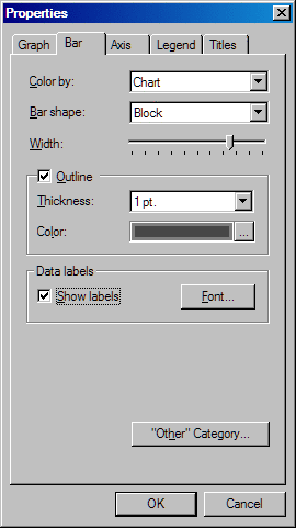
Specify how colors
are used in the graph. Select one of the following items from the Color by list box:
Specify the shape of
the bars. Select Block, Cylinder, Hexagon, Prism, or Star from the Bar shape list box.
Set the width of the
bars. To increase the width of the bars, drag the slider thumb to
the right or click to the right of the thumb. To decrease the width
of the bars, drag the slider thumb to the left or click to the left
of the thumb.
Select or clear the Outline check box to control whether bars are outlined.
Use the Thickness list box to change the
thickness of the bar outline. Click the Color selection button to open the Color dialog box. The Color dialog
box contains additional colors to select from and the option to define
your own color for the bar outline. See Using the Color Dialog Box.
Select one of the buttons
to specify whether the subgroups are shown as bars stacked horizontally
or as bars grouped vertically. These buttons are available only when
the graph contains subgroups.
Select the "Other" category button to specify display parameters
for categories that are four percent or less of the total bar chart.
The "Other" Category dialog box opens. You can make the following
changes in this dialog box:
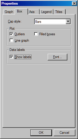
Box Tab
Histogram Tab
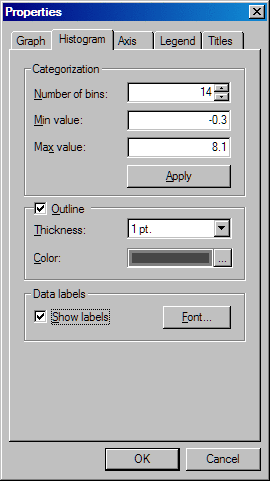
Select or clear the Outline check box to control whether bins are outlined.
If outlines are displayed, then you can change the thickness of the
outline by selecting a different value from the Thickness list box.
To change the color,
click to open the Color dialog box. The Color dialog box
contains colors to choose from and the option to define your own color
for the outline. See Using the Color Dialog Box.
to open the Color dialog box. The Color dialog box
contains colors to choose from and the option to define your own color
for the outline. See Using the Color Dialog Box. Pie Tab
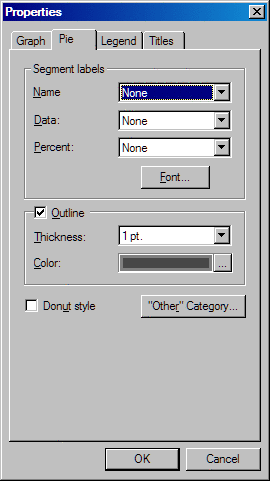
Select or clear the Outline check box to control whether pie slices are
outlined. If outlines are displayed, then you can change the thickness
of the outline by selecting a different value from the Thickness list box. Use the Color selection button to
open the Color dialog box. The Color dialog box enables you to select
a color to be used for your pie outline.
To change the color
of the outlines, click to open the Color dialog box. The Color dialog box
contains colors to choose from and the option to define your own color. See Using the Color Dialog Box.
to open the Color dialog box. The Color dialog box
contains colors to choose from and the option to define your own color. See Using the Color Dialog Box. Select the "Other" category button to specify display parameters
for categories that are four percent or less of the total pie chart.
The "Other" Category dialog box opens. You can make the following
changes in this dialog box:
Plot Tab
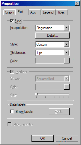
The Plot tab in the Properties dialog box contains the following
items for customizing scatter plots:
You can display lines
between markers in a scatter plot. Select the Line check box to enable the display of lines.
Use the Interpolation
list box to change the interpolation method for the graph. Depending
on the interpolation type that you select, the Detail button might be enabled. Click the Detail button to specify more details for the lines. The following list
summarizes the interpolation methods and describes any details that
apply to the interpolation:
To change the color
of the lines, click to open the Color dialog box. The Color dialog box
contains additional colors to select from and the option to define
your own color. See Using the Color Dialog Box.
to open the Color dialog box. The Color dialog box
contains additional colors to select from and the option to define
your own color. See Using the Color Dialog Box. You can customize the
markers in a scatter plot. Select or clear the Markers check box to enable or hide markers. If markers are enabled, then
you can make the following changes:
To change the color
of the markers, click to open the Color dialog box. See Using the Color Dialog Box.
to open the Color dialog box. See Using the Color Dialog Box.