Schedule Chart

Definition

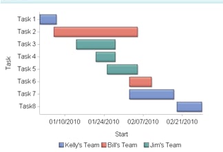
A schedule chart (also called Gantt chart) is a graphic representation of the tasks that make up a project. The chart shows start and finish dates, the duration of each task, the order of the tasks, and any dependencies among the tasks.
Example of a Schedule Chart Indicator
example schedule chart indicator
For a sample of the indicator data that was used to create this indicator, see “Sample Data Structure” for this indicator.

Usage Information

Data best suited for
Schedule charts are commonly used to display how certain tasks, events, or activities are scheduled over time. Although not required, displaying the task on the vertical axis and the time factor on the horizontal axis makes the chart easier to read. Schedule charts are especially useful for comparing task length and frequency. A third factor can be introduced by assigning a different color to each bar. This color can represent items such as categories, importance, or urgency.
Target audience
Use caution when choosing the schedule chart because most people might not be familiar with this indicator type. However, it is not difficult to interpret, so even users who are unfamiliar with this indicator type should be able to understand it. Audiences that might be familiar with this indicator type include business analysts, business users, executives, and financial analysts.
Data aggregation support
This indicator type does not aggregate the indicator data.
Range support
Ranges are not supported.
Alert support
Alerts are not supported.
Link support
This indicator type can be used to define a link or as the destination of a link.For more information about defining an indicator with a hyperlink, see Adding Links to Indicators or Other Content.
Interaction support
  • Data filter support: This indicator type can be used as either a source or target indicator.
  • Interactive highlighting support: This indicator type can be used as either a source or target indicator.
For more information, see Adding Interactions between Indicators.
Filter multiple items support
Filtering multiple items is supported.For more information, see Supporting Multiple Selections in a Filtered Data Interaction.

General Settings

Display Settings

The following display settings are used in the preceding figure. For more information, see “Sample Data Structure” for this indicator.
Display Setting
Selection Used for Figure
Task value
Task
Group by value
Team
Start date
Start date
Finish date
End date
X-axis title
Set to Start
Y-axis title
<blank> (defaults to Task)
You can customize the following display settings for this indicator:
  • (Required) From the Task list, select the value that you want to use for the task axis in the indicator.
  • (Required) From the Group by value list, select the value that you want to use to group the data in the indicator.
  • (Required) From the Start date list, select the start date for the tasks in the indicator.
  • (Required) From the Finish date list, select the finish date for the tasks in the indicator.
  • In the X-axis title field, type the title to use for the X axis in the indicator. If you do not specify a title, the value that you selected from the X-axis value list is used by default. If you do not want a title, type a space in the field. If you select Scale X axis, a measurement label is added to the title.
  • In the Y-axis title field, type the title to use for the Y axis in the indicator. If you do not specify a title, the value that you selected from the Y-axis value list is used by default. If you do not want a title, type a space in the field. If you select Scale Y axis, a measurement label is added to the title.
  • Select Scale X axis if you want to scale that axis. When you make this selection, a measurement label is added to the X-axis title if the data is numeric. For example, if the X-axis title is set to Revenue and you select Scale X axis, the X-axis title is displayed as Revenue (millions).
  • Select Scale Y axis if you want to scale that axis. When you make this selection, a measurement label is added to the Y-axis title if the data is numeric. For example, if the Y-axis title is set to Revenue and you select Scale Y axis, the Y-axis title is displayed as Revenue (millions).
  • From the X-axis format list, select the format that you want to apply to the data on that axis. If you do not want to specify a format, select (none). When set to (none), the indicator uses the format that is used in the data source.

Sample Data Structure

To create a schedule chart, you must provide two variables and two dates (start and finish).
The following data sample is associated with the figure previously shown. Underneath each column heading is its associated display setting.
Team
(Group by value)
Task
(Task)
Start Date
(Start date)
End Date
(Finish date)
Kelly’s Team
Task 1
01/01/2010
01/07/2010
Bill’s Team
Task 2
01/06/2010
02/05/2010
Jim’s Team
Task 3
01/14/2010
01/28/2010
Jim’s Team
Task 4
01/21/2010
01/28/2010
Jim’s Team
Task 5
01/25/2010
02/05/2010
Bill’s Team
Task 6
02/02/2010
02/10/2010