Defining a Data Source
Data Columns
When you
define a data source, part of the information that you specify is
the display attributes for each data column that is retrieved from
the data source by a query or an information map.
Here is
an explanation of the fields:
The data column that
contains the formatted value that is displayed. This format can be
a simple numeric value of a label.
An SQL query does not
require this field. To create a formatted label at the bottom of a
gauge, create the label as a formatted string in the SQL query, and
then define that formatted string as the Label attribute.
SAS Information Map Data Source
Overview
A SAS
Information Map data source easily aggregates data in such a flexible
manner that a single SAS Information Map can drive several different
dashboard indicators, such as the example shown here:
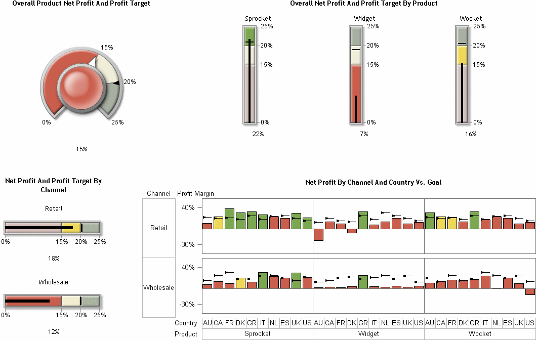
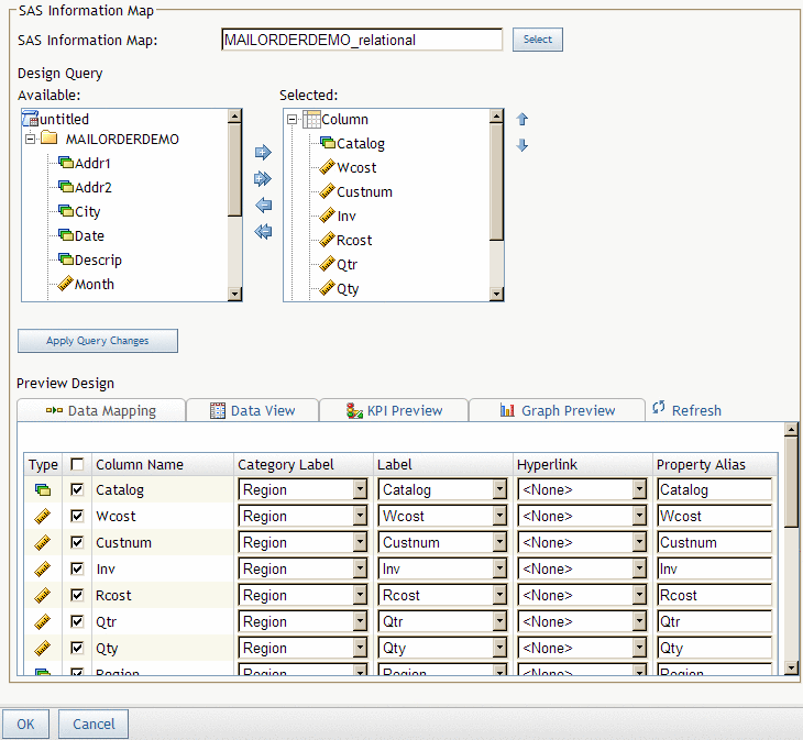
This example
demonstrates how a single SAS Information Map can be configured to
drive different indicators by taking advantage of aggregation at the
SAS Intelligent Query Services level. The information map for this
example is a simple relational SAS Information Map that returns approximately
60 rows of data. Here is a sample of the data:
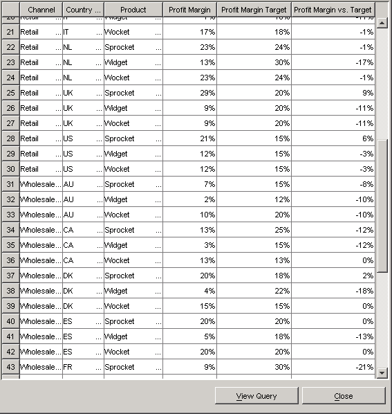
The data
columns Country, Channel, and Product contain data that is repeated.
Repeated data is a great candidate for grouping.
The first
indicator (Overall Product Net Profit And Profit Target) requires
only a single row of data. To specify a single row of data in SAS
Information Map Studio, select the numeric values and specify that
SAS Information Map Studio aggregate them. In the BI Dashboard, the
KPI display type shows one gauge per row of data. To create a single
gauge, you must aggregate the data so that only a single row of data
is returned from the SAS Information Map. The one row of data returns
the value by aggregating the data columns according to the aggregation
method for the data item. In this example the method is average. The
default aggregation method, sum, usually is not desirable for a dashboard,
so you must specify the aggregation method on the Classification/Formats tab of the Data Item Properties dialog box in SAS Information Map
Studio.
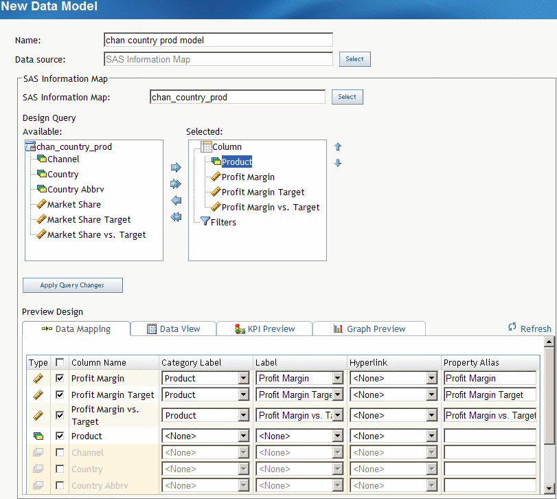
Here are
the settings for the data model that drives the Overall Product Net
Profit And Profit Target indicator:
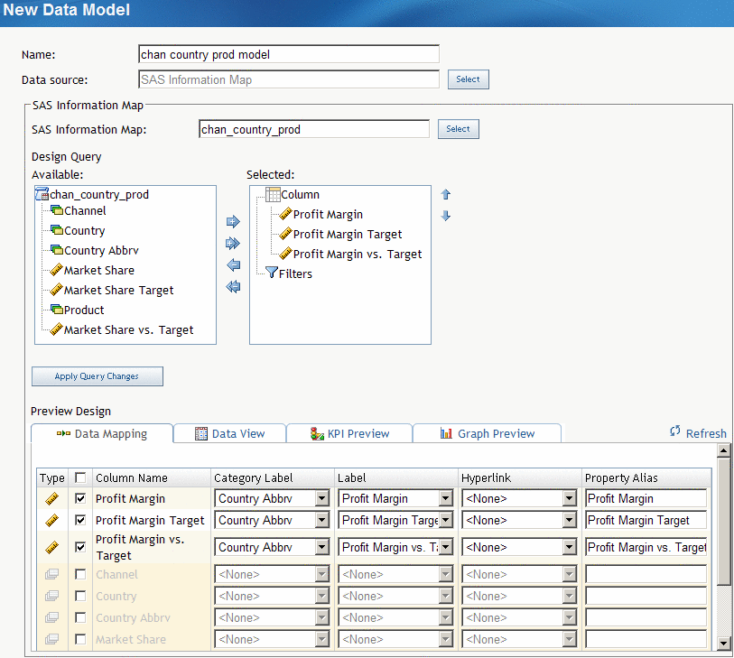
For the
Overall Net Profit And Profit Target By Product indicator, the data
columns are different. This indicator displays three gauges, one for
each product. For this data model, Product is selected, but Channel and Country are not. (There are also some numeric data columns
concerning market share in this SAS Information Map that are not pertinent
to this discussion.) For each numeric data column, Product is selected in the Category label field
so that the gauge is labeled with the appropriate name. Here are the
settings for this data model:
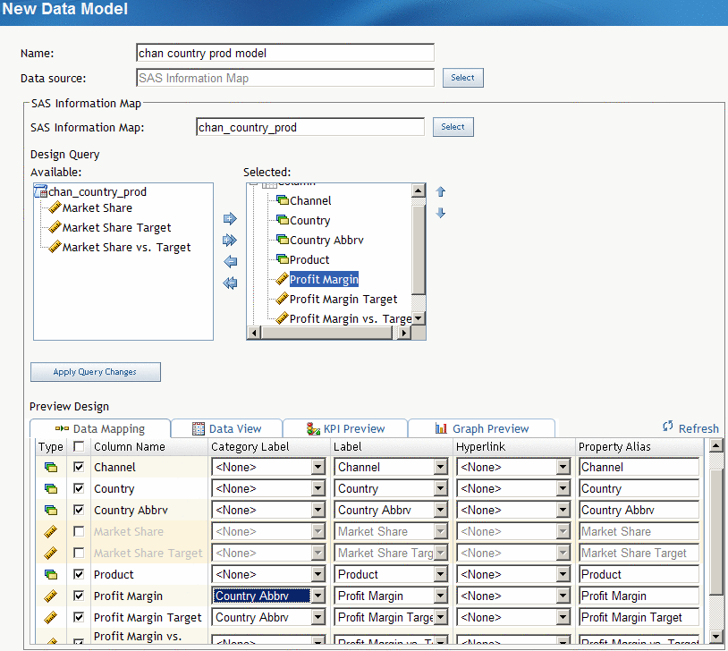
For the
Net Profit And Profit Target By Channel indicator, the data model
uses only the relevant numeric data columns and the Channel data column.
For each numeric data column, Channel is
selected in the Category label field so that
the gauge is labeled with the appropriate name.
OLAP Information Maps
The data
returned from an OLAP information map is flattened into a two-dimensional
table structure. You assign a role for each dimension when you define
the data source. The roles are Column, Row, and Slicer.
For dimensions
with the role of Row, the levels of each hierarchy are the data fields.
The corresponding members of the level are the values of the data
field, where the field name is the label for the level. The other
data fields are the columns that are typically seen in an OLAP viewer.
The field names for the data fields are the comma-delimited levels
of the dimensions with the role of Column, in the order of the dimensions
with the role of Row.
Define a SAS Information Map Data Source
You define a SAS Information
Map data source when you create or edit a data model, or create or
edit an indicator. For more information, see Create or Edit a Data Model and Create or Edit an Indicator.
-
From the Available list of data columns and filters, move items between the Available list and the Selected list by selecting one or more items and clicking the arrows between the lists.A filter is moved under the Filters node. By default, a data column is moved under the Column node. If the SAS Information Map is based on an OLAP cube, the Selected list includes the nodes Row and Slicer. To use a data column in either of these roles, select Row or Slicer before moving the data column from the Available list.
Define a SAS Data Set Data Source
You define a SAS Data Set data source when you create
or edit a data model, or create or edit an indicator. For more information,
see Create or Edit a Data Model and Create or Edit an Indicator.
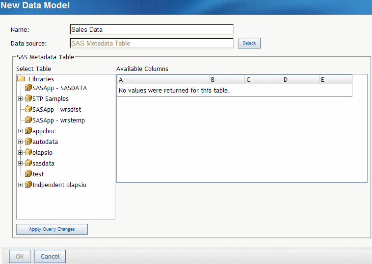
Define a Metadata Table Data Source
You define a SAS metadata table
data source when you create or edit a data model, or create or edit
an indicator. For more information, see Create or Edit a Data Model and Create or Edit an Indicator.
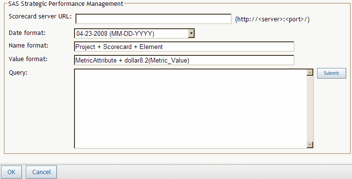
Define a SAS Strategic Performance Management Data Source
You define
a SAS Strategic Performance Management data source when you create
or edit a data model, or create or edit an indicator. For more information,
see Create or Edit a Data Model and Create or Edit an Indicator.
-
You can type any text. However, keywords supply certain information from SAS Strategic Performance Management. When the query is run, the keywords are replaced with values from SAS Strategic Performance Management for the cell specified in the query. These are the keywords:is the name of the template on which the scorecard that is associated with the queried cell is based.is the name of the project in which the scorecard that is associated with the queried cell is located.
-
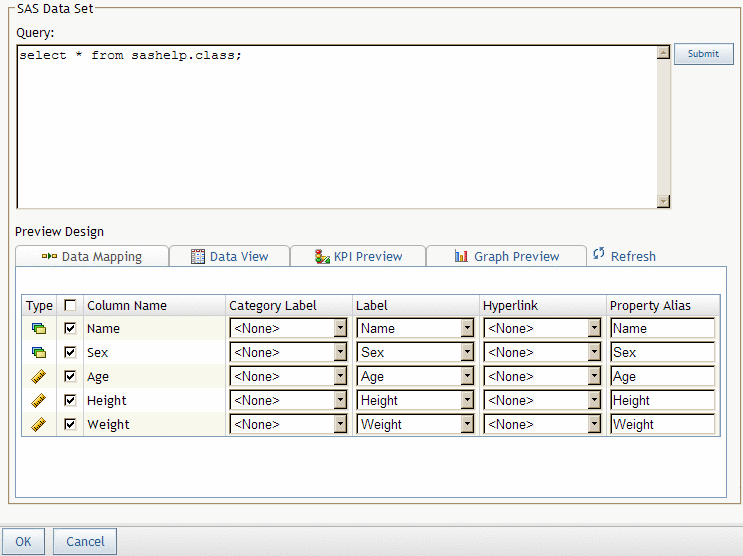
In the Query field, type the query that specifies a cell within SAS Strategic Performance Management from which to retrieve values, and then click Submit.Use a vertical bar (|) to separate the parts of the query that specify a cell. Here is the general format to specify a cell: