Introduction to the SAS Information Delivery Portal 2.0
Exploring the Portal's Graphical Interface
Before attempting to understand portal features, it is helpful to understand the portal's fundamental components. This topic introduces you to the portal's graphical user interface.
Note: While reading this topic, keep in mind that your organization can customize the portal so that it looks different from the examples shown here. Not only will you see different content, but your organization might use a different color, style, logo, page layout, and navigation. 
By default, the portal's Public Kiosk is displayed prior to logging on. The Public Kiosk serves as a welcome page and can be viewed by anyone in your organization.
The following figure shows a sample Public Kiosk that contains corporate news and links to various Web sites. These items provide examples of the types of content that can be added to your Public Kiosk.
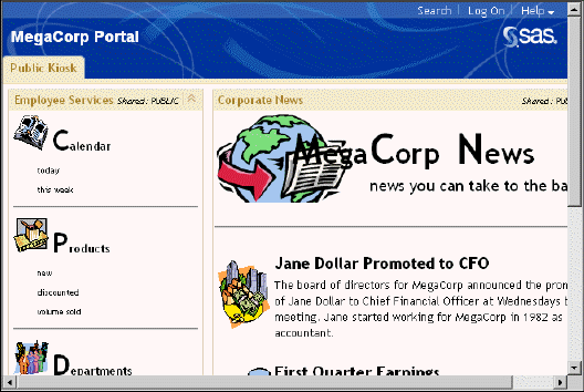
A banner spans the top of the portal, and the top right corner of the banner contains links that enable you to log on the portal, search for information in the portal, and get help while using the portal. From the Public Kiosk, you can select Log On in the banner when you are ready to access the portal.

Your organization can choose not to include a Public Kiosk. In that case, your portal would open to the logon page.
Your organization can also choose to configure the portal so that there is no logon page. In that configuration, any user who can access your organization's Web server can access the portal.
After logging on, you see a portal similar to the following display. Callouts have been added to help you identify the main components:
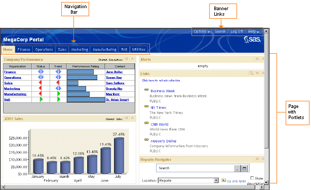
In the display, the portal's Home page is the active Web page. Notice that the Home link is highlighted on the navigation bar. The navigation bar contains links for all the portal Web pages that are accessible to you. If you were looking at an actual portal, you could open another page by clicking its name in the navigation bar.
The portal uses portlets to organize information on a page. Portlets are the rectangular display components of a portal page that contain the links, graphs, reports, and other information that is available in the portal. A page can contain any number of portlets. The previous example shows portlets arranged on the page in two columns. You can arrange the portlets in one, two, or three columns on a page. For more details about portlets, see Organizing Content in the Portal.
After you have logged in, the banner contains an Options link. (This link was not available from the Public Kiosk because you must log on to the portal before you can use the options that are available for managing the portal.)

In the banner, your login name is displayed next to the Log Off link. In addition, if you are logged on as a group content administrator, the words *Content Administrator* are displayed in the center of the banner. A content administrator is authorized to share portal content with all portal users or with a group of users. After content is shared, only a group content administrator can edit or delete the content.
Selecting Options in the banner displays a menu from which you can perform common management tasks. For example, you can add pages and portlets, rearrange portal elements, and personalize your portal. See Personalizing Your Portal for more details.