Graphs, Charts, and Plots
Bar Charts
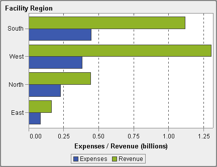
A bar chart consists of vertical or horizontal bars that represent quantitative data. Use bar
charts to compare data that is aggregated by the distinct values of a category.
You can apply grouping and create data-driven lattices. You can filter or rank your data based on a specified number of top or bottom values.
A Bar Chart
Targeted Bar Charts
A targeted bar chart is a variation of the bar chart that has target values. A target value is represented as a triangle with a line at the target value that is determined by
the target role.
A Targeted Bar Chart
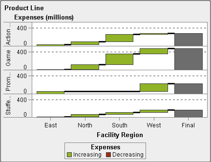
Waterfall Charts
A waterfall chart (also known as a progressive bar chart) shows how the initial value of a measure increases or decreases during a series of operations or transactions.
The first bar begins at the initial value, and each subsequent bar begins where the
previous bar ends. The length and direction of a bar indicate the magnitude and type
(positive or negative, for example) of the operation or transaction. The resulting
chart is a stepped bar showing how incremental changes lead to the final value of
the measure.
A Waterfall Chart
Line Charts
A line chart shows the relationship of one or more measures over some interval, such as time or
a series of ranges. You can measure a single measure (univariate analysis), or you can show the relationships among multiple measures (multivariate analysis), such as the leading or lagging relationship between advertising and sales
over time. The category on the X axis of a line chart is discrete; the category on the X axis
of a time series plot is continuous.
You can apply grouping
and create lattices.
A Line Chart
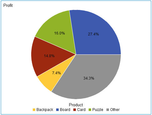
Pie Charts
A pie chart displays a part-to-whole relationship in a circle divided into multiple slices for
each value of a category data item based on a single measure data item. Each slice represents the relative contribution of each part to the whole. In a pie chart, the legend is sorted by contribution.
In SAS Visual Analytics Designer (the designer), a pie chart does not show a slice
with a missing or zero response.
Effective pie charts limit the number of slices to 5 or 6. In the designer, you can
use a rank to reduce the number of slices in a pie chart. For more information,
see Add a New Rank.
Note: The Other slice does not
display data tip values. In addition, the Other slice always sums
the included values, regardless of the aggregation method selected
for the measure. For example, if the aggregation method selected is
Count, then the Other slice displays the sum of the individual counts.
A Pie Chart
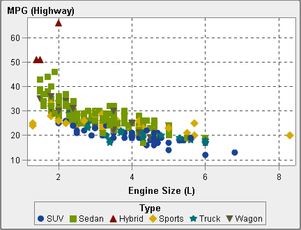
Scatter Plots
A scatter plot is a two-dimensional plot that shows the relationship of two measure data items. Each marker (represented by
a symbol such as a dot, a square, or a plus sign) represents an observation. The marker’s position indicates the value for each observation. Use a scatter plot
to examine the relationship between numeric data items. You can apply grouping by assigning a category to the Color role.
Scatter plots do not
use aggregated data.
A Scatter Plot
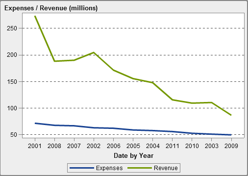
Time Series Plots
A time series plot shows an ordered sequence of values that are observed at equally
spaced time intervals.
A time series plot requires a date, datetime, time, or hierarchy data item that is continuous on the X axis.
A Time Series Plot
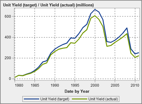
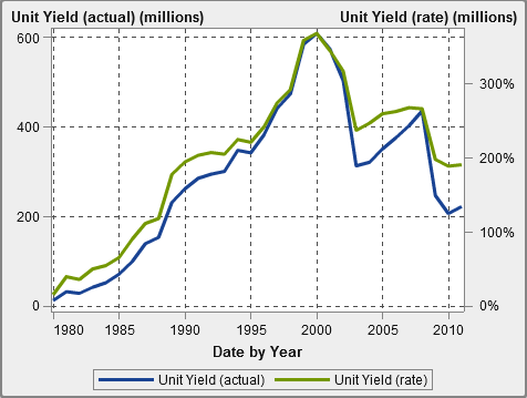
Comparative Time Series Plots
A comparative time series plot uses line segments to chart two measures on different scales over time. A comparative
time series plot requires a date, datetime, time, or hierarchy data item that is continuous
on the X axis. The X axis is shared across both plots.
Tip
This report object is not
displayed in the designer by default. You can select what you want
to display using the designer’s Show or Hide Objects window.
A Comparative Time Series Plot
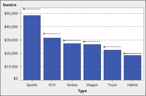
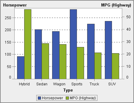
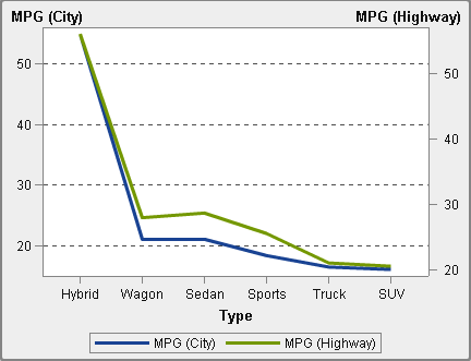
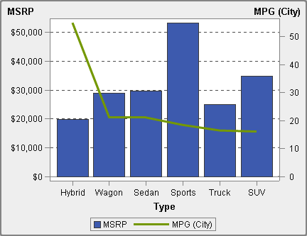
Series Plots
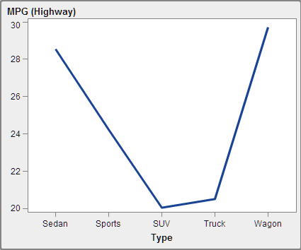
A series plot displays a series of line segments that connect observations of input data. A series
plot can use numeric or character data on the X axis.
Note: You must create and save
this custom graph object in the SAS Visual Analytics Graph Builder
(the graph builder) before the object is available for use in reports.
The following example
shows MPG averages for different types of vehicles:
A Series Plot
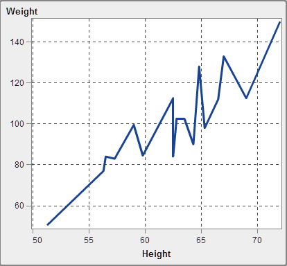
Numeric Series Plots
A numeric series plot shows the relationship of one or more measures across a series
of numeric values.
A numeric series plot requires numeric data on the X axis.
Tip
This report object is not
displayed in the designer by default. You can select what you want
to display using the designer’s Show or Hide Objects window.
A Numeric Series Plot
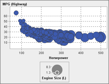
Bubble Plots
A bubble plot is a variation of a scatter plot in which the markers are replaced with bubbles.
A bubble plot displays the relationships among at least three measures. Two measures
are represented
by the plot axes, and the third measure is represented by the size of the bubbles.
Each bubble
represents an observation. A bubble plot is useful for data sets with dozens to hundreds
of values. You can
add categories to the Grouping and Lattice roles.
Note: A bubble’s size is
scaled relative to the minimum and maximum values of the size variable.
The minimum and maximum sizes are illustrated in the plot legend.
The actual value for each bubble is displayed as a data tip. For example,
the legend that is displayed in A Bubble Plot, the minimum size is 1.3 and the maximum size is 8.3.
A Bubble Plot
Bubble Change Plots
A bubble change plot shows changes in two sets of measures using
bubbles and directed line segments.
Tip
This report object is not
displayed in the designer by default. You can select what you want
to display using the designer’s Show or Hide Objects window.
A Bubble Change Plot
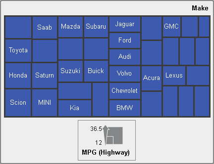
Treemaps
A treemap displays your data as a set of rectangles (called tiles). Each tile represents a category node or a hierarchy node. The color of each tile represents the value of the first measure. The size of each
tile represents the value of the second measure. (There are two data roles for measures
in a treemap—Size and Color.)
For example, a sales data treemap might have tile sizes that represent
the number of orders, and it might have tile colors that are derived
from color gradients that represent sales.
The layout of the tiles in the treemap is dependent on the size of the display area
because it uses a space-filling algorithm to lay the tiles down. This means that the
same treemap might appear slightly different in the designer than it does in the viewer
or on a mobile device because the aspect ratio and size available in those viewers might be different from what the original report
designer sees in the designer.
Note: Treemaps allow only one category
data item or hierarchy data item.
A Treemap
Dual Axis Bar Charts
A dual axis bar chart is a variation of the bar chart that has two measures. A measure is on each axis.
A Dual Axis Bar Chart
Dual Axis Line Charts
A dual axis line chart is a variation of the line chart that has two measures. A measure
is displayed on both the left and right side of
the Y axis. The relationship between two measures can be examined on two different
scales in a dual axis line chart.
A Dual Axis Line Chart
Dual Axis Bar-Line Charts
A dual axis bar-line chart is a variation of the bar chart that has two measures. A measure is on each axis,
and the bar chart is overlaid by
a line chart.
A Dual Axis Bar-Line Chart
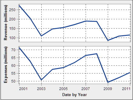
Dual Axis Time Series Plots
A dual axis time series plot is a variation of the time series plot that has two measures.
A measure is displayed on both the left and right side of
the Y axis.
For example, a dual axis time series plot can be useful when you need to display two
measures that have the same unit of measurement
and different scales, such as quantity ordered and returns, or when you need to display
two measures that have different units of measurement, such as sales and quantity
ordered.
A Dual Axis Time Series Plot
Band Plots
A band plot draws a horizontal band with two Y values for each X value. Or, it draws a vertical
band with two X values for each Y value. A band plot is typically used to show confidence,
error, prediction, or control limits. The points on the upper and lower band boundaries can be joined to create two outlines.
The area between the boundaries is filled.
Here are some key points
about band plots:
-
You must create and save this custom graph object in the graph builder before the object is available for use in reports.
-
A band plot does not support display rules in the designer.
A Band Plot
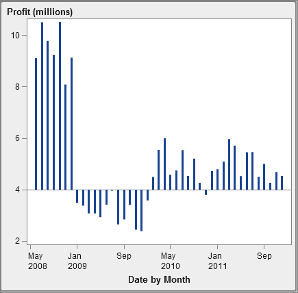
Needle Plots
A needle plot is a plot in which data points are connected by a vertical line that connects to
a horizontal
baseline. The baseline intersects the 0 value or the minimum value on the vertical axis.
Tip
This report object is not
displayed in the designer by default. You can select what you want
to display using the designer’s Show or Hide Objects window.
The following example
shows profits during a particular time period. The example specifies
an optional baseline value on the Y axis.
A Needle Plot
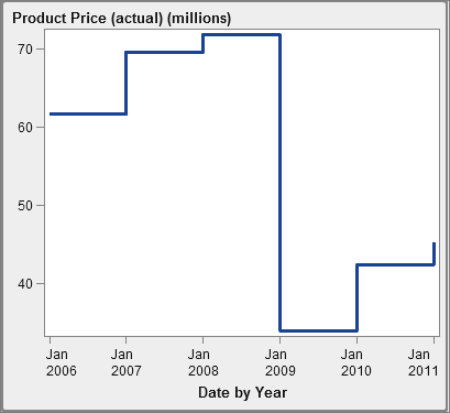
Step Plots
A step plot consists of a series of horizontal and vertical
line segments (giving the appearance of steps) that connect observations
of input data.
Note: A step plot does not support
display rules in the designer.
Tip
This report object is not
displayed in the designer by default. You can select what you want
to display using the designer’s Show or Hide Objects window.
The following example
shows the price trend during a particular time interval:
A Step Plot
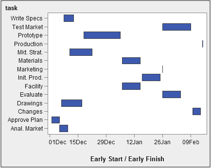
Schedule Charts
A schedule chart makes it easy to visualize time lines by representing
tasks, start dates, durations, and end dates in cascading horizontal
bar charts.
Tip
This report object is not
displayed in the designer by default. You can select what you want
to display using the designer’s Show or Hide Objects window.
A Schedule Chart
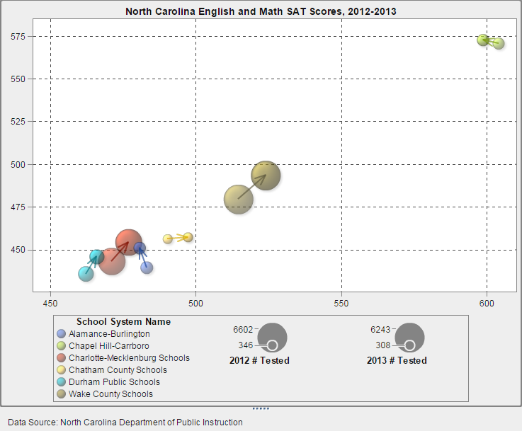
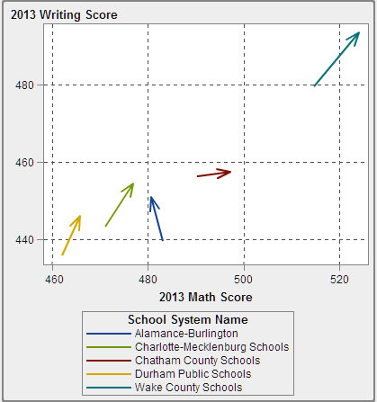
Vector Plots
A vector plot
shows the change in value of a measure using directed line segments,
or vectors, to represent both direction and magnitude at each point.
Tip
This report object is not
displayed in the designer by default. You can select what you want
to display using the designer’s Show or Hide Objects window.
The following example
shows the changes in exam scores for different North Carolina school
systems from 2012 to 2013:
A Vector Plot
For an example
that shows a vector plot enhanced with bubble plots, see Example: Vector Plot.
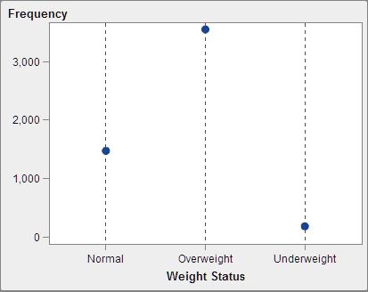
Dot Plots
A dot plot compares
data that is aggregated by the value of a category.
Tip
This report object is not
displayed in the designer by default. You can select what you want
to display using the designer’s Show or Hide Objects window.
A Dot Plot
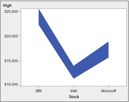
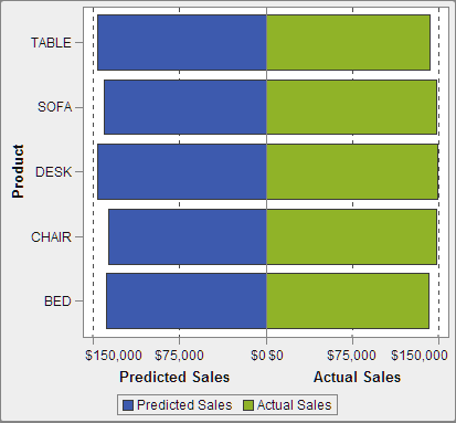
Butterfly Charts
A butterfly chart compares two measures for a category of values.
Tip
This report object is not
displayed in the designer by default. You can select what you want
to display using the designer’s Show or Hide Objects window.
A Butterfly Chart
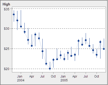
Stock High-Low Plots
A stock high-low plot tracks changes in the price of a tradable asset over time. This plot creates a display of floating vertical lines that represent
high and low stock values. The plot also displays stock closing values as markers.
Tip
This report object is not
displayed in the designer by default. You can select what you want
to display using the designer’s Show or Hide Objects window.
A Stock High-Low Plot
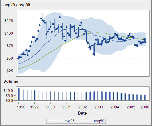
Stock Volume and Volatility Plots
A stock volume and volatility plot tracks changes in the price of a tradable asset over time with additional context.
This plot creates a display of floating vertical lines that represent high and low
stock values. The plot also displays stock closing values as markers. The plot shows
the stock’s moving average and Bollinger upper and lower bands.
Tip
This report object is not
displayed in the designer by default. You can select what you want
to display using the designer’s Show or Hide Objects window.
A Stock Volume and Volatility Plot
Copyright © SAS Institute Inc. All Rights Reserved.
Last updated: January 8, 2019