Using Graphs to Display Results
Overview of the Graph Types
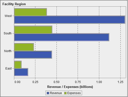
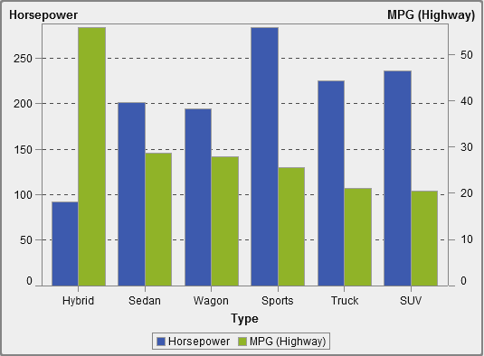
About Bar Charts
A bar chart consists
of vertical or horizontal bars that represent quantitative data. Use
bar charts to compare data that is aggregated by the distinct values
of a category.
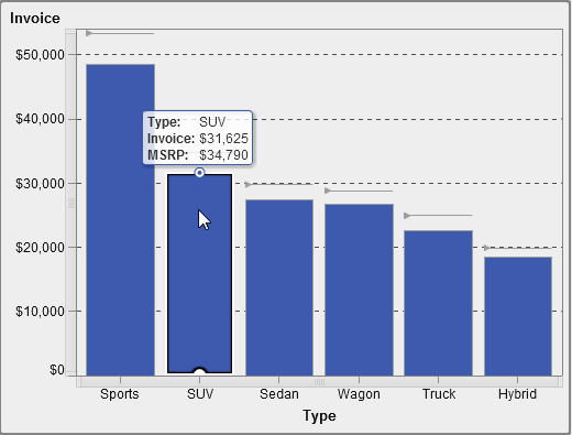
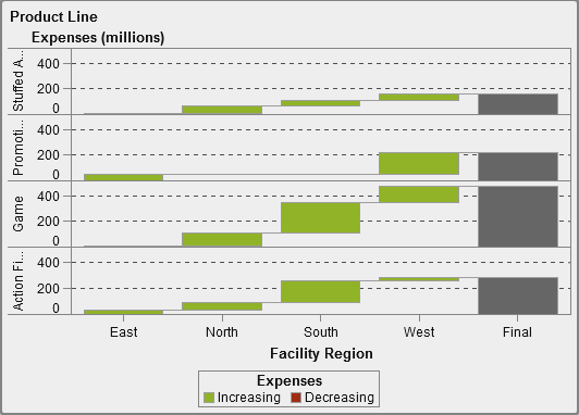
About Waterfall Charts
A waterfall
chart (also known as a progressive bar chart) shows
how the initial value of a measure increases or decreases during a
series of operations or transactions. The first bar begins at the
initial value, and each subsequent bar begins where the previous bar
ends. The length and direction of a bar indicate the magnitude and
type (positive or negative, for example) of the operation or transaction.
The resulting chart is a stepped bar showing how incremental changes
lead to the final value of the measure..
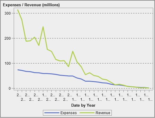
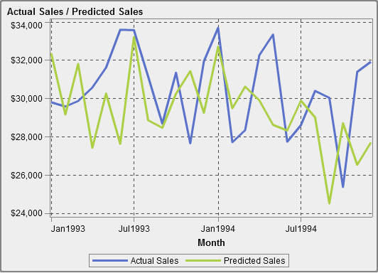
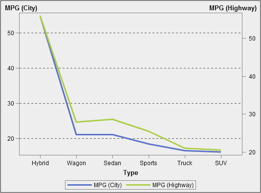
About Line Charts
A line
chart shows the relationship of one or more measures
over some interval, such as time or a series of ranges. You can measure
a single measure (univariate analysis), or you can show the relationships
among multiple measures (multivariate analysis), such as the leading
or lagging relationship between advertising and sales over time. The
category on the X axis of a line chart is discrete; the category on
the X axis of a time series plot is continuous.
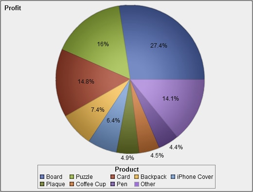
About Pie Charts
A pie chart displays
a part-to-whole relationship in a circle divided into multiple slices
for each value of a category data item based on a single measure data
item. Each slice represents the relative contribution of each part
to the whole. In a pie chart, the legend is sorted by contribution.
Effective pie charts
limit the number of slices to 5 or 6. In the designer, you can use
a rank to reduce the number of slices in a pie chart. For more information,
see Adding a New Rank.
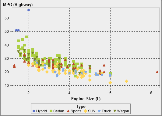
About Scatter Plots
A scatter
plot is a two-dimensional plot that shows the relationship
of two measure data items. Each marker (represented by a symbol such
as a dot, a square, or a plus sign) represents an observation. The
marker’s position indicates the value for each observation.
Use a scatter plot to examine the relationship between numeric data
items. You can apply grouping by assigning a category to the Color role.
About Bubble Plots
A bubble
plot is a variation of a scatter plot in which the markers
are replaced with bubbles. A bubble plot displays the relationships
among at least three measures. Two measures are represented by the
plot axes, and the third measure is represented by the size of the
plot markers. Each bubble represents an observation. A bubble plot
is useful for data sets with dozens to hundreds of values. You can
add categories to the Grouping and Lattice roles.
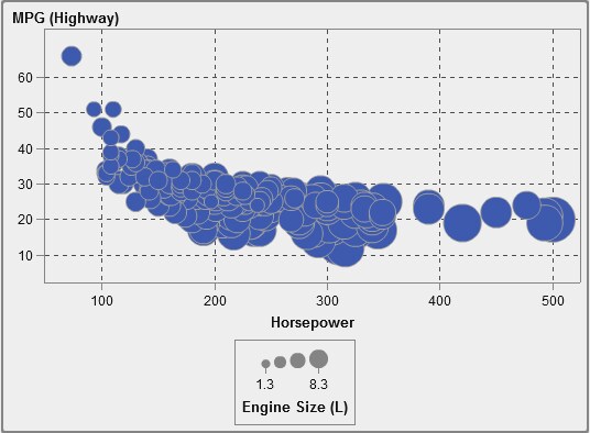
Note: A bubble’s size is
scaled relative to the minimum and maximum values of the size variable.
The minimum and maximum sizes are illustrated in the plot legend.
The actual value for each bubble is displayed as a data tip. For example,
the legend that is displayed in A Bubble Plot, the minimum size is 1.3 and the maximum size is 8.3.
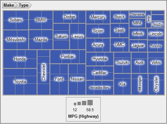
About Treemaps
A treemap displays
your data as a set of rectangles (called tiles). Each tile represents
a category or a hierarchy node. The color of each tile represents
the value of the first measure. The size of each tile represents the
value of the second measure. (There are two data roles for measures
in a treemap—Size and Color.)
For example, a sales data treemap might have tile sizes that represent
the number of orders, and it might have tile colors that are derived
from color gradients that represent sales.
Treemaps can display
a large number of category values that might be hierarchical in a
relatively small amount of space, so it is easy to see small changes
or exceptions.
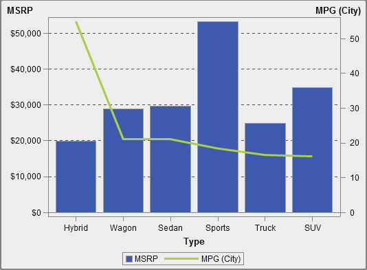
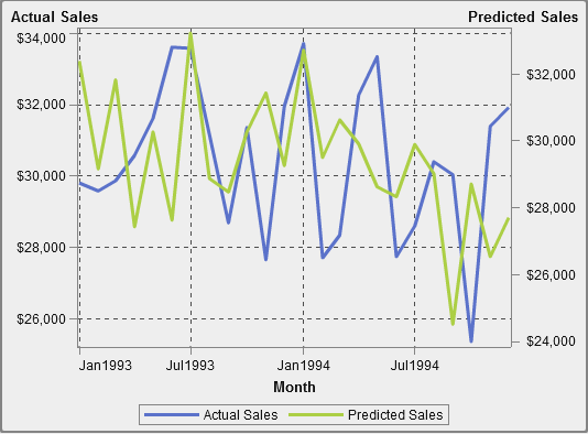
About Dual Axis Time Series Plots
A dual
axis time series plot is a variation of the time series
plot that has two measures. A measure is displayed on both the left
and right side of the Y axis.
For example, a dual
axis time series plot can be useful when you need to display two measures
that have the same unit of measurement and different scales, such
as quantity ordered and returns, or when you need to display two measures
that have different units of measurement, such as sales and quantity
ordered.


Copyright © SAS Institute Inc. All rights reserved.