| Techniques for Exploring Data |
Example
In this section you create a bar chart of the category variable in the Hurricanes data set.
| Open the Hurricanes data set. |
Note that the column heading for the category variable displays Nom to indicate that the variable is nominal.
| Create a bar chart of the category variable. |
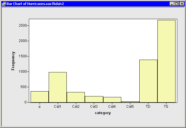
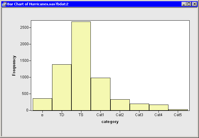
The bar chart is shown in Figure 11.7. Note that the first category
consists of missing values, and the other categories appear in
standard ASCII order.
|
Figure 11.7: Standard Ordering of the Category Data
When exploring data, it is useful to be able to reorder data
categories. The next step arranges the bar chart categories according
to frequency counts.
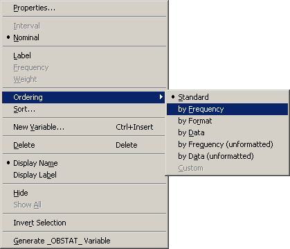
| Right-click in the data table on the column heading for the category
variable. Select Ordering |
|
Figure 11.8: Ordering by Frequency Count
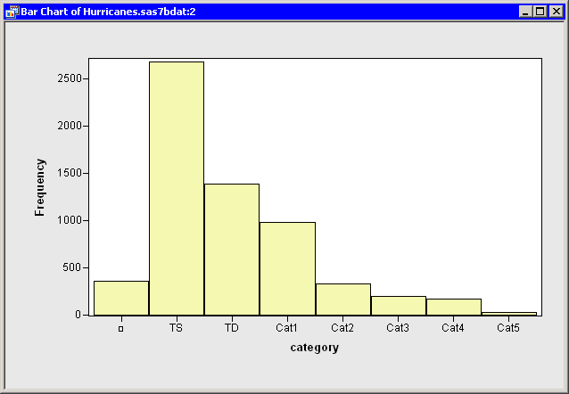
The bar chart automatically updates, as shown in Figure 11.9.
Note that the first bar still represents missing values, but that the
remaining bars are ordered by their frequency counts. This
presentation of the plot makes it easier to compare the relative
frequencies of categories.
Note that the column heading for the category variable now
displays Ord to indicate that this variable has a nonstandard
ordering.
|
Figure 11.9: The Category Data Ordered by Frequency Count
The next step arranges the bar chart categories according
to the data order of the seven nonmissing categories.
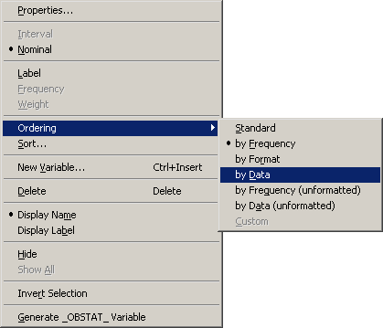
| Right-click in the data table on the column heading for the category
variable. Select Ordering |
|
Figure 11.10: Ordering by Data Set Position
The bar chart automatically updates, as shown in
Figure 11.11.
As always, the first bar represents missing values. The TD category
is ordered next, because TD is the first nonmissing value for the
category variable. The next category is TS, because as you
traverse the data starting from the top, the next unique value you
encounter is TS (the eighth observation).
The remaining categories are Cat1 (the 72nd observation),
Cat2 (the 148th observation), Cat3 (the 149th observation), Cat4 (the
155th observation), and Cat5 (the 157th observation).
|
Figure 11.11: The Category Data Ordered by Data Set Position
Arranging values by their data order is sometimes useful
when the values are inherently ordered. For example, suppose you have a
variable Y with the values Low, Medium, and High. The ASCII order for these
categories is {High, Low, Medium}. A plot displaying the categories in this order
might be confusing. One way to deal with this problem is to do the
following:
- Create a numerical indicator variable with the values {1, 2, 3} corresponding to observations with the values {Low, Medium, High} for Y. The section "Custom Transformations" describes how to create an indicator variable.
- Sort the data by the indicator variable.
- Save the sorted data.
- Close your workspace.
- Open the sorted data.
- Right-click on the column heading for the
variable, and select Ordering
 by Data.
Plots of the Y variable will display the categories in the order {Low, Medium, High}.
Although you can use the previous steps to order any single variable, you might not be able to order multiple variables simultaneously using this method. In that case, you should consult the online Help and read about the DataObject.SetVarValueOrder method.
Copyright © 2008 by SAS Institute Inc., Cary, NC, USA. All rights reserved.