| Multivariate Analysis: Principal Component Analysis |
Example
In this example, you compute principal components of several variables in the Baseball data set. The Baseball data set contains performance measures for major league baseball players in 1986. A full description of the Baseball data is included in Appendix A, "Sample Data Sets."
Suppose you are interested in exploring the sources of variation in players' performances during the 1986 season. There are six measures of players' batting performance: no_atbat, no_hits, no_home, no_runs, no_rbi, and no_bb. There are three measures of players' fielding performance: no_outs, no_assts, and no_error. These data form a nine-dimensional space. The goal of this example is to use principal component analysis to capture most of the variance of these data in a low-dimensional subspace - preferably in two or three dimensions. The subspace will be formed by the span of the first few principal components. (Recall that the span of a set of vectors is the vector space consisting of all linear combinations of the vectors.)
| Open the Baseball data set. |
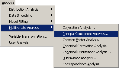
| Select Analysis |
|
Figure 26.1: Selecting the Principal Component Analysis
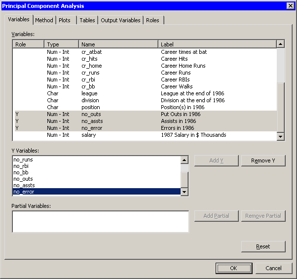
A dialog box appears as in Figure 26.2.
You can select variables for the analysis
by using the Variables tab.
| Select no_atbat. While holding down the CTRL key, select no_hits, no_home, no_runs, no_rbi, and no_bb. Click Add Y. |
Note: Alternately, you can select the variables by using contiguous selection: click on the first item, hold down the SHIFT key, and click on the last item. All items between the first and last item are selected and can be added by clicking Add Y.
The three measures of fielding performance are located near the end of the list of variables.
| Scroll to the end of the variable list. Select no_outs. While holding down the CTRL key, select no_assts and no_error. Click Add Y. |
|
Figure 26.2: The Variables Tab
| Click the Method tab. |
The Method tab (Figure 26.4) becomes active. You can use the Method tab to set options in the analysis.
By default, the analysis is carried out on the correlation matrix. The alternative is to use the covariance matrix. The covariance matrix is recommended only when all the variables are measured in comparable units. For this example, the correlation matrix is appropriate.
By default, the analysis computes all ![]() principal components for the
principal components for the
![]() variables selected in the Variables tab. It is often
sufficient to compute a smaller number of principal components.
variables selected in the Variables tab. It is often
sufficient to compute a smaller number of principal components.
| Set Number of principal components to 4. |

|
Figure 26.3: The Method Tab
| Click the Plots tab. |
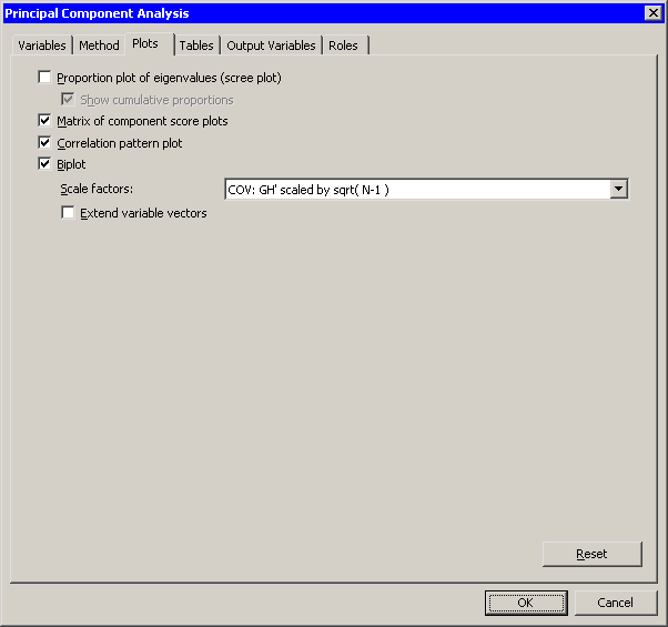
The Plots tab (Figure 26.4) becomes active.
| Clear Proportion plot of eigenvalues (scree plot). |
| Select Matrix of component score plots. |
| Click OK. |
|
Figure 26.4: The Plots Tab
The analysis calls the PRINCOMP procedure, which uses the options
specified in the dialog box. The procedure displays tables in the
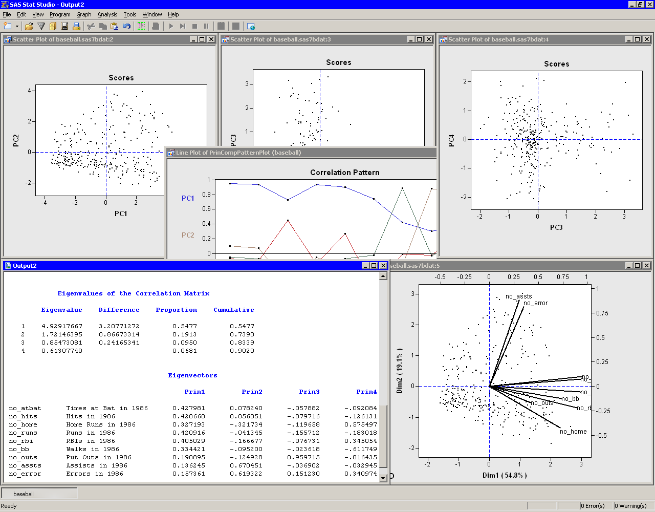
output document, as shown in Figure 26.5. The
"Simple Statistics" table displays
the mean and standard
deviation for each variable. (The "Simple Statistics" table is not
visible in Figure 26.5. You can scroll through the output window
to view it.) The "Correlation Matrix" table (also not
shown) displays the correlation between each pair of variables.
The "Eigenvalues of the Correlation Matrix" table
contains all the eigenvalues
of
the correlation matrix, differences between
successive eigenvalues, the proportion of
variance explained by each eigenvalue, and the
cumulative proportion of the variance explained.
The eigenvalues correspond to the principal
components and represent a partitioning of the
total variation in the sample.
Because correlations are used, the sum of all the
eigenvalues is equal to the number of variables.
The first row of the table corresponds to the
first principal component, the second row to
the second principal component, and so on.
In this example, the first three principal components
account for over 83% of the variation; the first four
account for 90%.
|
Figure 26.5: Output from a Principal Component Analysis
The "Eigenvectors" table contains the first four
eigenvectors
of the correlation matrix.
The eigenvectors are
principal component vectors.
The first column of the table corresponds to the
first principal component, the second column to
the second principal component, and so on.
Each principal component is a
linear combination of the Y variables.
For example,
the first principal component corresponds to the
linear combination
The first principal component (PC1) appears to be a weighted measure of the players' overall performance, as seen by the relative magnitudes of the coefficients. More weight is given to batting performance (the batting coefficients are in the range 0.33--0.43) than to fielding performance (the fielding coefficients are in the range 0.14--0.19). The second principal component (PC2) is primarily related to the no_assts and no_error variables. Players with large values of PC2 have many assists, but also relatively many errors. The third component (PC3) is primarily related to the no_outs variable. The fourth component is a contrast between no_home and no_bb (that is, between home runs and walks). This component separates players with many home runs and few walks from the players who often walk and rarely hit a home run.
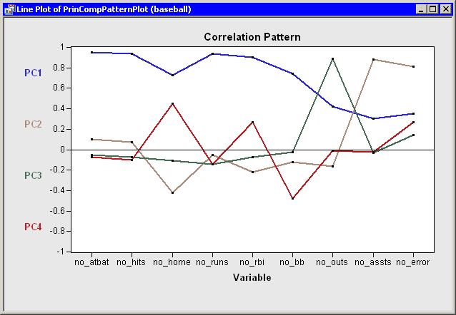
You can use the correlation pattern plot
(Figure 26.6) to
examine correlations between the principal components and the original
variables. For example, the first principal component (PC1) is
positively correlated with all of the original variables. It is
correlated more with batting performance than with the fielding variables.
|
Figure 26.6: Correlation Pattern Plot
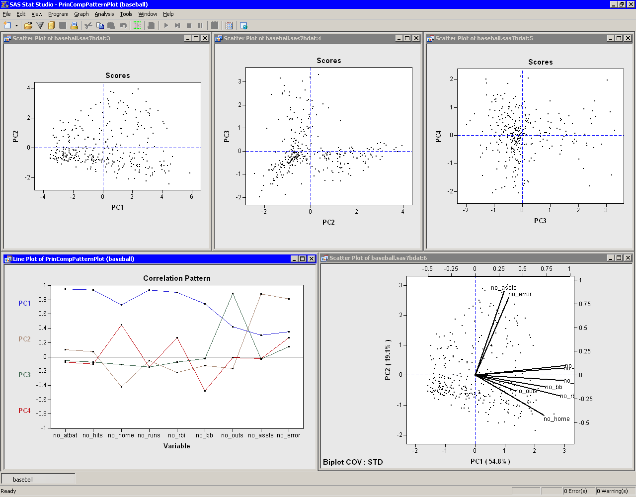
The relationship between the
original variables and observations is shown in the biplot, at the lower
right of Figure 26.7.
The line segments represent the projection of a vector in the
direction of each original variable onto a two-dimensional subspace.
The points in the biplot are the projection of the observations onto
the same two-dimensional subspace. The section "Biplots"
discusses biplots in further detail.
|
Figure 26.7: Graphs from a Principal Component Analysis
The plots tiled across the top of Figure 26.7 are called
score plots.
These are plots of the observations in the
coordinate system defined by the principal components.
For these data, each observation represents a player. The following steps set the value of the name variable to be the label you see when you click on an observation.
| Click on the score plot of PC2 versus PC1 to activate it. |
| Press the F9 key to display the data table associated with this plot. |
| Right-click on the variable heading for name to display the Variables menu. Select Label. |
| Click in the upper-left cell of the data table to deselect the variable. |
| Close the data table. |
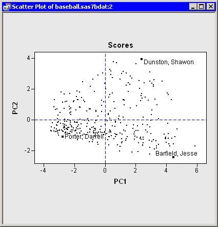
| Click on some observations in the score plot of PC2 versus PC1, as shown in Figure 26.8. |
The first principal component measures a player's hitting performance
during the 1986 season. Consequently, players to the right (such as
Jesse Barfield) had strong
hitting statistics, whereas players to the left (such as Darrell
Porter) had weaker statistics.
The second principal component primarily measures the number of
assists (and errors) for each player. Consequently, players near the top
of the plot (such as Shawon Dunston) have many assists, whereas
players near the bottom (such as Jesse Barfield) have few.
|
Figure 26.8: Score Plot of First Two Principal Components
The score plot of the second and third principal components is
interesting because it compares two different measures of fielding
performance. Also, there are few players in the first quadrant of the
plot. Recall that the third principal component primarily measures
the no_outs variable. This variable records
putouts. Common situations leading to a putout include tagging or
forcing out a base runner, catching a fly ball, or (for catchers)
catching a third strike.
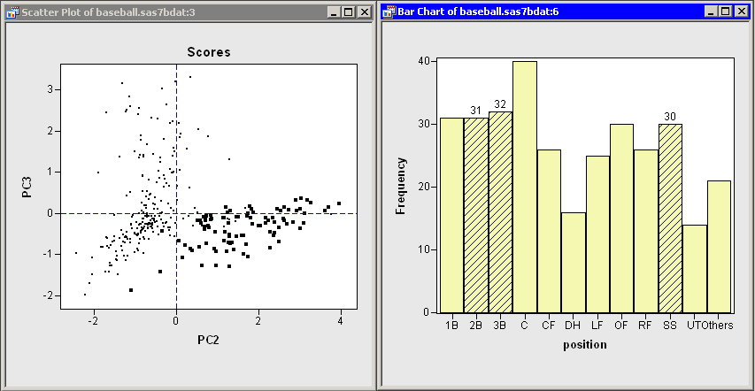
The opportunities for a player to get a putout or
an assist are highly dependent on the player's position.
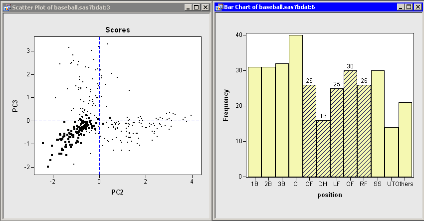
Figure 26.9 shows the score plot for the positions of
second base, third base, and shortstop. Note that these observations
primarily lie in the fourth quadrant. These players have many
assists because they often field ground balls and throw to first base,
but they have relatively few opportunities to put out runners themselves.
In contrast, Figure 26.10 shows the score plot for
outfielders and designated hitters. These observations lie in the
third quadrant. These players have few
assists and relatively few putouts. (The outfielders are credited with
a putout when they catch a fly ball, but there are many fewer
fly balls than ground balls in a typical game.) Catchers and first
basemen (not shown) have scores primarily in the second quadrant of
the plot, corresponding to many putouts but few assists.
|
Figure 26.9: Fielding Scores for Some Infielders
|
Figure 26.10: Fielding Scores for Outfielders and Designated Hitters
In summary, the analysis shows that most of the
variation in these data occurs in the first principal component: an
overall measure of batting performance. The next two principal
components incorporate variation due to fielding
performance. Figure 26.9 and
Figure 26.10 show that the source of this fielding
variation is differences in player positions. Together, these three
components account for 83% of the variation in the nine-dimensional
space of the original variables.
Principal components can also be used as explanatory variables in regression. For example, you could examine how well overall batting performance in 1986 predicts a player's salary by using PC1 as an explanatory variable in a regression model.
Copyright © 2008 by SAS Institute Inc., Cary, NC, USA. All rights reserved.