| Adjusting Axes and Ticks |
Adjusting Axes and Ticks
In Chapter 3, "Creating Dynamically Linked Graphics," you created standard statistical graphics. In this chapter, you learn how to adjust the range and location of tick marks on axes. You also learn how to change the label for an axis. You cannot adjust the tick locations for nominal variables (for example, the horizontal axis on a bar chart), but you can change the axis label.
The program statements in this chapter are distributed with Stat Studio. To open the program containing the statements:
- Select File
 Open File from the main menu.
- Click Go to Installation directory near the bottom of the dialog box.
- Navigate to the Programs\Doc\STATGuide folder.
- Select the Axes.sx file.
- Click Open.
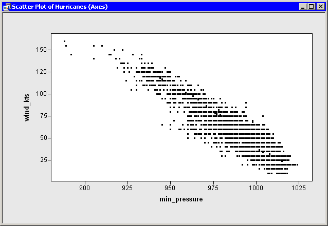
First, open the Hurricanes data set and create a scatter plot.
Type or copy the following statements into the program window, and select
Program ![]() Run from the main menu.
Run from the main menu.
 declare DataObject dobj;
 dobj = DataObject.CreateFromFile("Hurricanes");

 declare ScatterPlot plot;
 plot = ScatterPlot.Create( dobj, "min_pressure", "wind_kts" );
The plot in Figure 9.1 appears.
Stat Studio tries to make appropriate choices for the location of
ticks and for the minimum and maximum of the axis view
range. However, sometimes you might want to change
characteristics of the axes.
|
Figure 9.1: Default Axes
There are several methods in the Plot class that can be used to
change the way that axes are displayed. These methods all begin with
the prefix SetAxis. For example:
- The SetAxisLabel method changes the axis label.
- The SetAxisTickUnit method changes the increment between tick marks.
- The SetAxisTickAnchor method shifts the location of tick marks along an axis. (The argument to SetTickAnchor must be a number between the minimum and maximum values of the axis tick range.)
- The SetAxisMinorTicks method adds minor tick marks (that is, unlabeled tick marks between major ticks).
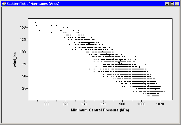
Suppose you want to change the horizontal axis in the following ways:
- Label the axis with the variable's label instead of the variable's name.
- Change the size of the increment between successive ticks from 25 to 20 so that the ticks marks are located at 900, 920, ..., 1020.
- Add one minor tick mark between each major tick.
To make these changes, add the following
statements at the bottom of the program window, and select Program
![]() Run from the main menu. Figure 9.2 shows the new
label, minor ticks, and tick placement for the horizontal axis.
Run from the main menu. Figure 9.2 shows the new
label, minor ticks, and tick placement for the horizontal axis.
 plot.SetAxisLabel ( XAXIS, AXISLABEL_VARLABEL );
 plot.SetAxisTickUnit( XAXIS, 20 );
 plot.SetAxisTickAnchor( XAXIS, 900 );
 plot.SetAxisMinorTicks( XAXIS, 1 );
|
Figure 9.2: New Horizontal Axis
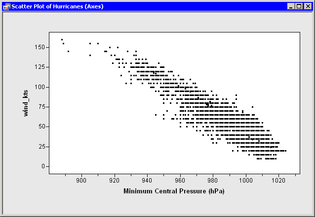
By default, the axis view range is determined by the minimum and maximum values of the axis variable. (More precisely, it is determined by the minimum and maximum values that are included in the plots.) At times you might want to override that default. A common reason for doing this is to include a reference value (for example, zero) in the plot, even though there are no observations with that value.
As an example of changing the axis view range, suppose you want the
vertical axis (the wind_kts axis) to show zero wind speed as in
Figure 9.3.
To change the ticks on the horizontal axis, add the following
statement at the bottom of the program window, and select
Program ![]() Run from the main menu.
Run from the main menu.
plot.SetAxisViewRange( YAXIS, 0, 160 );
|
Figure 9.3: Vertical Axis Range That Includes Zero
Up to this point, this example has shown you how to contruct uniformly spaced tick marks at locations of your choosing. You can also draw tick marks that are not uniformly spaced using the SetAxisTicks method of the Plot class. This method can also be used to display labels for ticks that are different from the numerical values of the ticks. For example, you might decide that you want the tick marks on the vertical axis to show the categories of the Saffir-Simpson intensity scale (Table 9.1).
Table 9.1: The Saffir-Simpson Intensity Scale| Category | Wind Speed (knots) |
|---|---|
| Tropical Depression (TD) | 22 - 34 |
| Tropical Storm (TS) | 34 - 64 |
| Category 1 Hurricane (Cat1) | 64 - 83 |
| Category 2 Hurricane (Cat2) | 83 - 96 |
| Category 3 Hurricane (Cat3) | 96 - 114 |
| Category 4 Hurricane (Cat4) | 114 - 135 |
| Category 5 Hurricane (Cat5) | greater than 135 |
Add the following statements at the bottom of the program window, and select
Program ![]() Run from the main menu. Figure 9.4
shows the tick locations and labels for the vertical axis.
Run from the main menu. Figure 9.4
shows the tick locations and labels for the vertical axis.
 plot.SetAxisLabel( YAXIS, "Intensity" );
 StormTicks  = {22 34 64 83 96 114 135};
 StormLabels = {'TD' 'TS' 'Cat1' 'Cat2' 'Cat3' 'Cat4' 'Cat5'};
 plot.SetAxisTicks( YAXIS, StormTicks, StormLabels );
 plot.ShowAxisReferenceLines( YAXIS );

|
Figure 9.4: Vertical Axis with Custom Ticks
Adjusting Tick Marks for Histograms