The GLIMMIX Procedure
-
Overview

-
Getting Started
-
SyntaxPROC GLIMMIX StatementBY StatementCLASS StatementCODE StatementCONTRAST StatementCOVTEST StatementEFFECT StatementESTIMATE StatementFREQ StatementID StatementLSMEANS StatementLSMESTIMATE StatementMODEL StatementNLOPTIONS StatementOUTPUT StatementPARMS StatementRANDOM StatementSLICE StatementSTORE StatementWEIGHT StatementProgramming StatementsUser-Defined Link or Variance Function
-
DetailsGeneralized Linear Models TheoryGeneralized Linear Mixed Models TheoryGLM Mode or GLMM ModeStatistical Inference for Covariance ParametersDegrees of Freedom MethodsEmpirical Covariance (Sandwich) EstimatorsExploring and Comparing Covariance MatricesProcessing by SubjectsRadial Smoothing Based on Mixed ModelsOdds and Odds Ratio EstimationParameterization of Generalized Linear Mixed ModelsResponse-Level Ordering and ReferencingComparing the GLIMMIX and MIXED ProceduresSingly or Doubly Iterative FittingDefault Estimation TechniquesDefault OutputNotes on Output StatisticsODS Table NamesODS Graphics
-
ExamplesBinomial Counts in Randomized BlocksMating Experiment with Crossed Random EffectsSmoothing Disease Rates; Standardized Mortality RatiosQuasi-likelihood Estimation for Proportions with Unknown DistributionJoint Modeling of Binary and Count DataRadial Smoothing of Repeated Measures DataIsotonic Contrasts for Ordered AlternativesAdjusted Covariance Matrices of Fixed EffectsTesting Equality of Covariance and Correlation MatricesMultiple Trends Correspond to Multiple Extrema in Profile LikelihoodsMaximum Likelihood in Proportional Odds Model with Random EffectsFitting a Marginal (GEE-Type) ModelResponse Surface Comparisons with Multiplicity AdjustmentsGeneralized Poisson Mixed Model for Overdispersed Count DataComparing Multiple B-SplinesDiallel Experiment with Multimember Random EffectsLinear Inference Based on Summary Data
- References
Graphics for LS-Mean Comparisons
The following subsections provide information about the ODS statistical graphics for least squares means produced by the GLIMMIX procedure. Mean plots display marginal or interaction means. The diffogram, control plot, and ANOM plot display least squares mean comparisons.
Mean Plots
The following SAS statements request a plot of the Pressure![]()
Temp means in which the pressure trends are plotted for each temperature.
ods graphics on;
ods select CovParms Tests3 MeanPlot;
proc glimmix data=Yields;
   class Vendor Pressure Temp;
   model Yield = Pressure Temp Pressure*Temp;
   random Vendor;
   lsmeans Pressure*Temp / plot=mean(sliceby=Temp join);
run;
ods graphics off;
There is a significant effect of temperature and an interaction between pressure and temperature (Figure 41.24). Notice that the pressure main effect might be masked by the interaction. Because of the interaction, temperature comparisons
depend on the pressure and vice versa. The mean plot option requests a display of the Pressure ![]()
Temp least squares means with separate trends for each temperature (Figure 41.25).
Figure 41.24: Tests for Fixed Effects
| Covariance Parameter Estimates | ||
|---|---|---|
| Cov Parm | Estimate | Standard Error |
| Vendor | 0.8602 | 0.7406 |
| Residual | 1.1039 | 0.3491 |
| Type III Tests of Fixed Effects | ||||
|---|---|---|---|---|
| Effect | Num DF | Den DF | F Value | Pr > F |
| Pressure | 2 | 20 | 1.42 | 0.2646 |
| Temp | 1 | 20 | 6.48 | 0.0193 |
| Pressure*Temp | 2 | 20 | 3.82 | 0.0393 |
The interaction between the two effects is evident in the lack of parallelism in Figure 41.25. The masking of the pressure main effect can be explained by slopes of different sign for the two trends. Based on these results, inferences about the pressure effects are conducted for a specific temperature. For example, Figure 41.26 is produced by adding the following statement:
lsmeans pressure*temp / slicediff=temp slice=temp;
Figure 41.25: Interaction Plot for Pressure x Temperature
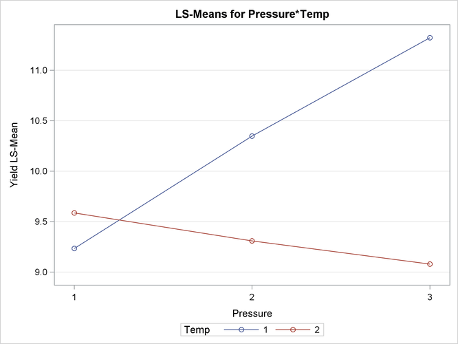
Figure 41.26: Pressure Comparisons at a Given Temperature
| Tests of Effect Slices for Pressure*Temp Sliced By Temp |
||||
|---|---|---|---|---|
| Temp | Num DF | Den DF | F Value | Pr > F |
| 1 | 2 | 20 | 4.95 | 0.0179 |
| 2 | 2 | 20 | 0.29 | 0.7508 |
| Simple Effect Comparisons of Pressure*Temp Least Squares Means By Temp | |||||||
|---|---|---|---|---|---|---|---|
| Simple Effect Level |
Pressure | _Pressure | Estimate | Standard Error | DF | t Value | Pr > |t| |
| Temp 1 | 1 | 2 | -1.1140 | 0.6645 | 20 | -1.68 | 0.1092 |
| Temp 1 | 1 | 3 | -2.0900 | 0.6645 | 20 | -3.15 | 0.0051 |
| Temp 1 | 2 | 3 | -0.9760 | 0.6645 | 20 | -1.47 | 0.1575 |
| Temp 2 | 1 | 2 | 0.2760 | 0.6645 | 20 | 0.42 | 0.6823 |
| Temp 2 | 1 | 3 | 0.5060 | 0.6645 | 20 | 0.76 | 0.4553 |
| Temp 2 | 2 | 3 | 0.2300 | 0.6645 | 20 | 0.35 | 0.7329 |
The slope differences are evident by the change in sign for comparisons within temperature 1 and within temperature 2. There is a significant effect of pressure at temperature 1 (p = 0.0179), but not at temperature 2 (p = 0.7508).
Pairwise Difference Plot (Diffogram)
Graphical displays of LS-means-related analyses consist of plots of all pairwise differences (DiffPlot), plots of differences against a control level (ControlPlot), and plots of differences against an overall average (AnomPlot). The following data set is from an experiment to investigate how snapdragons grow in various soils (Stenstrom, 1940). To eliminate the effect of local fertility variations, the experiment is run in blocks, with each soil type sampled in each block. See the “Examples” section of Chapter 42: The GLM Procedure, for an in-depth analysis of these data.
data plants;
   input Type $ @;
   do Block = 1 to 3;
      input StemLength @;
      output;
   end;
   datalines;
Clarion   32.7 32.3 31.5
Clinton   32.1 29.7 29.1
Knox      35.7 35.9 33.1
ONeill    36.0 34.2 31.2
Compost   31.8 28.0 29.2
Wabash    38.2 37.8 31.9
Webster   32.5 31.1 29.7
;
The following statements perform the analysis of the experiment with the GLIMMIX procedure:
ods graphics on;
ods select LSMeans DiffPlot;

proc glimmix data=plants order=data plots=Diffogram;
   class Block Type;
   model StemLength = Block Type;
   lsmeans Type;
run;

ods graphics off;
The PLOTS= option in the PROC GLIMMIX statement requests that plots of pairwise least squares means differences are produced for effects that are listed in corresponding
LSMEANS statements. This is the Type effect.
The Type LS-means are shown in Figure 41.27. Note that the order in which the levels appear corresponds to the order in which they were read from the data set. This
was accomplished with the ORDER=DATA option in the PROC GLIMMIX statement.
Figure 41.27: Least Squares Means for Type Effect
| Type Least Squares Means | |||||
|---|---|---|---|---|---|
| Type | Estimate | Standard Error | DF | t Value | Pr > |t| |
| Clarion | 32.1667 | 0.7405 | 12 | 43.44 | <.0001 |
| Clinton | 30.3000 | 0.7405 | 12 | 40.92 | <.0001 |
| Knox | 34.9000 | 0.7405 | 12 | 47.13 | <.0001 |
| ONeill | 33.8000 | 0.7405 | 12 | 45.64 | <.0001 |
| Compost | 29.6667 | 0.7405 | 12 | 40.06 | <.0001 |
| Wabash | 35.9667 | 0.7405 | 12 | 48.57 | <.0001 |
| Webster | 31.1000 | 0.7405 | 12 | 42.00 | <.0001 |
Because there are seven levels of Type in this analysis, there are ![]() pairwise comparisons among the least squares means. The comparisons are performed in the following fashion: the first level
of
pairwise comparisons among the least squares means. The comparisons are performed in the following fashion: the first level
of Type is compared against levels 2 through 7; the second level of Type is compared against levels 3 through 7; and so forth.
The default difference plot for these data is shown in Figure 41.28. The display is also known as a “mean-mean scatter plot” (Hsu, 1996; Hsu and Peruggia, 1994). It contains 21 lines rotated by 45 degrees counterclockwise, and a reference line (dashed 45-degree line). The ![]() coordinate for the center of each line corresponds to the two least squares means being compared. Suppose that
coordinate for the center of each line corresponds to the two least squares means being compared. Suppose that ![]() and
and ![]() denote the ith and jth least squares mean, respectively, for the effect in question, where
denote the ith and jth least squares mean, respectively, for the effect in question, where ![]() according to the ordering of the effect levels. If the ABS option is in effect, which is the default, the line segment is
centered at
according to the ordering of the effect levels. If the ABS option is in effect, which is the default, the line segment is
centered at ![]() . Take, for example, the comparison of “Clarion” and “Compost” types. The respective estimates of their LS-means are
. Take, for example, the comparison of “Clarion” and “Compost” types. The respective estimates of their LS-means are ![]() and
and ![]() . The center of the line segment for
. The center of the line segment for ![]() is placed at
is placed at ![]() .
.
The length of the line segment for the comparison between means i and j corresponds to the width of the confidence interval for the difference ![]() . This length is adjusted for the rotation in the plot. As a consequence, comparisons whose confidence interval covers zero
cross the 45-degree reference line. These are the nonsignificant comparisons. Lines associated with significant comparisons
do not touch or cross the reference line. Because these data are balanced, the estimated standard errors of all pairwise comparisons
are identical, and the widths of the line segments are the same.
. This length is adjusted for the rotation in the plot. As a consequence, comparisons whose confidence interval covers zero
cross the 45-degree reference line. These are the nonsignificant comparisons. Lines associated with significant comparisons
do not touch or cross the reference line. Because these data are balanced, the estimated standard errors of all pairwise comparisons
are identical, and the widths of the line segments are the same.
Figure 41.28: LS-Means Plot of Pairwise Differences
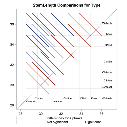
The background grid of the difference plot is drawn at the values of the least squares means for the seven type levels. These grid lines are used to find a particular comparison by intersection. Also, the labels of the grid lines indicate
the ordering of the least squares means.
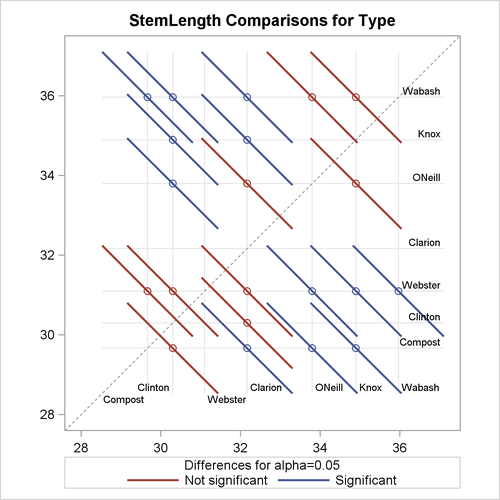
In the next set of statements, the NOABS and CENTER suboptions of the PLOTS=DIFFOGRAM option in the LSMEANS statement modify the appearance of the diffogram:
ods graphics on;
proc glimmix data=plants order=data;
   class Block Type;
   model StemLength = Block Type;
   lsmeans Type / plots=diffogram(noabs center);
run;
ods graphics off;
The NOABS suboption of the difference plot changes the way in which the GLIMMIX procedure places the line segments (Figure 41.29). If the NOABS suboption is in effect, the line segment is centered at the point ![]() ,
, ![]() . For example, the center of the line segment for a comparison of “Clarion” and “Compost” types is centered at
. For example, the center of the line segment for a comparison of “Clarion” and “Compost” types is centered at ![]() . Whether a line segment appears above or below the reference line depends on the magnitude of the least squares means and
the order of their appearance in the “Least Squares Means” table. The CENTER suboption places a marker at the intersection of the least squares means.
. Whether a line segment appears above or below the reference line depends on the magnitude of the least squares means and
the order of their appearance in the “Least Squares Means” table. The CENTER suboption places a marker at the intersection of the least squares means.
Because the ABS option places lines on the same side of the 45-degree reference, it can help to visually discover groups of significant and nonsignificant differences. On the other hand, when the number of levels in the effect is large, the display can get crowded. The NOABS option can then provide a more accessible resolution.
Figure 41.29: Diffogram with NOABS and CENTER Options
Least Squares Mean Control Plot
The following SAS statements create the same data set as before, except that one observation for Type=“Knox” has been removed for illustrative purposes:
data plants;
   input Type $ @;
   do Block = 1 to 3;
      input StemLength @;
      output;
   end;
   datalines;
Clarion   32.7 32.3 31.5
Clinton   32.1 29.7 29.1
Knox      35.7 35.9   .
ONeill    36.0 34.2 31.2
Compost   31.8 28.0 29.2
Wabash    38.2 37.8 31.9
Webster   32.5 31.1 29.7
;
The following statements request control plots for effects in LSMEANS statements with compatible option:
ods graphics on;
ods select Diffs ControlPlot;

proc glimmix data=plants order=data plots=ControlPlot;
   class Block Type;
   model StemLength = Block Type;
   lsmeans Type / diff=control('Clarion') adjust=dunnett;
run;

ods graphics off;
The LSMEANS statement for the Type effect is compatible; it requests comparisons of Type levels against “Clarion,” adjusted for multiplicity with Dunnett’s method. Because “Clarion” is the first level of the effect, the LSMEANS statement is equivalent to
lsmeans type / diff=control adjust=dunnett;
The “Differences of Type Least Squares Means” table in Figure 41.30 shows the six comparisons between Type levels and the control level.
Figure 41.30: Least Squares Means Differences
| Differences of Type Least Squares Means Adjustment for Multiple Comparisons: Dunnett |
|||||||
|---|---|---|---|---|---|---|---|
| Type | _Type | Estimate | Standard Error | DF | t Value | Pr > |t| | Adj P |
| Clinton | Clarion | -1.8667 | 1.0937 | 11 | -1.71 | 0.1159 | 0.3936 |
| Knox | Clarion | 2.7667 | 1.2430 | 11 | 2.23 | 0.0479 | 0.1854 |
| ONeill | Clarion | 1.6333 | 1.0937 | 11 | 1.49 | 0.1635 | 0.5144 |
| Compost | Clarion | -2.5000 | 1.0937 | 11 | -2.29 | 0.0431 | 0.1688 |
| Wabash | Clarion | 3.8000 | 1.0937 | 11 | 3.47 | 0.0052 | 0.0236 |
| Webster | Clarion | -1.0667 | 1.0937 | 11 | -0.98 | 0.3504 | 0.8359 |
The two rightmost columns of the table give the unadjusted and multiplicity-adjusted p-values. At the 5% significance level, both “Knox” and “Wabash” differ significantly from “Clarion” according to the unadjusted tests. After adjusting for multiplicity, only “Wabash” has a least squares mean significantly different from the control mean. Note that the standard error for the comparison involving “Knox” is larger than that for other comparisons because of the reduced sample size for that soil type.
In the plot of control differences a horizontal line is drawn at the value of the “Clarion” least squares mean. Vertical lines emanating from this reference line terminate in the least squares means for the other levels (Figure 41.31).
The dashed upper and lower horizontal reference lines are the upper and lower decision limits for tests against the control
level. If a vertical line crosses the upper or lower decision limit, the corresponding least squares mean is significantly
different from the LS-mean in the control group. If the data had been balanced, the UDL and LDL would be straight lines, because
all estimates ![]() would have had the same standard error. The limits for the comparison between “Knox” and “Clarion” are wider than for other comparisons, because of the reduced sample size for the “Knox” soil type.
would have had the same standard error. The limits for the comparison between “Knox” and “Clarion” are wider than for other comparisons, because of the reduced sample size for the “Knox” soil type.
Figure 41.31: LS-Means Plot of Differences against a Control
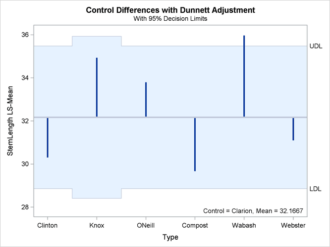
The significance level of the decision limits is determined from the ALPHA= level in the LSMEANS statement. The default are 95% limits. If you choose one-sided comparisons with DIFF=CONTROLL or DIFF=CONTROLU in the LSMEANS statement, only one of the decision limits is drawn.
Analysis of Means (ANOM) Plot
The analysis of means in PROC GLIMMIX compares least squares means not by contrasting them against each other as with all
pairwise differences or control differences. Instead, the least squares means are compared against an average value. Consequently,
there are k comparisons for a factor with k levels. The following statements request ANOM differences for the Type least squares means (Figure 41.32) and plots the differences (Figure 41.33):
ods graphics on;
ods select Diffs AnomPlot;
proc glimmix data=plants order=data plots=AnomPlot;
   class Block Type;
   model StemLength = Block Type;
   lsmeans Type / diff=anom;
run;
ods graphics off;
Figure 41.32: ANOM LS-Mean Differences
| Differences of Type Least Squares Means | ||||||
|---|---|---|---|---|---|---|
| Type | _Type | Estimate | Standard Error | DF | t Value | Pr > |t| |
| Clarion | Avg | -0.2635 | 0.7127 | 11 | -0.37 | 0.7186 |
| Clinton | Avg | -2.1302 | 0.7127 | 11 | -2.99 | 0.0123 |
| Knox | Avg | 2.5032 | 0.9256 | 11 | 2.70 | 0.0205 |
| ONeill | Avg | 1.3698 | 0.7127 | 11 | 1.92 | 0.0809 |
| Compost | Avg | -2.7635 | 0.7127 | 11 | -3.88 | 0.0026 |
| Wabash | Avg | 3.5365 | 0.7127 | 11 | 4.96 | 0.0004 |
| Webster | Avg | -1.3302 | 0.7127 | 11 | -1.87 | 0.0888 |
At the 5% level, the “Clarion,” “O’Neill,” and “Webster” soil types are not significantly different from the average. Note that the artificial lack of balance introduced previously reduces the precision of the ANOM comparison for the “Knox” soil type.
Figure 41.33: LS-Means Analysis of Means (ANOM) Plot
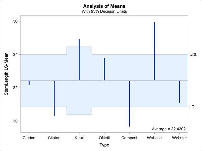
The reference line in the ANOM plot is drawn at the average. Vertical lines extend from this reference line upward or downward, depending on the magnitude of the least squares means compared to the reference value. This enables you to quickly see which levels perform above and below the average. The horizontal reference lines are 95% upper and lower decision limits. If a vertical line crosses the limits, you conclude that the least squares mean is significantly different (at the 5% significance level) from the average. You can adjust the comparisons for multiplicity by adding the ADJUST=NELSON option in the LSMEANS statement.