| The PROBIT Procedure |
| Traditional High-Resolution Graphics |
This section provides examples of using syntax available with the traditional high-resolution plots. There are four plot statements that you can use to request traditional high-resolution plots: CDFPLOT, IPPPLOT, LPREDPLOT, and PREDPPLOT. Some of these statements apply only to either the binomial model or the multinomial model. Table 72.33 shows the availability of these statements for different models.
Statement |
Binomial |
Multinomial |
|
CDFPLOT |
No |
Yes |
|
IPPPLOT |
Yes |
No |
|
LPREDPLOT |
Yes |
Yes |
|
PREDPPLOT |
Yes |
Yes |
An alternative is to use ODS Graphics to obtain these plots. See the section ODS Graphics for details.
The following example uses the data set study in the section Estimating the Natural Response Threshold Parameter to illustrate how to create high-resolution plots for the binomial model:
proc probit data=study log10 optc;
   model respond/number=dose;
   predpplot var=dose cfit=blue; inset;
   lpredplot var=dose cfit=blue; inset;
   ippplot   var=dose cfit=blue; inset/pos=se;
run;
All plot statements must follow the MODEL statement. The VAR= option specifies a continuous independent variable (dose variable) against which the predicted probability or the linear predictor is plotted. The INSET statement requests the inset box with summary information. See the section INSET Statement for more details.
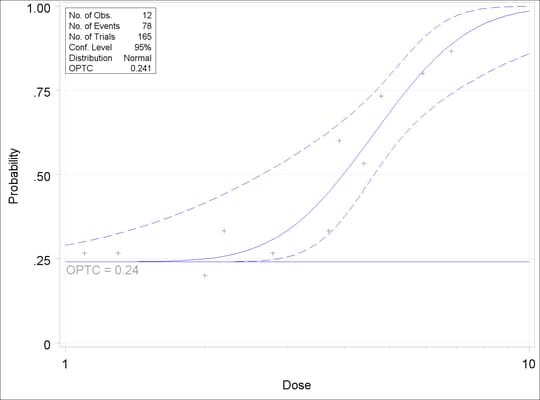
The PREDPPLOT statement creates the plot in Figure 72.6. This plot, similar to that in Figure 72.4, shows the relationship between dosage level, observed response proportions, and estimated probability values. The dashed lines represent pointwise confidence bands for the fitted probabilities, which can be suppressed with the NOCONF option. See the section PREDPPLOT Statement for more details.
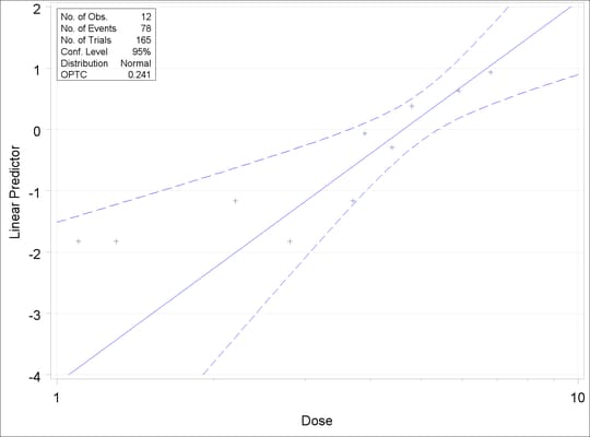
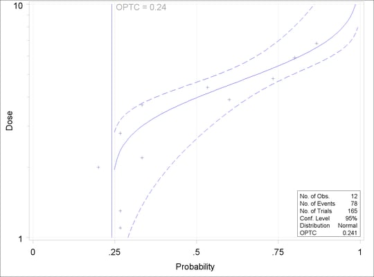
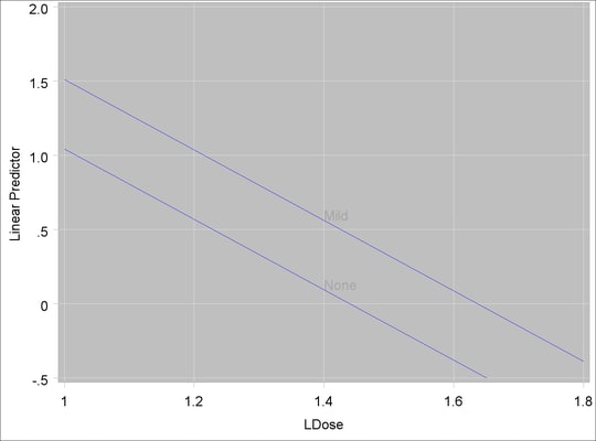
The IPPPLOT statement creates the plot in Figure 72.8, similar to that in Figure 72.5. See the section IPPPLOT Statement for details about this plot. The LPREDPLOT statement creates the linear predictor plot in Figure 72.7, which is described in the section LPREDPLOT Statement.
The following example uses the data set multi from Example 72.2 to illustrate how to create high-resolution plots for the multinomial model:
proc probit data=multi order=data;
   class prep symptoms;
   model symptoms=prep ldose;
   cdfplot var=ldose  level=("None" "Mild" "Severe")
             cfit=blue cframe=ligr noconf;
   lpredplot var=ldose  level=("None" "Mild" "Severe")
             cfit=blue cframe=ligr;
   predpplot var=ldose  level=("None" "Mild" "Severe")
             cfit=blue cframe=ligr;
   weight n;
run;
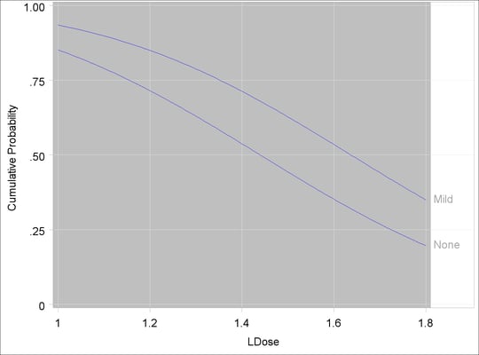
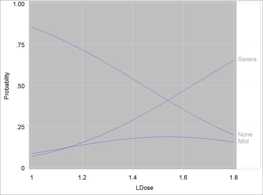
The CDFPLOT statement creates the plot in Figure 72.9. This plot, similar to that in Output 72.2.4, shows the relationship between the cumulative response probabilities and the dose levels. The plots in Figure 72.10 and Figure 72.11 are similar to those with the binomial model.
Copyright © SAS Institute, Inc. All Rights Reserved.