| Multivariate Analyses |
Canonical Discrimination Plots
You can request a bar chart for the Y variable and a plot of the first two canonical variables or the first three canonical variables from the canonical discriminant options dialog, shown in Figure 40.10, or from the Graphs menu, shown in Figure 40.46.
![[menu]](images/mult_muleq37.gif)
Figure 40.46: Canonical Discrimination Menu
Figure 40.47 shows a bar chart for the variable SPECIES.
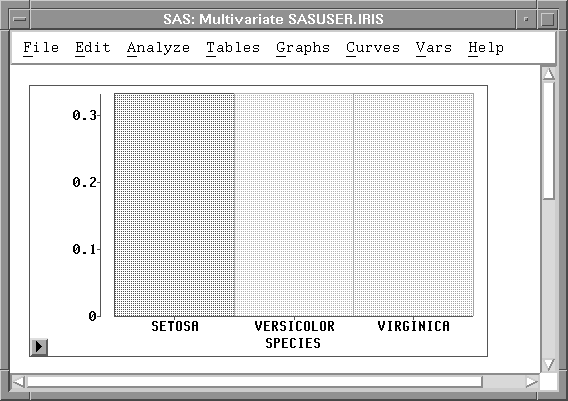
Figure 40.47: Y Var Bar Chart
Select Component Plot from the Canonical Discriminant menu in Figure 40.48 to display a Canonical Discriminant Component Plots dialog.
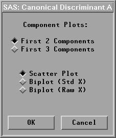
Figure 40.48: Canonical Discriminant Component Plots Dialog
In the dialog, you choose a canonical discriminant component scatter plot (Scatter Plot), a component biplot with standardized X variables (Biplot (Std X)), or a component biplot with centered X variables (Biplot (Raw X)).
In a canonical discriminant component biplot, the data points are displayed in a scatter plot of canonical discriminant components. With the approximated X variable axes also displayed in the scatter plot, the data values of the X variables are graphically estimated, as described previously in the "Principal Component Plots" section.
Figure 40.49 shows a biplot of the first two canonical variables from the X variable set with centered X variables. The biplot shows that the variable SEPALWID (highlighted axis) has a moderate negative correlation with CX1 and the other three variables have high correlation with CX1.
Note |
Use caution when evaluating distances in the biplot when the axes do not have comparable scales. |
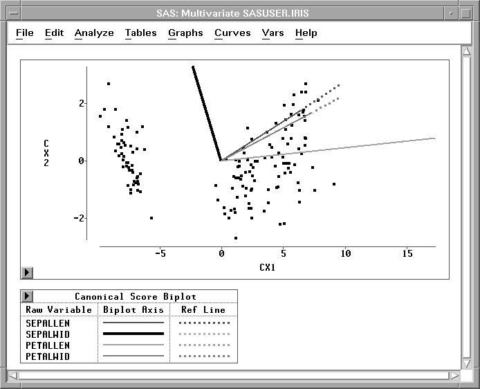
Figure 40.49: Canonical Discrimination Component Plot
Copyright © 2007 by SAS Institute Inc., Cary, NC, USA. All rights reserved.