| Coloring Observations |
Coloring Individual Observations
You can set the color for any observations you select.
| Open the GPA data set. |
| Create a scatter plot of SATM versus SATV. |
Use the techniques described in Chapter 5, "Exploring Data in Two Dimensions."
| Click on an observation to select it. |
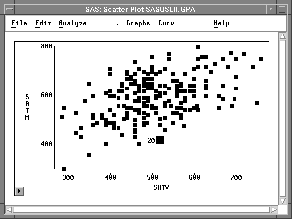
Figure 11.2: Scatter Plot
| Choose Edit:Windows:Tools. |
This toggles the display of the tools window, shown in Figure 11.4.
![[menu]](images/col_coleq1.gif)
Figure 11.3: Edit:Windows Menu
| Click on the red button in the tools window. |
This causes the selected observation to turn red. The marker also becomes red in the data window and in any other windows.
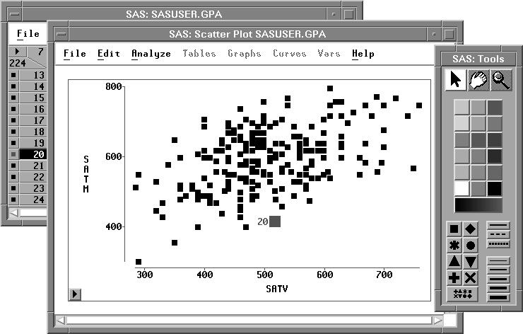
Figure 11.4: Changing a Color
You can similarly select a group of observations in a brush and assign colors for the group. Colors, like markers, provide a convenient way to track observations through multiple windows.
Copyright © 2007 by SAS Institute Inc., Cary, NC, USA. All rights reserved.