PROBPLOT Statement: CAPABILITY Procedure

Creating a Normal Probability Plot
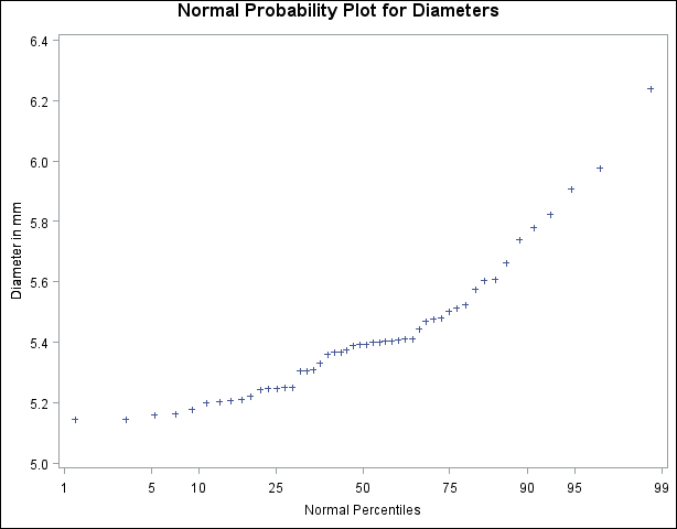
[See CAPPROB1 in the SAS/QC Sample Library]The diameters of 50 steel rods are measured and saved as values of the variable Diameter in the following data set:1
data Rods;
   input Diameter @@;
   label Diameter='Diameter in mm';
   datalines;
  5.501  5.251  5.404  5.366  5.445
  5.576  5.607  5.200  5.977  5.177
  5.332  5.399  5.661  5.512  5.252
  5.404  5.739  5.525  5.160  5.410
  5.823  5.376  5.202  5.470  5.410
  5.394  5.146  5.244  5.309  5.480
  5.388  5.399  5.360  5.368  5.394
  5.248  5.409  5.304  6.239  5.781
  5.247  5.907  5.208  5.143  5.304
  5.603  5.164  5.209  5.475  5.223
  ;
The process producing the rods is in statistical control, and as a preliminary step in a capability analysis of the process, you decide to check whether the diameters are normally distributed. The following statements create the normal probability plot shown in Figure 5.34:
ods graphics off;
symbol v=plus;
title 'Normal Probability Plot for Diameters';
proc capability data=Rods noprint;
   probplot Diameter;
run;
Note that the PROBPLOT statement creates a normal probability plot for Diameter by default.
The nonlinearity of the point pattern indicates a departure from normality. Since the point pattern is curved with slope increasing from left to right, a theoretical distribution that is skewed to the right, such as a lognormal distribution, should provide a better fit than the normal distribution. This possibility is explored in the next example.