| Getting Started: Exploratory Data Analysis of Tropical Cyclones |
Creating a Bar Chart
The category variable is a measure of wind intensity, corresponding to the Saffir-Simpson wind intensity scale in Table 2.1.
Table 2.1: The Saffir-Simpson Intensity Scale| Category | Description | Wind Speed (knots) |
|---|---|---|
| TD | Tropical Depression | 22 - 33 |
| TS | Tropical Storm | 34 - 63 |
| Cat1 | Category 1 Hurricane | 64 - 82 |
| Cat2 | Category 2 Hurricane | 83 - 95 |
| Cat3 | Category 3 Hurricane | 96 - 113 |
| Cat4 | Category 4 Hurricane | 114 - 134 |
| Cat5 | Category 5 Hurricane | 135 or greater |
In this section you create a bar chart of the category variable and exclude observations that correspond to weak storms.
| Select Graph |
The bar chart dialog box in Figure 2.2 appears.
| Select the variable category, and click Set X. |
Note: In most dialog boxes, double-clicking on a variable name adds the variable to the next appropriate field.
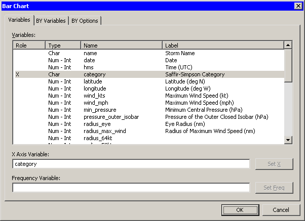 |
Figure 2.2: Bar Chart Dialog Box
| Click OK. |
The bar chart in Figure 2.3 appears.
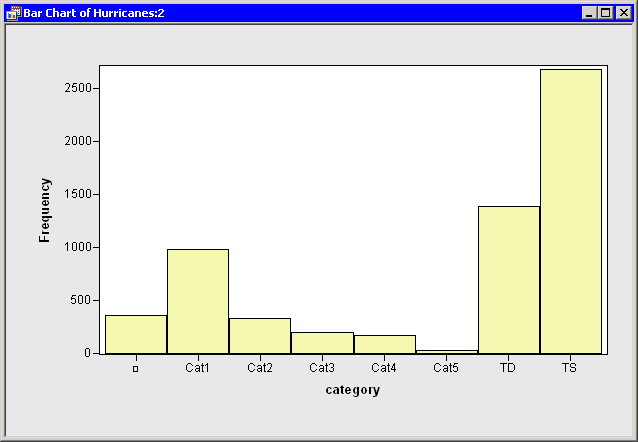 |
Figure 2.3: A Bar Chart
The bar chart shows the number of observations for storms in each Saffir-Simpson intensity category. In the next step, you exclude observations of less than tropical storm intensity (wind speeds less than 34 knots).
| In the bar chart, click on the bar labeled with the symbol |
This selects observations for which the category variable has a missing value. For these data, "missing" is equivalent to an intensity of less than tropical depression strength (wind speeds less than 22 knots).
| Hold down the CTRL key and click on the bar labeled "TD." |
When you hold down the CTRL key and click, you extend the set of selected observations. In this example, you select observations with tropical depression strength (wind speeds of 22 - 34 knots) without deselecting previously selected observations. This is shown in Figure 2.4.
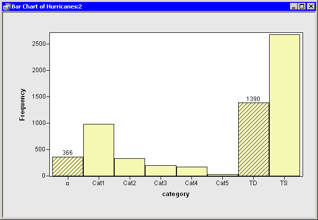 |
Figure 2.4: A Bar Chart with Selected Observations
The row heading of the data table includes two special cells for each observation: one showing the position of the observation in the data set, and the other showing the status of the observation in analyses and plots. Initially, the status of each observation is indicated by the marker (by default, a filled square) and a ![]() symbol. The presence of a marker indicates that the observation is included in plots, and the
symbol. The presence of a marker indicates that the observation is included in plots, and the ![]() symbol indicates that the observation is included in analyses (see Chapter 4, "The Data Table," for more information about the data table symbols).
symbol indicates that the observation is included in analyses (see Chapter 4, "The Data Table," for more information about the data table symbols).
| In the data table, right-click in the row heading of any selected observation, and select Exclude from Plots from the pop-up menu. |
The pop-up menu is shown in Figure 2.5. Notice that the bar chart redraws itself to reflect that all observations being displayed in the plots now have at least 34-knot winds. Notice also that the square symbol in the data table is removed from observations with relatively low wind speeds.
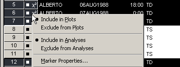 |
Figure 2.5: Data Table Pop-up Menu
| In the data table, right-click in the row heading of any selected observation, and select Exclude from Analyses from the pop-up menu. |
Notice that the ![]() symbol is removed from observations with relatively low wind speeds. Future analysis (for example, correlation analysis and regression analysis) will not use the excluded observations.
symbol is removed from observations with relatively low wind speeds. Future analysis (for example, correlation analysis and regression analysis) will not use the excluded observations.
| Click in any data table cell to clear the selected observations. |
Copyright © 2009 by SAS Institute Inc., Cary, NC, USA. All rights reserved.