Setting Panel Axis Features
The axes for classification panels are always external
to the cells and displayed as axes for the rows or columns.
Controlling Data Ranges of Rows or Columns
The strength of a classification
panel presentation is that it makes it easy to visually compare similar
plots across data categories. In the following example, the profits
for Darts, Golf, and Baseball are compared:
proc template;
 define statgraph unionall;
  begingraph / designwidth=350px
               designheight=400px;
    entrytitle
      "Yearly Profit for Sports Products";

    layout datapanel
        classvars=(product_group)/
        rowdatarange=unionall ;
      layout prototype;
        barchart x=year y=profit /
          stat=sum;
      endlayout;
    endlayout;
  endgraph;
 end;
run;

proc sgrender data=sashelp.orsales
              template=unionall;
  where product_group in
       ("Golf" "Darts" "Baseball");
run;
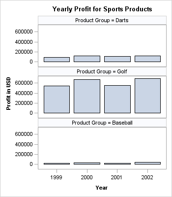
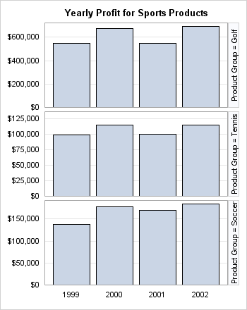
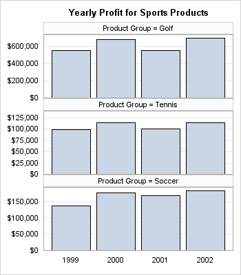
By default, the minimum
and maximum data ranges over all rows in all panels are used to establish
identical data ranges across for axes that appear in the rows. The
same is true for columns. The options that set these defaults are
ROWDATARANGE=UNIONALL and COLUMNDATARANGE=UNIONALL. In most cases,
these settings simplify quick comparisons because the axis for each
row is scaled identically. Likewise, all columns share a common scale.
So the graph just shown does a good job of showing that Golf products
in general provide more profits than Darts or Baseball, but it does
not do a very good job of showing the yearly variation in Baseball
profits because those profits are so small relative to Golf profits.
To set independent axis
scaling within each row, you can set ROWDATARANGE=UNION. Similarly,
to set independent axis scaling within each column, you can set COLUMNDATARANGE=UNION.
The following panel shows independent axes for each row. Now only
the data minimum and data maximum for the cells in each row are considered
in deciding the axis range.
layout datapanel classvars=(product_group)  /
                 rowdatarange=union ;
Setting Axis Options
Classification panels
use the ROWAXISOPTS=(axis-opts) and COLUMNAXISOPTS= (axis-opts) options to set axis features. Options are available for all four
axis types (LINEAR, DISCRETE, LOG, and TIME), and most of the available
axis options are a slightly restricted set of the axis options that
are available in an OVERLAY layout.
To demonstrate the use
of axis options, the following example suppresses the row axis label
because the tick values are formatted with the DOLLAR format and the
axis label is therefore not needed. The column axis label is suppressed
because the panel's title indicates what the bars represent. Adding
title information and eliminating axis labels is a good way to make
more space available to the panel's grid. Axis ticks on a discrete
axis (YEAR) are often not needed, so the example suppresses them.
It also turns on grid lines to make comparisons easier.
You have probably noticed
in the examples with bar charts that the bars do not touch the axis.
This happens because a default minimum axis offset is applied to the
axis to avoid possible tick value collision with an adjacent cell.
This example overrides the default offset by setting OFFSETMIN=0,
thus enabling the bars to touch the horizontal axis.
layout datapanel  classvars=(product_group)  /
  rowdatarange=union
  columnaxisopts=(display=(tickvalues))
  rowaxisopts=   (display=(tickvalues)
                  linearopts=(tickvalueformat=dollar12.)
                  griddisplay=on offsetmin=0) ;
Any DATAPANEL display
that uses one or two classifiers can be converted to a DATALATTICE
display. When the ROWVAR= option is used on the LAYOUT DATALATTICE
statement, the cell headers automatically become row headers. When
the COLVAR= option is used, cell headers automatically become column
headers. On the following LAYOUT DATALATTICE statement, the ROWVAR=
option is used, and the values of the classifier are displayed as
row headers: