Using Non-computed Plots in Classification Panels
So far the discussion
has focused on how to set up the grid and axes of the panel using
simple prototype examples. However, complex prototype plots can also
be specified, although BARCHART is the only computed plot that can
be used in the prototype. The restriction of using only non-computed
plots in the prototype is mitigated by the fact that most computed
plot types are available in a non-computed (parameterized) version—BOXPLOTPARM,
ELLIPSEPARM, and HISTOGRAMPARM. Also, the fit line statements (REGRESSIONPLOT,
LOESSPLOT, or PBSPLINEPLOT) can be emulated with a SERIESPLOT, and
the MODELBAND statement can be emulated with a more general BANDPLOT
statement, provided the appropriate variables have been created in
the input data. Many SAS/STAT and SAS/ETS procedures can create output
data sets with this information.
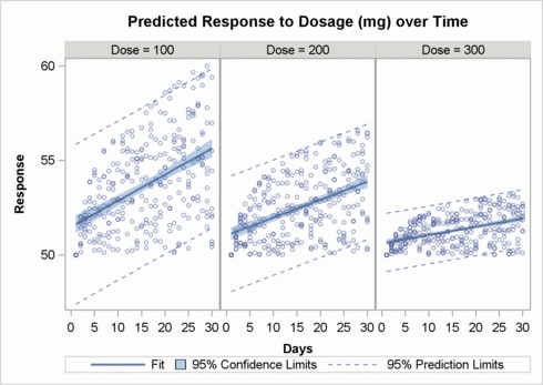
The following example
uses PROC GLM to create an output data set that is suitable for showing
a panel of scatter plots with overlaid fit lines and confidence bands.
proc template;
define statgraph dosepanel;
 begingraph / designwidth=490px designheight=350px;
   layout datapanel classvars=(dose) / rows=1;
     layout prototype;
       bandplot    x=days limitupper=uclm limitlower=lclm / name="clm"
                     display=(fill)  fillattrs=GraphConfidence
                     legendlabel="95% Confidence Limits";
       bandplot    x=days limitupper=ucl limitlower=lcl / name="cli"
                     display=(outline) outlineattrs=GraphPredictionLimits
                     legendlabel="95% Prediction Limits";
       seriesplot  x=days y=predicted / name="reg"
                     lineattrs=graphFit legendlabel="Fit";
       scatterplot x=days y=response /	 primary=true
                     markerattrs=(size=5px) datatransparency=.5;
     endlayout;
     sidebar / align=top;
       entry  "Predicted Response to Dosage (mg) over Time" /
               textattrs=GraphTitleText pad=(bottom=10px);
     endsidebar;
     sidebar / align=bottom;
       discretelegend "reg" "clm" "cli" / across=3;
     endsidebar;
   endlayout;
  endgraph;
 end;
run;
The following procedure
code creates the required input data set for the template. It uses
a BY statement with the procedure to request the same classification
variable that is used in the panel.
data trial;
 do Dose = 100 to 300 by 100;
   do Days=1 to 30;
     do Subject=1 to 10;
       Response=log(days)*(400-dose)* .01*ranuni(1) + 50;
     output;
   end;
  end;
end;
run;

proc glm data=trial alpha=.05 noprint;
 by dose;
 model response=days / p cli clm;
 output out=stats
        lclm=lclm uclm=uclm
        lcl=lcl ucl=ucl
        predicted=predicted;
run; quit;

ods html style=statistical;
proc sgrender data=stats template=dosepanel;
run;