Example Program and Statement Details
Example Program
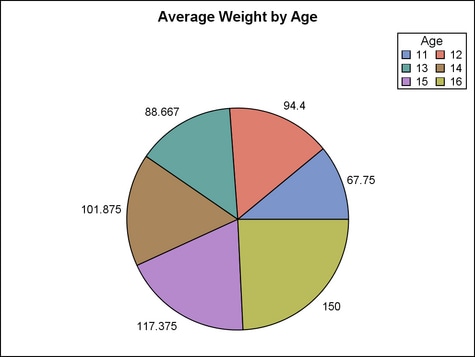
proc template;
  define statgraph layoutregion;
    begingraph;
      entrytitle "Average Weight by Age";
      layout region;
        piechart category=age response=weight /
          stat=mean name="p"
          datalabelcontent=(response) datalabellocation=outside;
        discretelegend "p" / title="Age" across=2
          border=true halign=right valign=top;
      endlayout;
    endgraph;
  end;

proc sgrender data=sashelp.class template=layoutregion;
run;
Statement Summary
The REGION layout provides
a container for graphs that do not use axes. Within the LAYOUT REGION
block, you can specify a single plot statement of a type that never
uses axes, such as a PIECHART. If multiple plot statements are specified,
only the first one is honored. You can also specify one or more insets,
such as nested layout statements (for example, LAYOUT GRIDDED), ENTRY
statements, and legend statements (CONTINUOUSLEGEND or DISCRETELEGEND).
For example, you could specify a PIECHART statement with a DISCRETELEGEND
statement and an ENTRY statement. You can also nest one or more layout
blocks within the REGION layout. For example, you could nest a LAYOUT
GRIDDED statement that creates a small table of text.
To control the horizontal
and vertical positioning of some insets, you can use the inset statement’s
HALIGN= or VALIGN= options. Each nested inset determines its own relative
position in the parent REGION. This positioning achieves the best
results for text-based insets whose size can be easily fit within
an open area of the graph wall. A large text-based inset might not
fit well, and an inset that contains a plot might be dropped from
the display without warning when the template is executed. For more
information about how child positions are determined in an overlay-type
or region layout, see the LAYOUT OVERLAY’s Example Program and Statement Details.
Options
specifies the attributes
of the border line around the layout. See General Syntax for Attribute Options for the syntax
on using a style-element and Line Options for available line-options.
specifies the amount
of extra space that is added inside the layout border.
Default: The default padding for all sides is 0. Values without units are
in pixels (px). A unit must be provided if other than pixels.
Enables separate settings
for the left, right, top, and bottom padding dimensions. Use the pad-options to create non-uniform padding. These
options must be enclosed in parentheses. Each option is specified
as a name = value pair. Sides
not assigned padding are padded with the default amount.
| LEFT=dimension | specifies the amount of extra space added to the left side. |
| RIGHT=dimension | specifies the amount of extra space added to the right side. |
| TOP=dimension | specifies the amount of extra space added to the top. |
| BOTTOM=dimension | specifies the amount of extra space added to the bottom. |