Example Program and Statement Details
Example Program
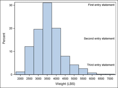
proc template;
  define statgraph entry;
    begingraph;
      layout overlay;

        entry halign=right "First entry statement" /
          valign=top;

        histogram weight;

        entry halign=right "Second entry statement";

        entry halign=right "Third entry statement" /
          valign=bottom pad=(bottom=40px);

      endlayout;
    endgraph;
  end;
run;

proc sgrender data=sashelp.cars template=entry;
run;
Statement Summary
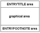
An ENTRY statement
creates one line of text in the plot area. The statement must be specified
within a LAYOUT, HEADER, SIDEBAR, or CELL statement block. It cannot
be specified outside of one of these blocks, where global statements
like ENTRYTITLE and ENTRYFOOTNOTE are used.
The text line specified
on an ENTRY statement can be made of several pieces of the text called text-items. Statement options that are used establish
properties for the entire line of text (that is, all text-items). These properties can be overridden
with prefix-options that are
specific to one or more text-items. See Required Arguments for more information.
Required Arguments
specifies one or more
pieces of text for the entry. Each text-item has the following form:
Each piece of text
can have multiple prefix settings that precede the piece of text.
A piece of text is either a string literal, a dynamic, or a text command.
All text-items with the same
HALIGN= setting are concatenated into one string. Up to three strings
can result for each ENTRY statement. Leading and trailing blanks in
the concatenated string are always used.
When used, a prefix
option applies not only to immediately following piece of text but
also to ALL subsequent text strings and text-commands. If the same
prefix option appears more than once, it has the effect of overriding
the last used prefix of the same name.
See Managing Text Items for more information and several examples.
Options and Text Commands
specifies whether the
entry is automatically aligned within its parent when nested within
an overlay-type or region layout. For more information about how child
positions are determined in an overlay-type or region layout, see
the LAYOUT OVERLAY’s Statement Summary.
Available only if the
parent layout contains a scatter plot; ignored otherwise. Within the
parent layout, attempt to center the entry in the area that is farthest
from any surrounding data point markers.
Within the available
area, restrict the entry’s possible locations to those locations
in the specified location-list, and use the location-list position that least collides with the other graphics features in
the area. The location-list is blank-separated and can contain any of these locations: TOPLEFT,
TOP, TOPRIGHT, LEFT, CENTER, RIGHT, BOTTOMLEFT, BOTTOM, and BOTTOMRIGHT.
specifies the attributes
of the border line around the text. See General Syntax for Attribute Options for the syntax
on using a style-element and Line Options for available line-options.
specifies the amount
of extra space that is reserved inside the entry border.
Enables separate settings
for the left, right, top, and bottom padding dimensions. Use the pad-options to create non-uniform padding. These
options must be enclosed in parentheses. Each option is specified
as a name = value pair. Sides
not assigned padding are padded with the default amount.
| LEFT=dimension | specifies the amount of extra space added to the left side. |
| RIGHT=dimension | specifies the amount of extra space added to the right side. |
| TOP=dimension | specifies the amount of extra space added to the top. |
| BOTTOM=dimension | specifies the amount of extra space added to the bottom. |
specifies the angle
of text rotation measured in degrees. The angle is measured from a
horizontal line passing through the middle of the bounding box of
the text, counter-clockwise starting at the center of the bounding
box.
Interaction: The bounding box is the determined by the size of the text in the
current font plus any horizontal and vertical padding. See TEXTATTRS= and PAD=.
as a statement option, specifies the text properties
of the entire entry text. As a prefix-option, specifies the text properties of individual text-items. See General Syntax for Attribute Options for the syntax
on using a style-element and Text Options for available text-options.
text-command that specifies a glyph (character)
to be displayed using its Unicode specification or keyword equivalent.
A four-byte hexadecimal
constant that represents a UNICODE character in the current font.
For a complete listing, see http://unicode.org/charts/charindex.html.
A SAS keyword for a
UNICODE character. For a listing of SAS supplied keywords, see see Reserved Keywords and Unicode Values..
This text command
attempts to access a UNICODE value in the current font. Not all fonts
support accessing characters via their UNICODE value. Some fonts only
support a limited set of UNICODE values. If the UNICODE value is not
accessible, the command might be ignored or an unprintable character
might be substituted.