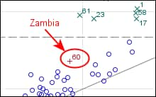
Adding Annotations to Highlight Outlier Data
The observation in the middle of the plot denoted
by a red plus sign is an outlier. You can label it with the name of
the country that it represents in order draw attention to the outlier.
To do this, use the oval and arrow annotation tools in the Graph toolbar.
Add an Oval to the Outlier
-
Select the oval icon

in the Graph toolbar.
-
Press CTRL, click the
observation, and drag the cursor to create an oval around the observation.
Click and drag the circles along the border of the oval to change
the size of the annotation.
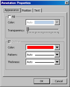
Change the Color of the Oval
Change the color of
the oval in order to make the oval stand out from the rest of the
graph.
-
Right-click the circle
and select
Annotation Properties from the
pop-up menu. The
Annotation Properties dialog
box appears.
-
In the
Outline area of the dialog box, select the red color from the
Color list box.
-
Draw an Arrow That Points to the Outlier
-
Click the arrow icon

in the Graph toolbar.
-
Position your cursor
at a starting position in the graph and drag the arrow toward the
circle annotation.
Add Text to the Arrow
To add text to the
arrow:
-
Right-click the arrow
and select
Add ('Edit') Text from the pop-up
menu.
A text box appears at
the tail end of the arrow.
-
In the text box, type
Zambia.
-
Right-click the arrow
and select
Annotation Properties. The
Annotation Properties dialog box appears.
-
On the
Text tab, select the red color from the
Color list box. Then click
OK. The annotations
all display in red.
Copyright © SAS Institute Inc. All rights reserved.