Producing Charts
Block Charts
The GCHART procedure produces
block charts that use three-dimensional blocks to graphically represent
values of statistics. Block charts are useful
for emphasizing relative magnitudes and differences among data values.
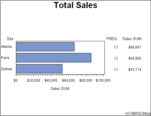
Horizontal Bar Charts
The GCHART procedure produces
horizontal bar charts that use horizontal bars to represent statistics
based on the values of one or more variables. Horizontal
bar charts can generate a table of chart statistics and are useful
for displaying exact magnitudes and emphasizing differences.
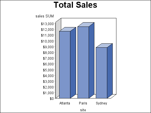
Vertical Bar Charts
The GCHART procedure produces
vertical bar charts that use vertical bars to represent statistics
based on the values of one or more variables. Vertical
bar charts generate only one statistic and are useful for displaying
exact magnitudes and emphasizing differences.
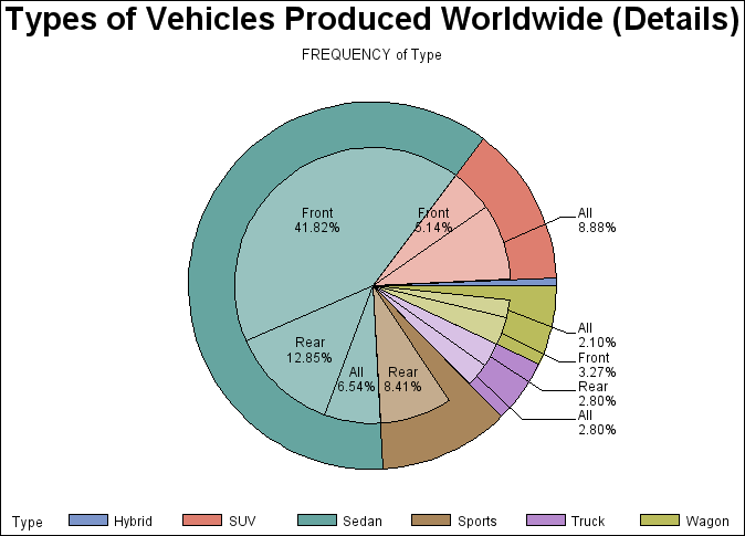
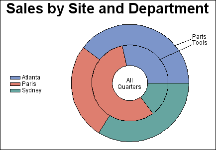
Pie Charts and Donut Charts
The GCHART procedure
produces pie charts, detailed pie charts, three-dimensional pie charts,
and donut charts. The angles of pie slices are
used to graphically represent the value of a statistic for a data
range. Pie charts are useful for examining how the values of a variable
contribute to the whole and for comparing the values of several variables.
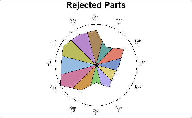
Star Charts
The GCHART procedure produces
star charts use the length of spines to graphically represent the
value of a statistic for a data range. Star
charts are useful for analyzing where data is out of balance.
Bar-line Charts
The GBARLINE procedure produces vertical bar charts with
plot overlays. These charts graphically represent the value of a statistic
calculated for one or more variables in an input SAS data set. The
charted variables can be either numeric or character.

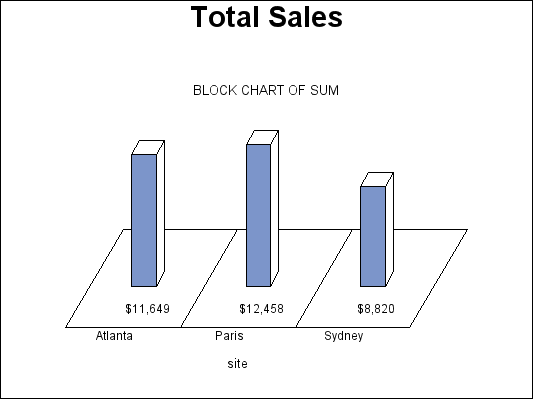
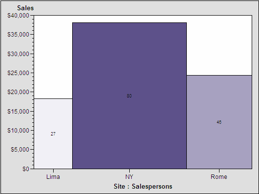
Area Bar Charts
The GAREABAR procedure
produces area bar charts that show the magnitudes of two variables
for each category of data. For example, the following area bar chart
shows the sales total for each of three geographical sites. The width
of each bar indicates the number of salespersons at each site. In a bar chart such
as the chart shown in Vertical Bar Charts, the width is the same for each bar.
In an area bar chart, the width and height of each bar is determined
by the value of variables. See GAREABAR Procedure for a complete
description.
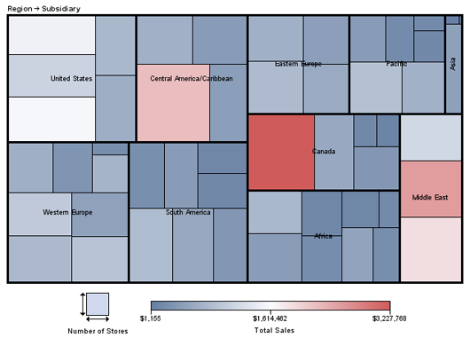
Tile Charts
The GTILE procedure
produces charts that tile charts that consist of a rectangle or square
divided into tiles. The sizes of the individual tiles represent the
value of the size variable. You can also specify a color variable,
so that the colors of the individual tiles represent the magnitude
of the color variable. Tile charts are useful for determining the
relative magnitude of categories of data or the contribution of a
category toward the whole. See GTILE Procedure for more information.
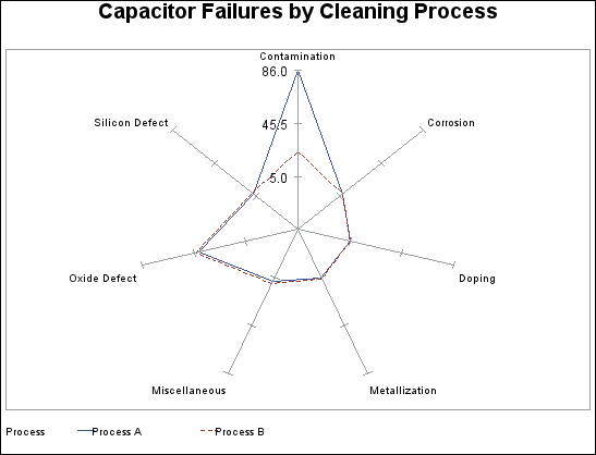
Radar Charts
The GRADAR procedure
produces radar charts that show the relative frequency of data measures.
On a radar chart, the chart statistics are displayed along spokes
that radiate from the center of the chart. The charts are often stacked
on top of one another with reference circles, thus giving them the
look of a radar screen. Radar charts are frequently called star charts
and are often used in quality control or market research problems.
See GRADAR Procedure for a complete
description.