| The FORECAST Procedure |
| Plotting Forecasts |
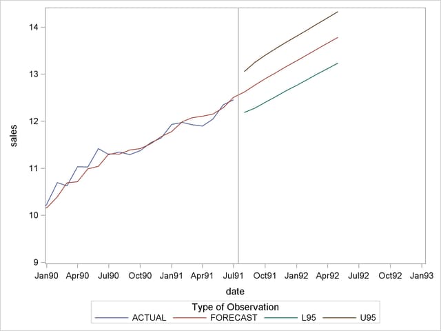
The forecasts, confidence limits, and actual values can be plotted on the same graph with the SGPLOT procedure. Use the appropriate output control options in the PROC FORECAST statement to include in the OUT= data set the series you want to plot. Use the _TYPE_ variable in the SGPLOT procedure GROUP option to separate the observations for the different plots.
The OUTFULL option is used in the following statements. The resulting output data set contains the actual and predicted values, as well as the upper and lower 95% confidence limits.
proc forecast data=past interval=month lead=10
              out=pred outfull;
   id date;
   var sales;
run;

proc sgplot data=pred;
   series x=date y=sales / group=_type_ lineattrs=(pattern=1);
   xaxis values=('1jan90'd to '1jan93'd by qtr);
   refline '15jul91'd / axis=x;
run;
The _TYPE_ variable is used in the SGPLOT procedure’s PLOT statement to make separate plots over time for each type of value. A reference line marks the start of the forecast period. (See SAS/GRAPH: Reference for more information about using PROC SGPLOT.) The WHERE statement restricts the range of the actual data shown in the plot. In this example, the variable SALES has monthly data from July 1989 through July 1991, but only the data for 1990 and 1991 are shown in Figure 15.4.
Copyright © SAS Institute, Inc. All Rights Reserved.