| The MODEL Procedure |
Example 18.20 Illustration of ODS Graphics
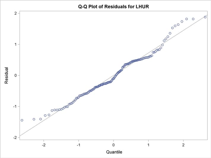
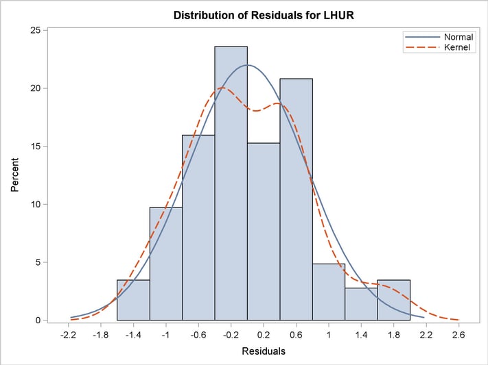
This example illustrates graphical output from PROC MODEL. This is a continuation of the section Nonlinear Regression Analysis. These graphical displays are requested by specifying the ODS GRAPHICS ON statement. For information about the graphics available in the MODEL procedure, see the section ODS Graphics.
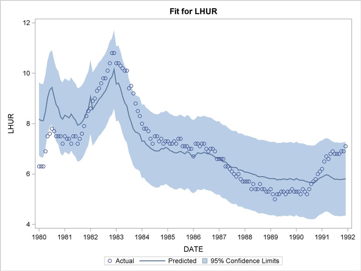
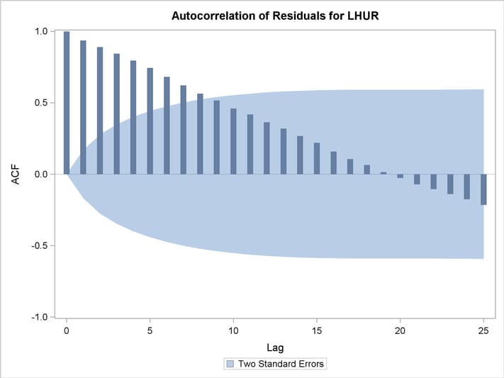
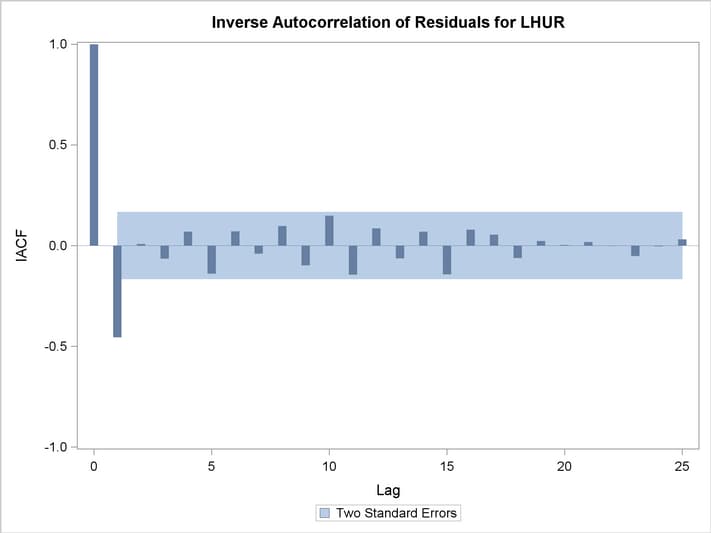
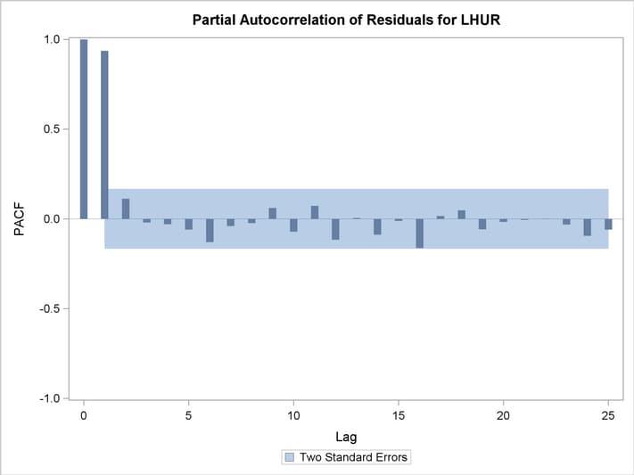
The following statements show how to generate ODS graphics plots with the MODEL procedure. The plots are displayed in Output 18.20.1 and Output 18.20.2. Note that the variable date in the ID statement is used to define the horizontal tick mark values when appropriate.
   title1 'Example of Graphical Output from PROC MODEL';

   proc model data=sashelp.citimon;
      lhur = 1/(a * ip + b) + c;
      fit lhur;
      id date;
   run;
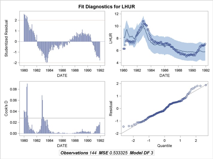
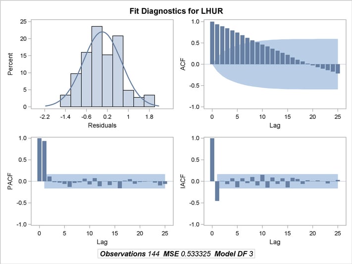
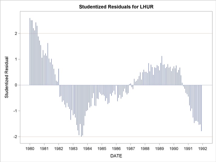
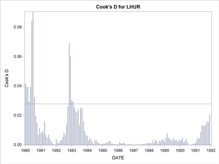
You can also obtain the plots in the diagnostics panel as separate graphs by specifying the PLOTS(UNPACK) option. These plots are displayed in Output 18.20.3 through Output 18.20.10.
   title1 'Unpacked Graphical Output from PROC MODEL';

   proc model data=sashelp.citimon plots(unpack);
      lhur = 1/(a * ip + b) + c;
      fit lhur;
      id date;
   run;
Copyright © 2008 by SAS Institute Inc., Cary, NC, USA. All rights reserved.