The JMP Graph Builder
enables you to overlay data onto a map. In this example, you plot
average income on a state-by-state basis over a map of the USA.
-
Select the
JMP
Data Exploration node. Right-click the node and select
Run.
In the
Confirmation window, select
Yes.
-
After the process flow
diagram has successfully run, select
Results in
the
Run Status window.
-
In the
Results window,
click the
View button.
-
By default, the target
variable is plotted in the
Graph Builder.
In this example, the target variable is PURCHASE.
-
To create a custom graph,
click the
Start Over button in the upper
left corner of the
Graph Builder window.
-
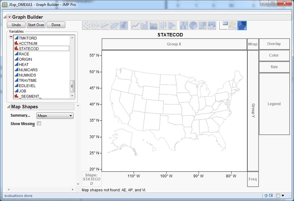
In the
Variables list,
select
STATECOD and drag it to the middle of
the graph. You should see a state map for the USA.
-
Right-click the graph
and select
Map Shapes Show
Missing Shapes
Show
Missing Shapes.
-
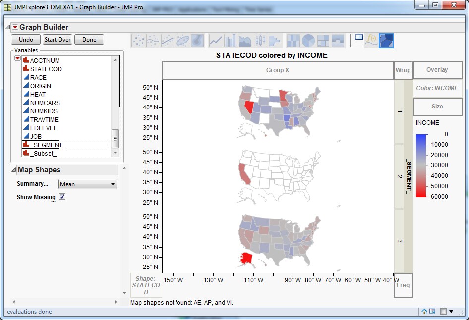
In the
Variables list,
select
Income and drag it to the
Color drop
zone. Next, drag the variable
_SEGMENT_ to
the
Group Y drop zone. This creates a graph
of income distribution by cluster and state.