Use the
Home
Equity branch to explore the predictive modeling capabilities
of JMP.
-
Right-click the
JMP
Data Exploration node in the process flow diagram and
select
Run. In the
Confirmation window,
select
Yes.
-
After the process flow
diagram has successfully run, select
Results in
the
Run Status window.
-
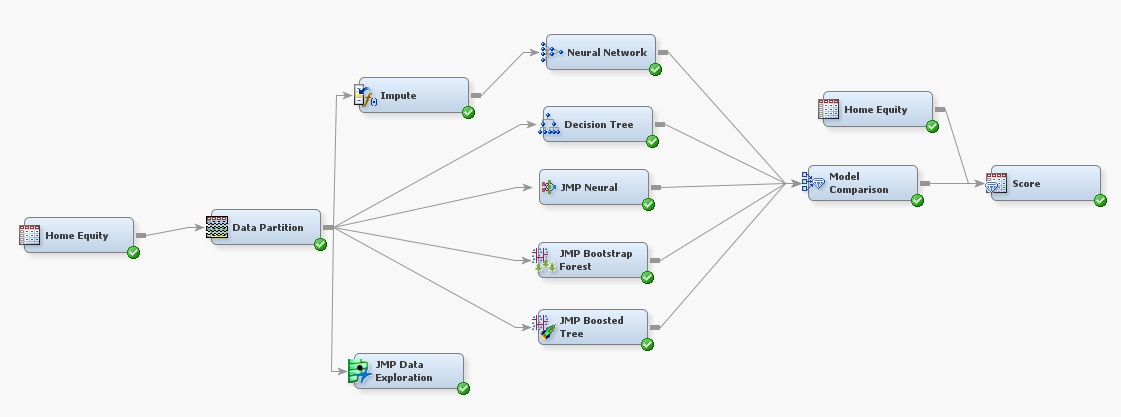
In the
Results window,
click the
View button. The target distribution
is plotted by default.
-
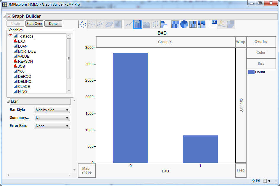
In the
Variables list,
select
DEBTINC and drag it to the
Y drop
zone.
-
Right-click the graph
and select
Box Plot. The box plot shows how
the debt-to-income ratio varies by loan status.
Note that there are
a lot of outliers with a high debt-to-income ratio for the delinquent
segment, where
BAD equals
1.
-
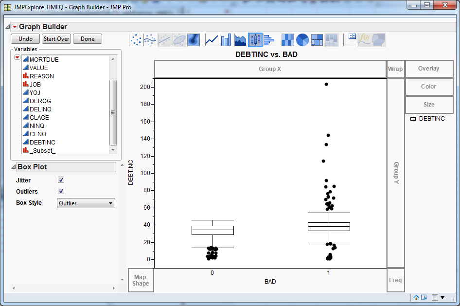
Suppose that you want
to check whether the relationship between DEBTINC and the target variable
varies by partition. In the
Variables list,
select
_Subset_ and drag it to the
Group
X drop zone. This separates the data by partition, which
is
Training and
Validation for
this example.
-
For both partitions,
there are more customers with a high debt-to-income ratio in the delinquent
segment. Close the
Graph Builder and the
Results windows.
-
Right-click the
Model
Comparison node and select
Run.
In the
Confirmation window, select
Yes.
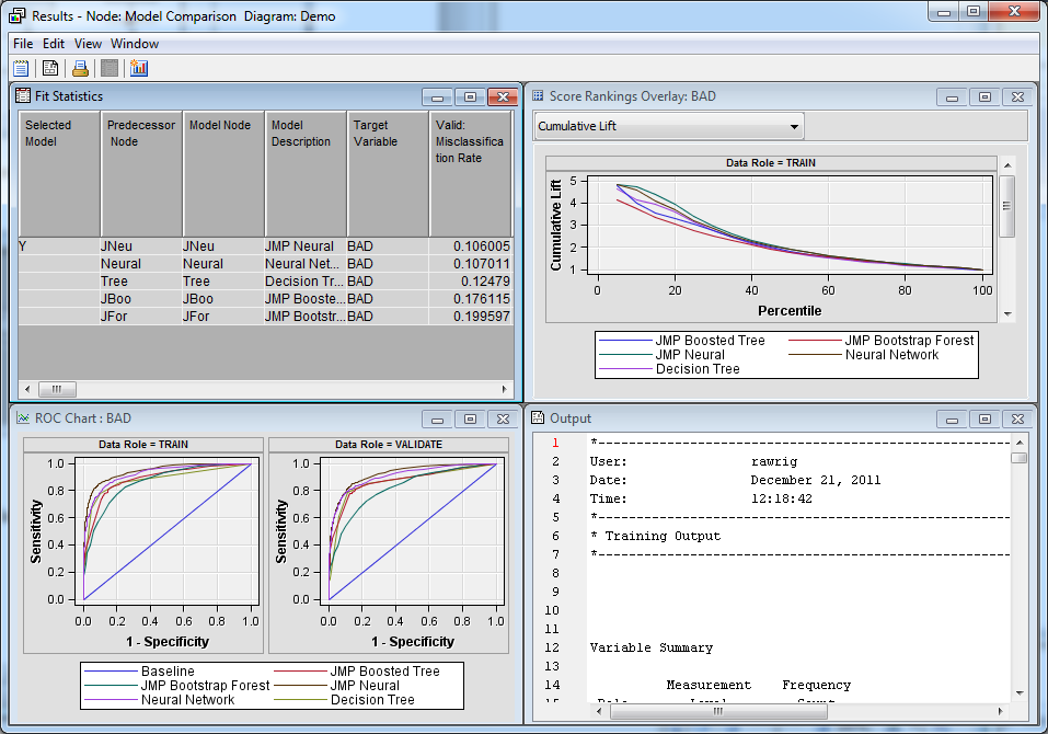
The
Model Comparison node evaluates the models
created by its five predecessor nodes.
-
After the process flow
diagram has successfully run, select
Results in
the
Run Status window.
-
Based on the misclassification
rate, the best two models are those created by the
JMP
Neural node and the
Neural Network node.
Close the
Results window.
-
Right-click the
JMP
Neural node and select
Results.
In the
Results window, click
View.
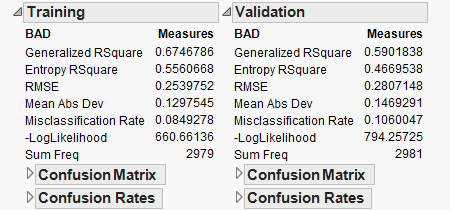
Classification results are shown at the beginning of the
Interactive
Report.
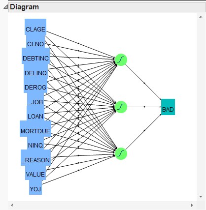
Also, a network structure
diagram is included in the results window. For this example, there
is a single hidden layer with three nodes.
The network structure
diagram is not informative on its own, but you can use the JMP
Prediction
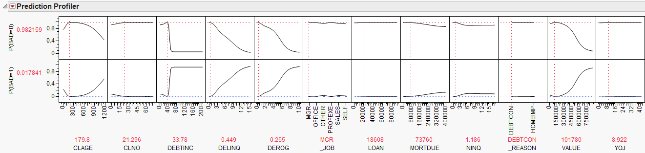
Profiler to interactively explore how each predictor
relates to the predicted values. For example, drag the dotted vertical
line in the
DEBTINC column to see how the
debt-to-income ratio affects the probabilities for the target variable.
For debt-to-income ratios
below 40, the odds of default are very low. Conversely, for debt-to-income
ratios above 50, the odds of default are very high. Close the
Results window.
-
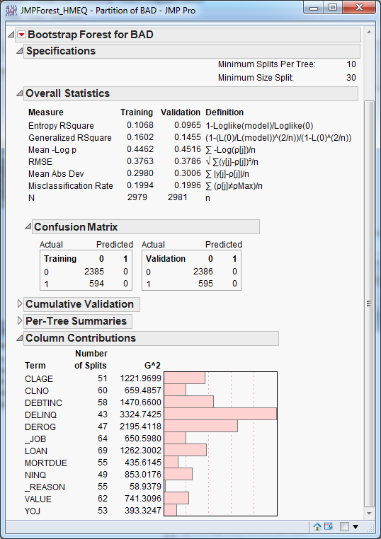
The
Results windows
for the
JMP Bootstrap Forest and
JMP
Boosted Tree nodes have a layout similar to the results
of the
JMP Neural node. Both
Results windows
include predictor (column) contributions. You should explore these
results on your own. A portion of the
JMP Bootstrap Forest node
results is shown below.
Close any
Results windows
that you have open.
-
Right-click the
Score node
and select
Run. In the
Confirmation window,
select
Yes.
-
After the process flow
diagram has successfully run, select
Results in
the
Run Status window.
-
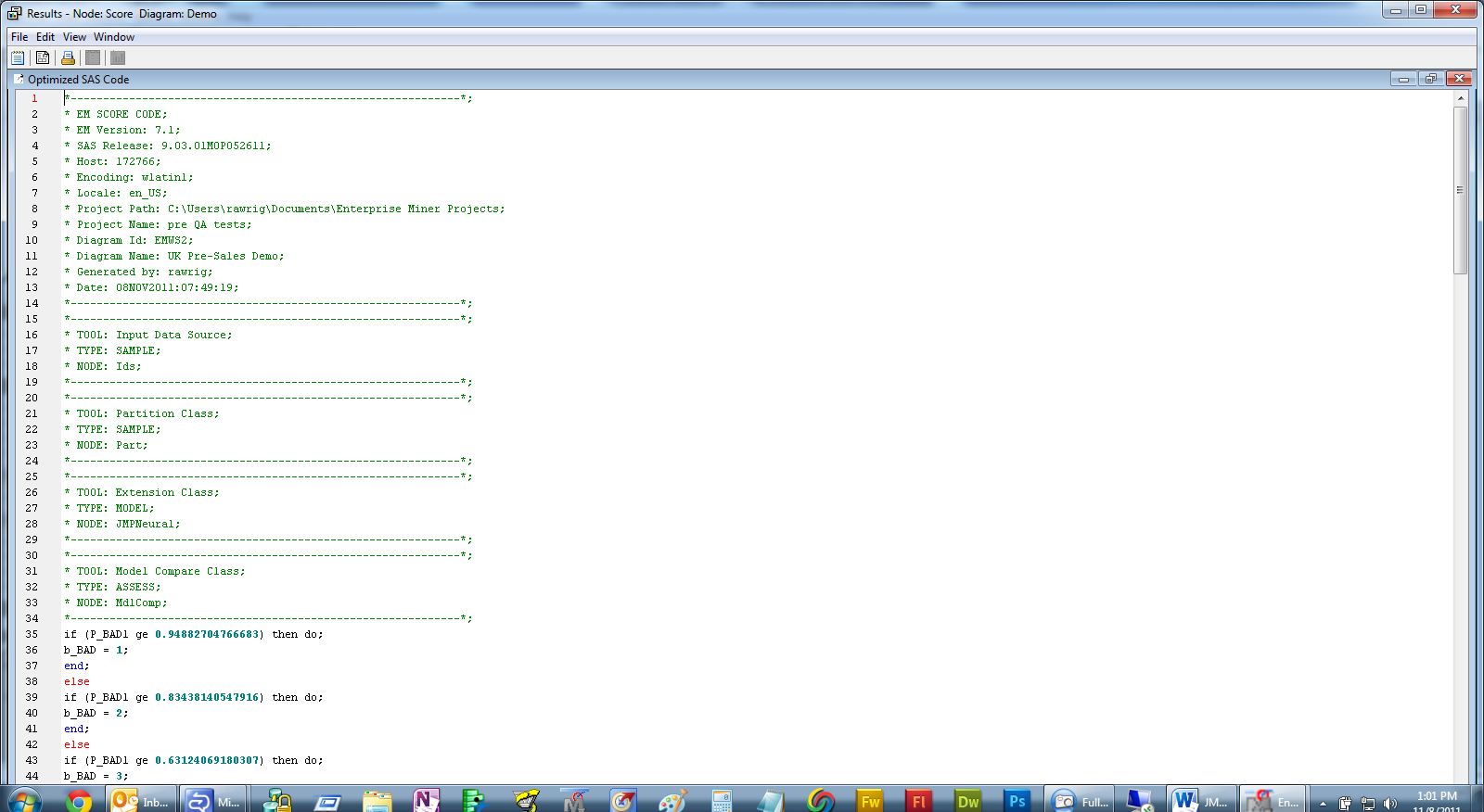
In the
Results window,
maximize the
Optimized SAS Code window. The
Optimized
SAS Code window displays the score code for the best
model, as determined by the
Model Comparison node.
In this example, that is the
JMP Neural node.