Create a Scorecard with a Logistic Regression Model
You are now ready to
use the grouped variables in a logistic regression model to create a scorecard.
-
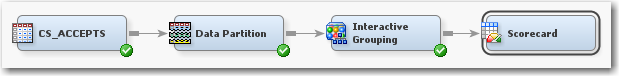
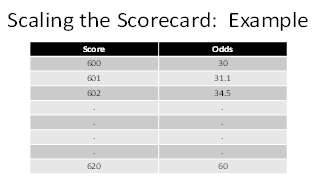
From the Credit Scoring tab, drag a Scorecard node into the Diagram Workspace. Connect the Interactive Grouping node to the Scorecard node.The Scorecard node is used to develop a preliminary scorecard with logistic regression and scaling. In SAS Enterprise Miner, there are three types of logistic regression selection methods to choose: forward, backward, and stepwise. There is also a selection in the Properties Panel of the Scorecard node for no selection method, so that all variable inputs enter the model.After the selection method is chosen, the regression coefficients are used to scale the scorecard. Scaling a scorecard refers to making the scorecard conform to a particular range of scores. Some reasons for scaling the scorecard are to enhance ease of interpretation, to meet legal requirements, and to have a transparent methodology that is widely understood among all users of the scorecard.The two main elements of scaling a scorecard are to determine the odds at a certain score and to determine the points required to double the odds. Scorecard points are associated with both of these elements. Consider the scorecard shown in the figure below. The scorecard points are scaled so that a total score of 600 corresponds to a good:bad odds of 30:1 and that an increase of 20 points corresponds to a doubling of the good:bad odds.The Scorecard node controls how a scorecard is scaled with the Odds, Scorecard Points, and Points to Double the Odds properties. The details of how SAS Enterprise Miner scales the scorecard are beyond the scope of this tutorial. For more information, see Siddiqi (2006) and Anderson & Hardin (2009) for a more detailed discussion about scorecard scaling.
-
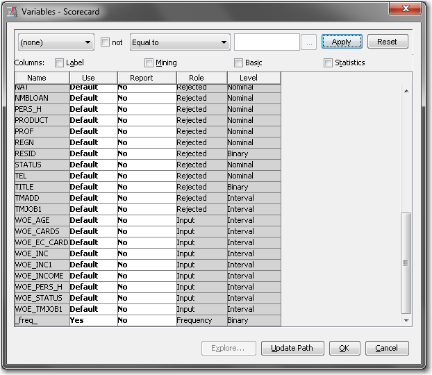
Note that for each original input variable there are now corresponding WOE_ and GRP_ variables. These were created by the Interactive Grouping node. Only the variables exceeding the Gini or IV cutoff set in the Interactive Grouping node is set to Input. All original inputs are set to Rejected.Using the Scorecard node, you can use either the WOE_ variables, which contain the weight of evidence of each binned variable, or the GRP_ variables, which contain the group ID. The Analysis Variables property of the Scorecard node is used to specify whether regression is using WOE_ variables or GRP_ variables. The default is to use WOE_ variables.
-
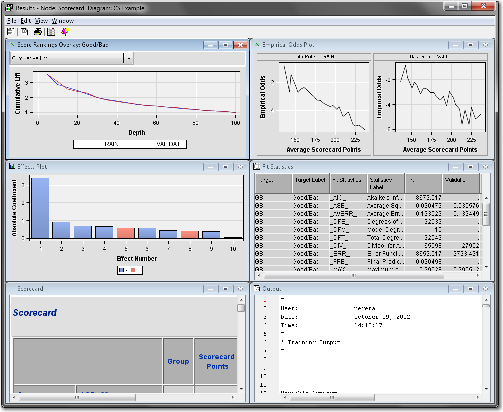
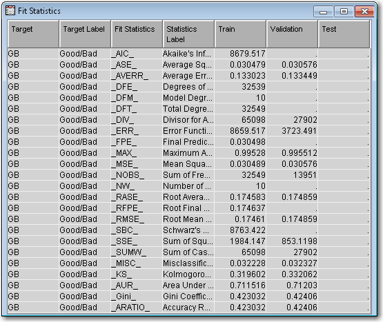
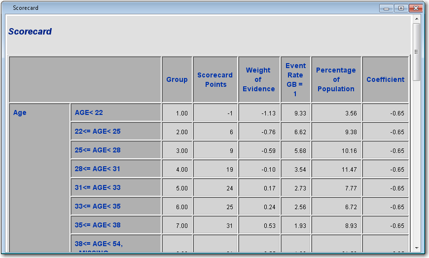
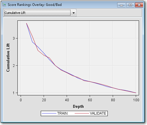
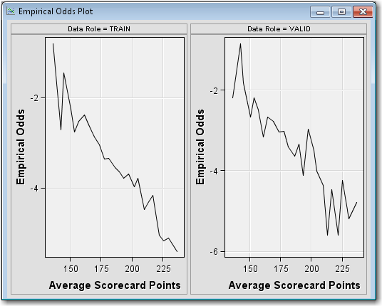
Right-click the Scorecard node and select Run. In the Confirmation window select Yes. In the Run Status window select Results.Maximize the Fit Statistics window. The Fit Statistics windowdisplays fit statistics such as the average square error (ASE), the area under the receiver operating characteristic curve (AUR), and the Kolmogorov-Smirnov (KS) statistic, among others. Notice that the AUR is 0.71203 for the Validation data set.Maximize the Scorecard window. The detailed Initial Scorecard displays information such as the scorecard points for each attribute, WOE, event rate (percentage of bad applicants in that score range), percentage of population, and the regression coefficient for each attribute. The Percentage of Population is the percentage of bad applicants who have a score higher than the lower limit of the score range.Maximize the Score Rankings Overlay window. By default, the Score Rankings Overlay window plots the Cumulative Lift chart. Recall that lift is the ratio of the percent of targets (that is, bad loans) in each decile to the percent of targets in the entire data set. Cumulative lift is the cumulative ratio of the percent of targets up to the decile of interest to the percent of targets in the entire data set.For lift and cumulative lift, the higher value in the lower deciles indicates a predictive scorecard model. Notice that both Lift and Cumulative Lift for this scorecard have high lift values in the lower deciles.Maximize the Empirical Odds Plot window. An empirical odds plot is used to evaluate the calibration of the scorecard. The chart plots the observed odds in a score bucket against the average score value in each bucket. The plot can help determine where the scorecard is or is not sufficiently accurate. The odds are calculated as the logarithm of the number of bad loans divided by the number of good loans for each scorecard bucket range. Thus, a steep negative slope implies that the good applicants tend to get higher scores than the bad applicants. As would be expected with the previous plot, as the scorecard points increase, so does the number of good loans in each score bucket.From the main menu, select View
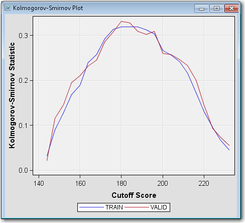
 Strength
StatisticsKolmogorov-Smirnov Plot. The Kolmogorov-Smirnov Plot shows
the Kolmogorov-Smirnov statistics plotted against scorecard cutoff
values. Recall that the Kolmogorov-Smirnov statistic is the maximum
distance between the empirical distribution functions for the good
applicants and the bad applicants. The difference is plotted, for
all cutoffs, in the Kolmogorov-Smirnov Plot.
The weakness of reporting only the maximum difference between the curves is that it provides only a measure of vertical separation at one cutoff value, but not overall cutoff values. According to the plot above, the best cutoff is approximately 180 (where the Kolmogorov-Smirnov score is at a maximum). At a cutoff value of 180, the scorecard best distinguishes between good and bad loans.From the main menu, select ViewStrength
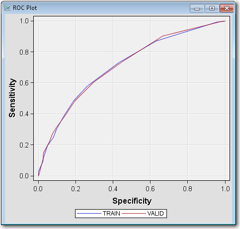
StatisticsROC Plot.
The ROC plot is a graphical measure of sensitivity versus 1–specificity.
The AUR (which is close to 0.71 for the validation data from the previous
Fit Statistics table) measures the area below each of the curves that
you see drawn in the plot. The AUR is generally regarded as providing
a much better measure of the scorecard strength than the Kolmogorov-Smirnov
statistic because the area being calculated encompasses all cutoff
values. A scorecard that is no better than random selection has an
AUR value equal to 0.50. The maximum value of the AUR is 1.0.
Strength
StatisticsKolmogorov-Smirnov Plot. The Kolmogorov-Smirnov Plot shows
the Kolmogorov-Smirnov statistics plotted against scorecard cutoff
values. Recall that the Kolmogorov-Smirnov statistic is the maximum
distance between the empirical distribution functions for the good
applicants and the bad applicants. The difference is plotted, for
all cutoffs, in the Kolmogorov-Smirnov Plot.
The weakness of reporting only the maximum difference between the curves is that it provides only a measure of vertical separation at one cutoff value, but not overall cutoff values. According to the plot above, the best cutoff is approximately 180 (where the Kolmogorov-Smirnov score is at a maximum). At a cutoff value of 180, the scorecard best distinguishes between good and bad loans.From the main menu, select ViewStrength
StatisticsROC Plot.
The ROC plot is a graphical measure of sensitivity versus 1–specificity.
The AUR (which is close to 0.71 for the validation data from the previous
Fit Statistics table) measures the area below each of the curves that
you see drawn in the plot. The AUR is generally regarded as providing
a much better measure of the scorecard strength than the Kolmogorov-Smirnov
statistic because the area being calculated encompasses all cutoff
values. A scorecard that is no better than random selection has an
AUR value equal to 0.50. The maximum value of the AUR is 1.0.

Copyright © SAS Institute Inc. All rights reserved.