Targeted Bar Chart
Definition
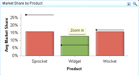
A targeted bar chart consists of a grid and some vertical or horizontal columns (bars), each of which contains a target value represented by a
reference line. Each column represents quantitative data.
For a sample of the indicator data that was used to create this indicator, see “Sample Data Structure” for this indicator.
Usage Information
|
Data best suited for
|
A targeted bar chart helps the user to quickly compare the values of different categories, as well as compare the level of
performance across
different categories based on a specified target.
|
|
Target audience
|
This indicator type is appropriate for all user audiences. Most people find this indicator type familiar and easy to interpret.
Associating the bars in the chart to a target and range enables the user to quickly see the performance of each category.
|
|
Data aggregation support
|
This indicator type averages the applicable indicator data.
|
|
Range support
|
A range is required.
|
|
Alert support
|
Alerts are supported. For information, see
Customizing Alerts.
|
|
Link support
|
This indicator type can be used to define a link or as the destination of a link. For
more information about defining an indicator with a hyperlink, see
Adding Links to Indicators or Other Content.
|
|
Interaction support
|
|
|
Filter multiple items
support
|
Filtering multiple items is supported. For
more information, see
Supporting Multiple Selections in a Filtered Data Interaction.
|
Display Settings
The following display settings are used in the preceding
figure. For more information, see “Sample Data Structure”
for this indicator.
|
Display Setting
|
Selection Used for Figure
|
|---|---|
|
Range value
|
market_share_vs_target
|
|
X-axis value
|
Product
|
|
Bar value
|
avg_market_share
|
|
Target value
|
avg_market_share_target
|
|
X-axis title
|
<blank> (defaults
to Product)
|
|
Y-axis title
|
Set to Avg
Market Share
|
|
Hide axes when zoomed
|
This setting is selected.
|
|
Y-axis format
|
-123% is
selected.
|
You can customize the following display settings for this indicator:
-
(Required) From the Range value list, select the value to which you want to apply the defined range intervals.
-
(Required) From the X-axis value list, select the column in your data that you want to use for the X-axis value in the indicator. When you view your indicator data, the columns in the data set are described by the values in the Column Name column. The selections available in the X-axis value list are all of the values in the Column Name column.
-
(Required) From the Bar value list, select the value that you want to use for the bars that are drawn in the indicator.
-
From the Target value list, select the value that you want to use for the target markers in the indicator.
-
In the X-axis title field, type the title to use for the X axis in the indicator. If you do not specify a title, the value that you selected from the X-axis value list is used by default. If you do not want a title, type a space in the field. If you select Scale X axis, a measurement label is added to the title.
-
In the Y-axis title field, type the title to use for the Y axis in the indicator. If you do not specify a title, the value that you selected from the Y-axis value list is used by default. If you do not want a title, type a space in the field. If you select Scale Y axis, a measurement label is added to the title.
-
Select Scale X axis if you want to scale that axis. When you make this selection, a measurement label is added to the X-axis title if the data is numeric. For example, if the X-axis title is set to Revenue and you select Scale X axis, the X-axis title is displayed as Revenue (millions).
-
Select Scale Y axis if you want to scale that axis. When you make this selection, a measurement label is added to the Y-axis title if the data is numeric. For example, if the Y-axis title is set to Revenue and you select Scale Y axis, the Y-axis title is displayed as Revenue (millions).
-
Select Hide axis tick labels if you want to hide the axis tick labels when a user zooms out the view of an indicator. When the user zooms in, the axis tick labels reappear. Select this setting to avoid visual clutter when the view is zoomed out.
-
Select Hide axes when zoomed out if you want to hide the axes when a user zooms out the view of an indicator. When the user zooms in, the axes reappear. Select this setting to avoid visual clutter when the view is zoomed out.
-
Select Horizontal if you want to change the orientation of the bars and labels from vertical to horizontal. This option is particularly useful if you have long labels that are difficult to read when they are displayed vertically.
-
From the Row group by list, select the value that you want to use to group rows of data. If you do not want to group the rows, select (none).
-
From the Column group by list, select the value that you want to use to group columns of data. If you do not want to group the columns, select (none).
-
From the X-axis format list, select the format that you want to apply to the data on that axis. If you do not want to specify a format, select (none). When set to (none), the indicator uses the format that is used in the data source.
-
From the Y-axis format list, select the format that you want to apply to the data on that axis. If you do not want to specify a format, select (none). When set to (none), the indicator uses the format that is used in the data source.
-
From the X-axis labels list, select the style to apply to the data labels that are used on the X axis. Depending on your labels, one style might be easier to read than others.
Sample Data Structure
To create a targeted bar chart, you must provide one variable (X-axis value) and three measures (bar value, target value,
and range value). Optionally, you can specify additional variables by using
the Row group by and Column group
by lists.
The following data
sample is associated with the figure previously shown. Underneath
each column heading is its associated display setting.
|
Market Share versus
Target
(Range value)
|
Product
(X-axis value)
|
Average Market Share
(Bar value)
|
Average Market Share
Target
(Target value)
|
|---|---|---|---|
|
Sprocket
|
0.16
|
0.27
|
—0.11
|
|
Widget
|
0.13
|
0.07
|
0.06
|
|
Wocket
|
0.16
|
0.17
|
—0.01
|
Copyright © SAS Institute Inc. All rights reserved.