Stacked Bar and Line Chart
Definition
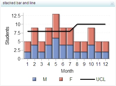
A stacked bar and line
chart has two parts:
-
a grid and some vertical or horizontal columns (bars) that include subgroups, or stacks, of data. Each column represents quantitative data. Bar charts can contain horizontal or vertical bars that are each subdivided into multiple components. Each of these components shows its relative contribution to the entire bar and the entity as a whole.
-
a line that represents a data series. A data series shows the relationship of one variable to another, often as movements or trends in the data over a period of time. Line charts summarize source data and typically are used to chart response values against discrete categorical values.
For a sample of the indicator data that was used to create this indicator, see “Sample Data Structure” for this indicator.
Usage Information
|
Data best suited for
|
Use a stacked bar and
line chart when the following criteria apply:
|
|
Not suited for
|
Stacked bar and line charts are not as effective when the subcomponents have values that are very similar or close together.
The goal with a stacked bar and line chart is to show the breakdown of an entity. If there is little or no breakdown, a simple
bar chart is more appropriate.
|
|
Target audience
|
This indicator type is appropriate for all user audiences. Most people find this indicator type familiar and easy to interpret.
|
|
Data aggregation support
|
This indicator type sums the applicable indicator data.
|
|
Range support
|
Ranges are not supported.
|
|
Alert support
|
Alerts are not supported.
|
|
Link support
|
This indicator type can be used to define a link or as the destination of a link. For
more information about defining an indicator with a hyperlink, see
Adding Links to Indicators or Other Content.
|
|
Interaction support
|
|
|
Filter multiple items
support
|
Filtering multiple items is supported. For
more information, see
Supporting Multiple Selections in a Filtered Data Interaction.
|
Display Settings
The following display settings are used in the preceding
figure. For more information, see “Sample Data Structure”
for this indicator.
|
Display Setting
|
Selection Used for Figure
|
|---|---|
|
X-axis value
|
Month
|
|
Stack group
|
Sex
|
|
Y-axis value
|
Students
|
|
X-axis title
|
<blank> (defaults
to Month)
|
|
Y-axis title
|
<blank> (defaults
to Students)
|
|
Scale Y axis
|
This setting is selected.
|
You can customize the following display settings for this indicator:
-
(Required) From the X-axis value list, select the column in your data that you want to use for the X-axis value in the indicator. When you view your indicator data, the columns in the data set are described by the values in the Column Name column. The selections available in the X-axis value list are all of the values in the Column Name column.
-
(Required) From the Stack group list, select the value that you want to use to define the stacked grouping in the indicator.
-
(Required) From the Y-axis value list, select the column in your data that you want to use for the Y-axis value in the indicator. When you view your indicator data, the columns in the data set are described by the values in the Column Name column. The selections available in the Y-axis value list are all of the values in the Column Name column.
-
From the Target value list, select the value that you want to use for the line chart.
-
In the X-axis title field, type the title to use for the X axis in the indicator. If you do not specify a title, the value that you selected from the X-axis value list is used by default. If you do not want a title, type a space in the field. If you select Scale X axis, a measurement label is added to the title.
-
In the Y-axis title field, type the title to use for the Y axis in the indicator. If you do not specify a title, the value that you selected from the Y-axis value list is used by default. If you do not want a title, type a space in the field. If you select Scale Y axis, a measurement label is added to the title.
-
Select Scale X axis if you want to scale that axis. When you make this selection, a measurement label is added to the X-axis title if the data is numeric. For example, if the X-axis title is set to Revenue and you select Scale X axis, the X-axis title is displayed as Revenue (millions).
-
Select Scale Y axis if you want to scale that axis. When you make this selection, a measurement label is added to the Y-axis title if the data is numeric. For example, if the Y-axis title is set to Revenue and you select Scale Y axis, the Y-axis title is displayed as Revenue (millions).
-
From the X-axis format list, select the format that you want to apply to the data on that axis. If you do not want to specify a format, select (none). When set to (none), the indicator uses the format that is used in the data source.
-
From the Y-axis format list, select the format that you want to apply to the data on that axis. If you do not want to specify a format, select (none). When set to (none), the indicator uses the format that is used in the data source.
-
From the X-axis labels list, select the style to apply to the data labels that are used on the X axis. Depending on your labels, one style might be easier to read than others.
Sample Data Structure
To create a stacked
bar and line chart, you must provide two variables (X-axis and stack)
and two measures (Y-axis and target value for the line).
The following data
sample is associated with the figure previously shown. Underneath
each column heading is its associated display setting.
|
Month
(X-axis value)
|
Sex
(Stack group)
|
Students
(Y-axis value)
|
UCL
(Target value)
|
|---|---|---|---|
|
1
|
M
|
2
|
8
|
|
1
|
F
|
3
|
8
|
|
2
|
M
|
4
|
8
|
|
2
|
F
|
5
|
8
|
|
3
|
M
|
2
|
8
|
|
3
|
F
|
3
|
8
|
|
4
|
M
|
4
|
8
|
|
4
|
F
|
5
|
8
|
|
5
|
M
|
6
|
8
|
|
5
|
F
|
7
|
8
|
|
6
|
M
|
4
|
8
|
|
6
|
F
|
5
|
8
|
|
7
|
M
|
4
|
8
|
|
7
|
F
|
5
|
8
|
|
8
|
M
|
2
|
10
|
|
8
|
F
|
3
|
10
|
|
9
|
M
|
2
|
10
|
|
9
|
F
|
3
|
10
|
|
10
|
M
|
4
|
10
|
|
10
|
F
|
5
|
10
|
|
11
|
M
|
2
|
10
|
|
11
|
F
|
3
|
10
|
|
12
|
M
|
2
|
10
|
|
12
|
F
|
3
|
10
|
Copyright © SAS Institute Inc. All rights reserved.