Needle Plot
Definition
A needle plot is a plot in which data points are connected by a vertical line that connects to a horizontal baseline. The baseline intersects
the 0 value, or the minimum value on the vertical axis.
For a sample of the indicator data that was used to create this indicator, see “Sample Data Structure” for this indicator.
Usage Information
|
Data best suited for
|
Needle plots can be used when working with many data points that all extend from the same baseline. A common example of needle
plot is the magnitude of earthquakes, which are represented by the needles in a needle plot. The horizontal axis typically
represents
time. Use a needle plot whenever there are too many data points to represent the data as a bar chart.
|
|
Target audience
|
Most people find this indicator type familiar and easy to interpret. However, it can sometimes be difficult for users to read.
It is best for helping users
to identify patterns, rather than read individual values.
|
|
Data aggregation support
|
This indicator type does not aggregate the indicator data.
|
|
Range support
|
Ranges are not supported.
|
|
Alert support
|
Alerts are not supported.
|
|
Link support
|
This indicator type can be used to define a link or as the destination of a link. For
more information about defining an indicator with a hyperlink, see
Adding Links to Indicators or Other Content.
|
|
Interaction support
|
|
|
Filter multiple items
support
|
Filtering multiple items is supported. For
more information, see
Supporting Multiple Selections in a Filtered Data Interaction.
|
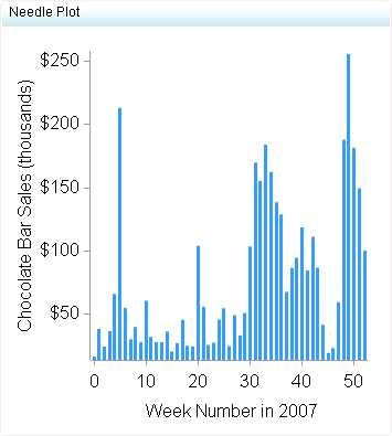
Display Settings
The following display settings are used in the preceding
figure. For more information, see “Sample Data Structure”
for this indicator.
|
Display Setting
|
Selection Used for Figure
|
|---|---|
|
X-axis value
|
Week Number
|
|
Y-axis value
|
Sale Amount
|
|
X-axis title
|
Set to Week
Number in 2007
|
|
Y-axis title
|
Set to Chocolate
Bar Sales
|
|
Scale X axis
|
This setting is selected.
|
You can customize the following display settings for this indicator:
-
(Required) From the X-axis value list, select the column in your data that you want to use for the X-axis value in the indicator. When you view your indicator data, the columns in the data set are described by the values in the Column Name column. The selections available in the X-axis value list are all of the values in the Column Name column.
-
(Required) From the Y-axis value list, select the column in your data that you want to use for the Y-axis value in the indicator. When you view your indicator data, the columns in the data set are described by the values in the Column Name column. The selections available in the Y-axis value list are all of the values in the Column Name column.
-
In the X-axis title field, type the title to use for the X axis in the indicator. If you do not specify a title, the value that you selected from the X-axis value list is used by default. If you do not want a title, type a space in the field. If you select Scale X axis, a measurement label is added to the title.
-
In the Y-axis title field, type the title to use for the Y axis in the indicator. If you do not specify a title, the value that you selected from the Y-axis value list is used by default. If you do not want a title, type a space in the field. If you select Scale Y axis, a measurement label is added to the title.
-
Select Scale X axis if you want to scale that axis. When you make this selection, a measurement label is added to the X-axis title if the data is numeric. For example, if the X-axis title is set to Revenue and you select Scale X axis, the X-axis title is displayed as Revenue (millions).
-
Select Scale Y axis if you want to scale that axis. When you make this selection, a measurement label is added to the Y-axis title if the data is numeric. For example, if the Y-axis title is set to Revenue and you select Scale Y axis, the Y-axis title is displayed as Revenue (millions).
-
From the X-axis format list, select the format that you want to apply to the data on that axis. If you do not want to specify a format, select (none). When set to (none), the indicator uses the format that is used in the data source.
-
From the Y-axis format list, select the format that you want to apply to the data on that axis. If you do not want to specify a format, select (none). When set to (none), the indicator uses the format that is used in the data source.
-
From the X-axis labels list, select the style to apply to the data labels that are used on the X axis. Depending on your labels, one style might be easier to read than others.
Copyright © SAS Institute Inc. All rights reserved.