Displays
This is a brief tour through the SAS/LAB windows. A data set containing air quality data has been loaded into LAB. The data includes measurements of various pollutant concentrations in a German city in November, 1989.
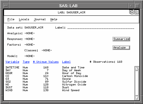
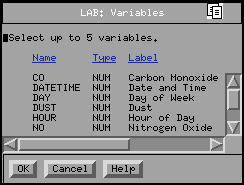
To begin investigating the data, click on the "Summarize" button to bring up the "Variables" selection list.
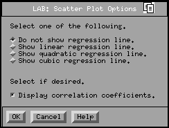
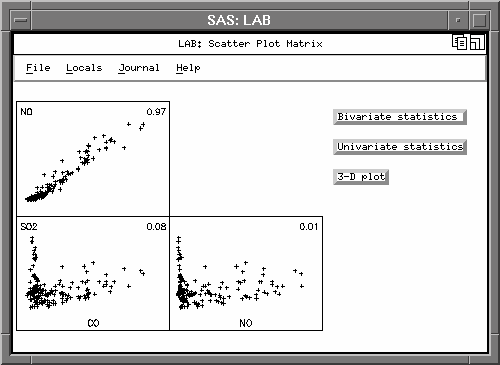
Scatter plots of all pairs of selected variables are displayed; regression lines and correlation coefficients can also be displayed using the pull-down menus to access the "Scatter Plot Options" screen.
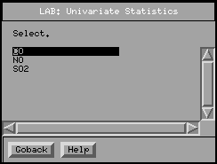
Select the "Univariate statistics" button then one of the previously chosen variables to create a histogram, a normal probability plot, and descriptive statistics.
The default histogram is created with a superimposed normal curve; this can be changed to a kernel curve through the pull-down menus.

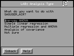
To begin an analysis, return to the Main Window and click on the "Analyze" button to pull up the "Analysis Type" selection list. Clicking on one of the five options will choose an analysis:
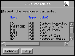
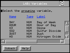
After selecting the "One-way ANOVA", SAS/LAB prompts you for a response variable (Carbon Monoxide) and a grouping variable (Day of the Week):
Note: if you had chosen "Not sure" you would be prompted for the response and explanatory variables; if you declare DAY to be a classification variable, SAS/LAB would automatically select a one-way analysis of variance.
A box-and-whisker plot is displayed, and the "Interpretation" window notes that some of the underlying assumptions for this analysis are violated.
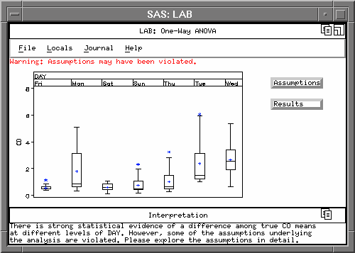
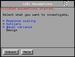
Click on the "Assumptions" button to display the "Assumptions" selection list. Of the four tested assumptions, the first three have been violated.
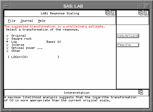
Clicking on "Response Scaling" gives some suggestions for a response variable transformation: "Optimal power..." is the Box-Cox optimal power transformation, "Other" will allow you to enter your own transformation, and "Original" allows you to go back to the untransformed variable.
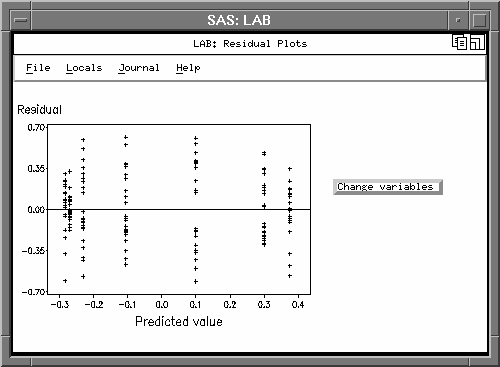
Display residual plots through the pull-down menus: Locals:Residual Plots. Selecting the "Change variables" button allows you to create plots of other model fit and diagnostic statistics.
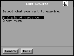
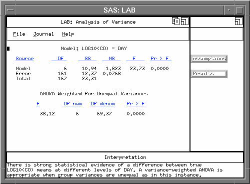
Clicking on the "Results" button in the "One-Way ANOVA" window gives a choice between looking at the ANOVA table or investigating the group means. First, look at the ANOVA table.
Since the "equal variance" assumption is still violated, use an ANOVA weighted for unequal variances (Welch's test).
Now go back and check out the "Group Means" options. This is Tukey's multiple comparison of group means; note that the "Interpretation" window summarizes the results.
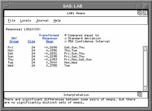
Choosing the "Standard deviation" or "95% Confidence Interval" buttons will replace "Sat,Sun,Thu..." with these statistics. You can also transform the means and the 95% confidence intervals back to the original response units.